Introduction
Overview
Teaching: 15 min
Exercises: 3 minQuestions
What are basic principles for using spreadsheets for good data organization?
Objectives
Describe best practices for organizing data so computers can make the best use of data sets.
Good data organization is the foundation of your research project. Most researchers have data or do data entry in spreadsheets. Spreadsheet programs are very useful graphical interfaces for designing data tables and handling very basic data quality control functions.
Spreadsheet outline
After this lesson, you will be able to:
- Implement best practices in data table formatting
- Identify and address common formatting mistakes
- Understand approaches for handling dates in spreadsheets
- Utilize basic quality control features and data manipulation practices
- Effectively export data from spreadsheet programs
Overall good data practices
Spreadsheets are good for data entry. Therefore we have a lot of data in spreadsheets. Much of your time as a researcher will be spent in this ‘data wrangling’ stage. It’s not the most fun, but it’s necessary. We’ll teach you how to think about data organization and some practices for more effective data wrangling.
What this lesson will not teach you
- How to do statistics in a spreadsheet
- How to do plotting in a spreadsheet
- How to write code in spreadsheet programs
If you’re looking to do this, a good reference is Head First Excel, published by O’Reilly.
Why aren’t we teaching data analysis in spreadsheets
-
Data analysis in spreadsheets usually requires a lot of manual work. If you want to change a parameter or run an analysis with a new dataset, you usually have to redo everything by hand. (We do know that you can create macros, but see the next point.)
-
It is also difficult to track or reproduce statistical or plotting analyses done in spreadsheet programs when you want to go back to your work or someone asks for details of your analysis.
Spreadsheet programs
Many spreadsheet programs are available. Since most participants utilize Excel as their primary spreadsheet program, this lesson will make use of Excel examples.
A free spreadsheet program that can also be used is LibreOffice.
Commands may differ a bit between programs, but the general idea is the same.
Exercise
- How many people have used spreadsheets in their research?
- How many people have accidentally done something that made them frustrated or sad?
Spreadsheets encompass a lot of the things we need to be able to do as researchers. We can use them for:
- Data entry
- Organizing data
- Subsetting and sorting data
- Statistics
- Plotting
We do a lot of different operations in spreadsheets. What kind of operations do you do in spreadsheets? Which ones do you think spreadsheets are good for?
Problems with Spreadsheets
Spreadsheets are good for data entry, but in reality we tend to use spreadsheet programs for much more than data entry. We use them to create data tables for publications, to generate summary statistics, and make figures.
Generating tables for publications in a spreadsheet is not optimal - often, when formatting a data table for publication, we’re reporting key summary statistics in a way that is not really meant to be read as data, and often involves special formatting (merging cells, creating borders, making it pretty). We advise you to do this sort of operation within your document editing software.
The latter two applications, generating statistics and figures, should be used with caution: because of the graphical, drag and drop nature of spreadsheet programs, it can be very difficult, if not impossible, to replicate your steps (much less retrace anyone else’s), particularly if your stats or figures require you to do more complex calculations. Furthermore, in doing calculations in a spreadsheet, it’s easy to accidentally apply a slightly different formula to multiple adjacent cells. When using a command-line based statistics program like R or SAS, it’s practically impossible to apply a calculation to one observation in your dataset but not another unless you’re doing it on purpose.
Using Spreadsheets for Data Entry and Cleaning
However, there are circumstances where you might want to use a spreadsheet program to produce “quick and dirty” calculations or figures, and data cleaning will help you use some of these features. Data cleaning also puts your data in a better format prior to importation into a statistical analysis program. We will show you how to use some features of spreadsheet programs to check your data quality along the way and produce preliminary summary statistics.
In this lesson, we will assume that you are most likely using Excel as your primary spreadsheet program - there are others (gnumeric, Calc from OpenOffice), and their functionality is similar, but Excel seems to be the program most used by biologists and ecologists.
In this lesson we’re going to talk about:
- Formatting data tables in spreadsheets
- Formatting problems
- Dates as data
- Quality control
- Exporting data
Key Points
Good data organization is the foundation of any research project.
Formatting data tables in Spreadsheets
Overview
Teaching: 15 min
Exercises: 20 minQuestions
How do we format data in spreadsheets for effective data use?
Objectives
Describe best practices for data entry and formatting in spreadsheets.
Apply best practices to arrange variables and observations in a spreadsheet.
The most common mistake made is treating spreadsheet programs like lab notebooks, that is, relying on context, notes in the margin, spatial layout of data and fields to convey information. As humans, we can (usually) interpret these things, but computers don’t view information the same way, and unless we explain to the computer what every single thing means (and that can be hard!), it will not be able to see how our data fits together.
Using the power of computers, we can manage and analyze data in much more effective and faster ways, but to use that power, we have to set up our data for the computer to be able to understand it (and computers are very literal).
This is why it’s extremely important to set up well-formatted tables from the outset - before you even start entering data from your very first preliminary experiment. Data organization is the foundation of your research project. It can make it easier or harder to work with your data throughout your analysis, so it’s worth thinking about when you’re doing your data entry or setting up your experiment. You can set things up in different ways in spreadsheets, but some of these choices can limit your ability to work with the data in other programs or have the you-of-6-months-from-now or your collaborator work with the data.
Note: the best layouts/formats (as well as software and interfaces) for data entry and data analysis might be different. It is important to take this into account, and ideally automate the conversion from one to another.
Keeping track of your analyses
When you’re working with spreadsheets, during data clean up or analyses, it’s very easy to end up with a spreadsheet that looks very different from the one you started with. In order to be able to reproduce your analyses or figure out what you did when Reviewer #3 asks for a different analysis, you should
- create a new file with your cleaned or analyzed data. Don’t modify the original dataset, or you will never know where you started!
- keep track of the steps you took in your clean up or analysis. You should track these steps as you would any step in an experiment. We recommend that you do this in a plain text file stored in the same folder as the data file.
This might be an example of a spreadsheet setup:
Put these principles in to practice today during your Exercises.
Note: This is out of scope for this lesson, but for information on how to maintain version control over your data, look at our lesson on ‘Git’.
Structuring data in spreadsheets
The cardinal rule of using spreadsheet programs for data is to keep it “tidy”:
- Put all your variables in columns - the thing you’re measuring, like ‘weight’ or ‘temperature’.
- Put each observation in its own row.
- Don’t combine multiple pieces of information in one cell. Sometimes it just seems like one thing, but think if that’s the only way you’ll want to be able to use or sort that data.
- Leave the raw data raw - don’t change it!
- Export the cleaned data to a text-based format like CSV (comma-separated values) format. This ensures that anyone can use the data, and is required by most data repositories.
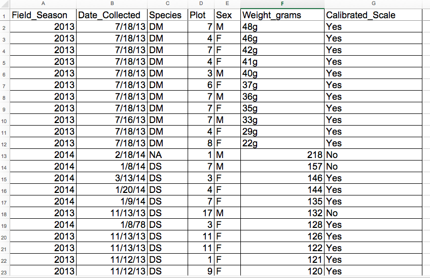
For instance, we have data from a survey of small mammals in a desert ecosystem. Different people have gone to the field and entered data into a spreadsheet. They keep track of things like species, plot, weight, sex and date collected.
If they were to keep track of the data like this:
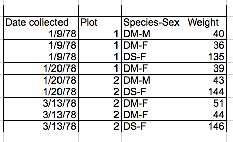
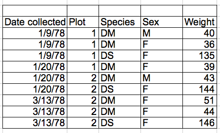
the problem is that species and sex are in the same field. So, if they wanted to look at all of one species or look at different weight distributions by sex, it would be hard to do this using this data setup. If instead we put sex and species in different columns, you can see that it would be much easier.
Columns for variables and rows for observations
The rule of thumb, when setting up a datasheet, is columns = variables, rows = observations, cells = data (values).
So, instead we should have:
Discussion
If not already discussed, introduce the dataset that will be used in this lesson, and in the other ecology lessons, the Portal Project Teaching Dataset.
The data used in the ecology lessons are observations of a small mammal community in southern Arizona. This is part of a project studying the effects of rodents and ants on the plant community that has been running for almost 40 years. The rodents are sampled on a series of 24 plots, with different experimental manipulations controlling which rodents are allowed to access which plots.
This is a real dataset that has been used in over 100 publications. We’ve simplified it just a little bit for the workshop, but you can download the full dataset and work with it using exactly the same tools we’ll learn about today.
Exercise
We’re going to take a messy version of the survey data and describe how we would clean it up.
- Download the data by clicking here to get it from FigShare.
- Open up the data in a spreadsheet program.
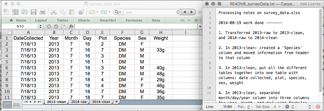
- You can see that there are two tabs. Two field assistants conducted the surveys, one in 2013 and one in 2014, and they both kept track of the data in their own way in tabs
2013and2014of the dataset, respectively. Now you’re the person in charge of this project and you want to be able to start analyzing the data.- With the person next to you, identify what is wrong with this spreadsheet. Also discuss the steps you would need to take to clean up the
2013and2014tabs, and to put them all together in one spreadsheet.Important Do not forget our first piece of advice: to create a new file (or tab) for the cleaned data, never modify your original (raw) data.
After you go through this exercise, we’ll discuss as a group what was wrong with this data and how you would fix it.
Solution
- Take about 10 minutes to work on this exercise.
- All the mistakes in 02-common-mistakes are present in the messy dataset. If the exercise is done during a workshop, ask people what they saw as wrong with the data. As they bring up different points, you can refer to 02-common-mistakes or expand a bit on the point they brought up.
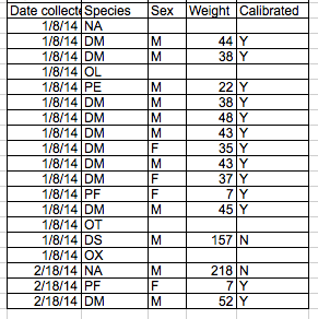
- Note that there is a problem with dates in table ‘plot 3’ in
2014tab. The field assistant who collected the data for year 2014 initially forgot to include their data for ‘plot 3’. They came back in 2015 to include the missing data and entered the dates for ‘plot 3’ in the dataset without the year. Excel automatically filled in the missing year as the current year (i.e. 2015) - introducing an error in the data without the field assistant realising. If you get a response from the participants that they’ve spotted and fixed the problem with date, you can say you’ll come back to dates again towards the end of lesson in episode 03-dates-as-data. If participants have not spotted the problem with dates in ‘plot 3’ table, that’s fine as you will address peculiarities of working with dates in spreadsheets in episode 03-dates-as-data.
An excellent reference, in particular with regard to R scripting is
Hadley Wickham, Tidy Data, Vol. 59, Issue 10, Sep 2014, Journal of Statistical Software. http://www.jstatsoft.org/v59/i10.
Key Points
Never modify your raw data. Always make a copy before making any changes.
Keep track of all of the steps you take to clean your data in a plain text file.
Organize your data according to tidy data principles.
Formatting problems
Overview
Teaching: 20 min
Exercises: 0 minQuestions
What are some common challenges with formatting data in spreadsheets and how can we avoid them?
Objectives
Recognize and resolve common spreadsheet formatting problems.
Common Spreadsheet Errors
This lesson is meant to be used as a reference for discussion as learners identify issues with the messy dataset discussed in the previous lesson. Instructors: don’t go through this lesson except to refer to responses to the exercise in the previous lesson.
There are a few potential errors to be on the lookout for in your own data as well as data from collaborators or the Internet. If you are aware of the errors and the possible negative effect on downstream data analysis and result interpretation, it might motivate yourself and your project members to try and avoid them. Making small changes to the way you format your data in spreadsheets can have a great impact on efficiency and reliability when it comes to data cleaning and analysis.
- Using multiple tables
- Using multiple tabs
- Not filling in zeros
- Using problematic null values
- Using formatting to convey information
- Using formatting to make the data sheet look pretty
- Placing comments or units in cells
- Entering more than one piece of information in a cell
- Using problematic field names
- Using special characters in data
- Inclusion of metadata in data table
- Date formatting
Using multiple tables
A common strategy is creating multiple data tables within one spreadsheet. This confuses the computer, so don’t do this! When you create multiple tables within one spreadsheet, you’re drawing false associations between things for the computer, which sees each row as an observation. You’re also potentially using the same field name in multiple places, which will make it harder to clean your data up into a usable form. The example below depicts the problem:
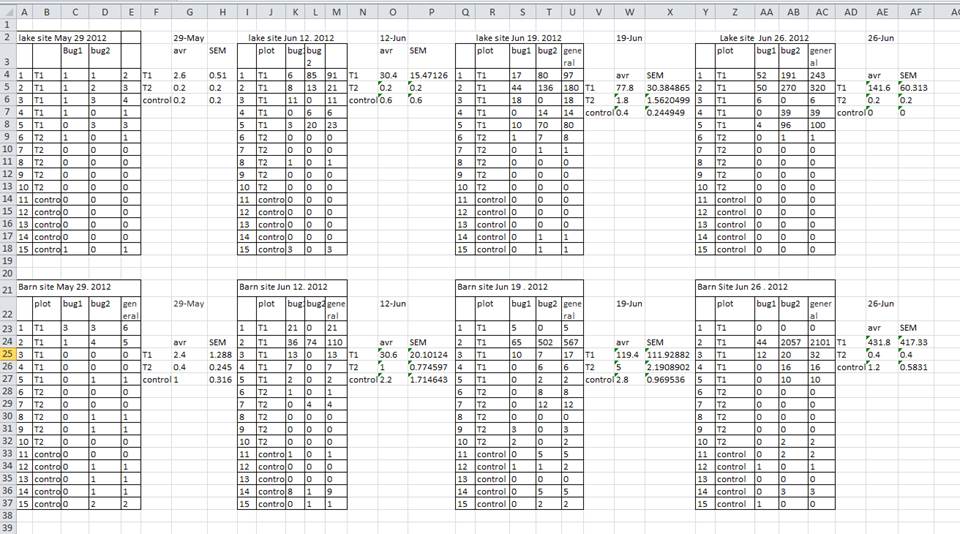
In the example above, the computer will see (for example) row 4 and assume that all columns A-AF refer to the same sample. This row actually represents four distinct samples (sample 1 for each of four different collection dates - May 29th, June 12th, June 19th, and June 26th), as well as some calculated summary statistics (an average (avr) and standard error of measurement (SEM)) for two of those samples. Other rows are similarly problematic.
Using multiple tabs
But what about workbook tabs? That seems like an easy way to organize data, right? Well, yes and no. When you create extra tabs, you fail to allow the computer to see connections in the data that are there (you have to introduce spreadsheet application-specific functions or scripting to ensure this connection). Say, for instance, you make a separate tab for each day you take a measurement.
This isn’t good practice for two reasons: 1) you are more likely to accidentally add inconsistencies to your data if each time you take a measurement, you start recording data in a new tab, and 2) even if you manage to prevent all inconsistencies from creeping in, you will add an extra step for yourself before you analyze the data because you will have to combine these data into a single datatable. You will have to explicitly tell the computer how to combine tabs - and if the tabs are inconsistently formatted, you might even have to do it manually.
The next time you’re entering data, and you go to create another tab or table, ask yourself if you could avoid adding this tab by adding another column to your original spreadsheet. We used multiple tabs in our example of a messy data file, but now you’ve seen how you can reorganize your data to consolidate across tabs.
Your data sheet might get very long over the course of the experiment. This makes it harder to enter data if you can’t see your headers at the top of the spreadsheet. But don’t repeat your header row. These can easily get mixed into the data, leading to problems down the road.
Instead you can freeze the column headers so that they remain visible even when you have a spreadsheet with many rows.
Documentation on how to freeze column headers in MS Excel
Not filling in zeros
It might be that when you’re measuring something, it’s usually a zero, say the number of times a rabbit is observed in the survey. Why bother writing in the number zero in that column, when it’s mostly zeros?
However, there’s a difference between a zero and a blank cell in a spreadsheet. To the computer, a zero is actually data. You measured or counted it. A blank cell means that it wasn’t measured and the computer will interpret it as an unknown value (otherwise known as a null value).
The spreadsheets or statistical programs will likely mis-interpret blank cells that you intend to be zeros. By not entering the value of your observation, you are telling your computer to represent that data as unknown or missing (null). This can cause problems with subsequent calculations or analyses. For example, the average of a set of numbers which includes a single null value is always null (because the computer can’t guess the value of the missing observations). Because of this, it’s very important to record zeros as zeros and truly missing data as nulls.
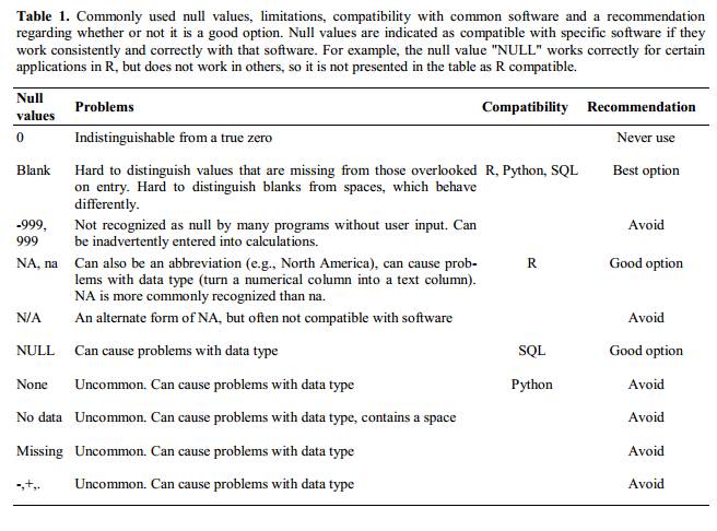
Using problematic null values
Example: using -999 or other numerical values (or zero) to represent missing data.
Solutions:
There are a few reasons why null values get represented differently within a dataset. Sometimes confusing null values are automatically recorded from the measuring device. If that’s the case, there’s not much you can do, but it can be addressed in data cleaning with a tool like OpenRefine before analysis. Other times different null values are used to convey different reasons why the data isn’t there. This is important information to capture, but is in effect using one column to capture two pieces of information. Like for using formatting to convey information it would be good here to create a new column like ‘data_missing’ and use that column to capture the different reasons.
Whatever the reason, it’s a problem if unknown or missing data is recorded as -999, 999, or 0. Many statistical programs will not recognize that these are intended to represent missing (null) values. How these values are interpreted will depend on the software you use to analyze your data. It is essential to use a clearly defined and consistent null indicator. Blanks (most applications) and NA (for R) are good choices. White et al, 2013, explain good choices for indicating null values for different software applications in their article: Nine simple ways to make it easier to (re)use your data. Ideas in Ecology and Evolution.
Using formatting to convey information
Example: highlighting cells, rows or columns that should be excluded from an analysis, leaving blank rows to indicate separations in data.
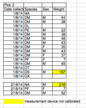
Solution: create a new field to encode which data should be excluded.
Using formatting to make the data sheet look pretty
Example: merging cells.
Solution: If you’re not careful, formatting a worksheet to be more aesthetically pleasing can compromise your computer’s ability to see associations in the data. Merged cells will make your data unreadable by statistics software. Consider restructuring your data in such a way that you will not need to merge cells to organize your data.
Placing comments or units in cells
Example: Your data was collected, in part, by a summer student who you later found out was mis-identifying some of your species, some of the time. You want a way to note these data are suspect.
Solution: Most analysis software can’t see Excel or LibreOffice comments, and would be confused by comments placed within your data cells. As described above for formatting, create another field if you need to add notes to cells. Similarly, don’t include units in cells: ideally, all the measurements you place in one column should be in the same unit, but if for some reason they aren’t, create another field and specify the units the cell is in.
Entering more than one piece of information in a cell
Example: You find one male, and one female of the same species. You enter this as 1M, 1F.
Solution: Don’t include more than one piece of information in a cell. This will limit the ways in which you can analyze your data. If you need both these measurements, design your data sheet to include this information. For example, include one column for number of individuals and a separate column for sex.
Using problematic field names
Choose descriptive field names, but be careful not to include spaces, numbers, or special characters of any kind. Spaces can be misinterpreted by parsers that use whitespace as delimiters and some programs don’t like field names that are text strings that start with numbers.
Underscores (_) are a good alternative to spaces. Consider writing names in camel case (like this: ExampleFileName) to improve
readability. Remember that abbreviations that make sense at the moment may not be so obvious in 6 months, but don’t overdo it with names
that are excessively long. Including the units in the field names avoids confusion and enables others to readily interpret your fields.
Examples
| Good Name | Good Alternative | Avoid |
| Max_temp_C | MaxTemp | Maximum Temp (°C) |
| Precipitation_mm | Precipitation | precmm |
| Mean_year_growth | MeanYearGrowth | Mean growth/year |
| sex | sex | M/F |
| weight | weight | w. |
| cell_type | CellType | Cell Type |
| Observation_01 | first_observation | 1st Obs |
Using special characters in data
Example: You treat your spreadsheet program as a word processor when writing notes, for example copying data directly from Word or other applications.
Solution: This is a common strategy. For example, when writing longer text in a cell, people often include line breaks, em-dashes, etc in their spreadsheet. Also, when copying data in from applications such as Word, formatting and fancy non-standard characters (such as left- and right-aligned quotation marks) are included. When exporting this data into a coding/statistical environment or into a relational database, dangerous things may occur, such as lines being cut in half and encoding errors being thrown.
General best practice is to avoid adding characters such as newlines, tabs, and vertical tabs. In other words, treat a text cell as if it were a simple web form that can only contain text and spaces.
Inclusion of metadata in data table
Example: You add a legend at the top or bottom of your data table explaining column meaning, units, exceptions, etc.
Solution: Recording data about your data (“metadata”) is essential. You may be on intimate terms with your dataset while you are collecting and analysing it, but the chances that you will still remember that the variable “sglmemgp” means single member of group, for example, or the exact algorithm you used to transform a variable or create a derived one, after a few months, a year, or more are slim.
As well, there are many reasons other people may want to examine or use your data - to understand your findings, to verify your findings, to review your submitted publication, to replicate your results, to design a similar study, or even to archive your data for access and re-use by others. While digital data by definition are machine-readable, understanding their meaning is a job for human beings. The importance of documenting your data during the collection and analysis phase of your research cannot be overestimated, especially if your research is going to be part of the scholarly record.
However, metadata should not be contained in the data file itself. Unlike a table in a paper or a supplemental file, metadata (in the form of legends) should not be included in a data file since this information is not data, and including it can disrupt how computer programs interpret your data file. Rather, metadata should be stored as a separate file in the same directory as your data file, preferably in plain text format with a name that clearly associates it with your data file. Because metadata files are free text format, they also allow you to encode comments, units, information about how null values are encoded, etc. that are important to document but can disrupt the formatting of your data file.
Additionally, file or database level metadata describes how files that make up the dataset relate to each other; what format are they are in; and whether they supercede or are superceded by previous files. A folder-level readme.txt file is the classic way of accounting for all the files and folders in a project.
(Text on metadata adapted from the online course Research Data MANTRA by EDINA and Data Library, University of Edinburgh. MANTRA is licensed under a Creative Commons Attribution 4.0 International License.)
Key Points
Avoid using multiple tables within one spreadsheet.
Avoid spreading data across multiple tabs.
Record zeros as zeros.
Use an appropriate null value to record missing data.
Don’t use formatting to convey information or to make your spreadsheet look pretty.
Place comments in a separate column.
Record units in column headers.
Include only one piece of information in a cell.
Avoid spaces, numbers and special characters in column headers.
Avoid special characters in your data.
Record metadata in a separate plain text file.
Dates as data
Overview
Teaching: 10 min
Exercises: 3 minQuestions
What are good approaches for handling dates in spreadsheets?
Objectives
Describe how dates are stored and formatted in spreadsheets.
Describe the advantages of alternative date formatting in spreadsheets.
Demonstrate best practices for entering dates in spreadsheets.
Dates in spreadsheets are stored in a single column. While this seems the most natural way to record dates, it actually is not best practice. A spreadsheet application will display the dates in a seemingly correct way (to a human observer) but how it actually handles and stores the dates may be problematic.
In particular, please remember that functions that are valid for a given spreadsheet program (be it LibreOffice, Microsoft Excel, OpenOffice, Gnumeric, etc.) are usually guaranteed to be compatible only within the same family of products. If you will later need to export the data and need to conserve the timestamps, you are better off handling them using one of the solutions discussed below.
Additionally, Excel can turn things that aren’t dates into dates, for example names or identifiers like MAR1, DEC1, OCT4. So if you’re avoiding the date format overall, it’s easier to identify these issues.
Exercise
Challenge: pulling month, day and year out of dates
- Let’s create a tab called
datesin our data spreadsheet and copy the ‘plot 3’ table from the2014tab (that contains the problematic dates).- Let’s extract month, day and year from the dates in the
Date collectedcolumn into new columns. For this we can use the following built-in Excel functions:
YEAR()
MONTH()
DAY()(Make sure the new columns are formatted as a number and not as a date.)
You can see that even though we expected the year to be 2014, the year is actually 2015. What happened here is that the field assistant who collected the data for year 2014 initially forgot to include their data for ‘plot 3’ in this dataset. They came back in 2015 to add the missing data into the dataset and entered the dates for ‘plot 3’ without the year. Excel automatically interpreted the year as 2015 - the year the data was entered into the spreadsheet and not the year the data was collected. Thereby, the spreadsheet program introduced an error in the dataset without the field assistant realising.
Solution
Exercise
Challenge: pulling hour, minute and second out of the current time
Current time and date are best retrieved using the functions
NOW(), which returns the current date and time, andTODAY(), which returns the current date. The results will be formatted according to your computer’s settings.1) Extract the year, month and day from the current date and time string returned by the
NOW()function.
2) Calculate the current time usingNOW()-TODAY().
3) Extract the hour, minute and second from the current time using functionsHOUR(),MINUTE()andSECOND().
4) PressF9to force the spreadsheet to recalculate theNOW()function, and check that it has been updated.Solution
1) To get the year, type
=YEAR(NOW())into any cell in your spreadsheet. To get the month, type=MONTH(NOW()). To get the day, type=DAY(NOW()).
2) Typing=NOW()-TODAY()will result in a decimal value that is not easily human parsable to a clock-based time. You will need to use the strategies in the third part of this challenge to convert this decimal value to readable time.
3) To extract the hour, type=HOUR(NOW()-TODAY())and similarly for minute and second.
Preferred date format
It is much safer to store dates with YEAR, MONTH, DAY in separate columns or as YEAR and DAY-OF-YEAR in separate columns.
Note: Excel is unable to parse dates from before 1899-12-31, and will thus leave these untouched. If you’re mixing historic data from before and after this date, Excel will translate only the post-1900 dates into its internal format, thus resulting in mixed data. If you’re working with historic data, be extremely careful with your dates!
Excel also entertains a second date system, the 1904 date system, as the default in Excel for Macintosh. This system will assign a different serial number than the 1900 date system. Because of this, dates must be checked for accuracy when exporting data from Excel (look for dates that are ~4 years off).
Date formats in spreadsheets
Spreadsheet programs have numerous “useful features” which allow them to handle dates in a variety of ways.
But these “features” often allow ambiguity to creep into your data. Ideally, data should be as unambiguous as possible.
Dates stored as integers
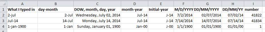
The first thing you need to know is that Excel stores dates as numbers - see the last column in the above figure. Essentially, it counts the days from a default of December 31, 1899, and thus stores July 2, 2014 as the serial number 41822.
(But wait. That’s the default on my version of Excel. We’ll get into how this can introduce problems down the line later in this lesson. )
This serial number thing can actually be useful in some circumstances. By using the above functions we can easily add days, months or years to a given date. Say you had a sampling plan where you needed to sample every thirty seven days. In another cell, you could type:
=B2+37
And it would return
8-Aug
because it understands the date as a number 41822, and 41822 + 37 = 41859
which Excel interprets as August 8, 2014. It retains the format (for the most
part) of the cell that is being operated upon, (unless you did some sort of
formatting to the cell before, and then all bets are off). Month and year
rollovers are internally tracked and applied.
Note Adding years and months and days is slightly trickier because we need to make sure that we are adding the amount to the correct entity.
- First we extract the single entities (day, month or year)
- We can then add values to do that
- Finally the complete date string is reconstructed using the
DATE()function.
As for dates, times are handled in a similar way; seconds can be directly added but to add hour and minutes we need to make sure that we are adding the quantities to the correct entities.
Which brings us to the many different ways Excel provides in how it displays dates. If you refer to the figure above, you’ll see that there are many ways that ambiguity creeps into your data depending on the format you chose when you enter your data, and if you’re not fully aware of which format you’re using, you can end up actually entering your data in a way that Excel will badly misinterpret and you will end up with errors in your data that will be extremely difficult to track down and troubleshoot.
Exercise
What happens to the dates in the
datestab of our workbook if we save this sheet in Excel (incsvformat) and then open the file in a plain text editor (like TextEdit or Notepad)? What happens to the dates if we then open thecsvfile in Excel?Solution
- Click to the
datestab of the workbook and double-click on any of the values in theDate collectedcolumn. Notice that the dates display with the year 2015.- Select
File -> Save Asin Excel and in the drop down menu for file format selectCSV UTF-8 (Comma delimited) (.csv). ClickSave.- You will see a pop-up that says “This workbook cannot be saved in the selected file format because it contains multiple sheets.” Choose
Save Active Sheet.- Navigate to the file in your finder application. Right click and select
Open With. Choose a plain text editor application and view the file. Notice that the dates display as month/day without any year information.- Now right click on the file again and open with Excel. Notice that the dates display with the current year, not 2015.
As you can see, exporting data from Excel and then importing it back into Excel fundamentally changed the data once again!
Note
You will notice that when exporting into a text-based format (such as CSV), Excel will export its internal date integer instead of a useful value (that is, the dates will be represented as integer numbers). This can potentially lead to problems if you use other software to manipulate the file.
Advantages of Alternative Date Formatting
Storing dates as YEAR, MONTH, DAY
Storing dates in YEAR, MONTH, DAY format helps remove this ambiguity. Let’s look at this issue a bit closer.
For instance this is a spreadsheet representing insect counts that were taken every few days over the summer, and things went something like this:
If Excel was to be believed, this person had been collecting bugs in the future. Now, we have no doubt this person is highly capable, but I believe time travel was beyond even their grasp.
Entering dates in one cell is helpful but due to the fact that the spreadsheet programs may interpret and save the data in different ways (doing that somewhat behind the scenes), there is a better practice.
In dealing with dates in spreadsheets, separate date data into separate fields (day, month, year), which will eliminate any chance of ambiguity.
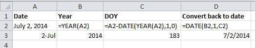
Storing dates as YEAR, DAY-OF-YEAR
There is also another option. You can also store dates as year and day of year (DOY). Why? Because depending on your question, this might be what’s useful to you, and there is practically no possibility for ambiguity creeping in.
Statistical models often incorporate year as a factor, or a categorical variable, rather than a numeric variable, to account for year-to-year variation, and DOY can be used to measure the passage of time within a year.
So, can you convert all your dates into DOY format? Well, in Excel, here’s a useful guide:
Storing dates as a single string
Another alternative could be to convert the date string
into a single string using the YYYYMMDDhhmmss format.
For example the date March 24, 2015 17:25:35 would
become 20150324172535, where:
YYYY: the full year, i.e. 2015
MM: the month, i.e. 03
DD: the day of month, i.e. 24
hh: hour of day, i.e. 17
mm: minutes, i.e. 25
ss: seconds, i.e. 35
Such strings will be correctly sorted in ascending or descending order, and by knowing the format they can then be correctly processed by the receiving software.
Key Points
Treating dates as multiple pieces of data rather than one makes them easier to handle.
Quality control
Overview
Teaching: 20 min
Exercises: 0 minQuestions
How can we carry out basic quality control and quality assurance in spreadsheets?
Objectives
Apply quality control techniques to identify errors in spreadsheets and limit incorrect data entry.
When you have a well-structured data table, you can use several simple techniques within your spreadsheet to ensure the data you enter is free of errors. These approaches include techniques that are implemented prior to entering data (quality assurance) and techniques that are used after entering data to check for errors (quality control).
Quality Assurance
Quality assurance stops bad data from ever being entered by checking to see if values are valid during data entry. For example, if research is being conducted at sites A, B, and C, then the value V (which is right next to B on the keyboard) should never be entered. Likewise if one of the kinds of data being collected is a count, only integers greater than or equal to zero should be allowed.
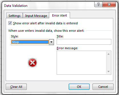
To control the kind of data entered into a spreadsheet we use Data Validation (Excel) or Validity (Libre Office Calc), to set the values that can be entered in each data column.
1. Select the cells or column you want to validate
2. On the Data tab select Data Validation
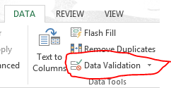
3. In the Allow box select the kind of data that should be in the
column. Options include whole numbers, decimals, lists of items, dates, and
other values.
4. After selecting an item enter any additional details. For example, if you’ve
chosen a list of values, enter a comma-delimited list of allowable
values in the Source box.
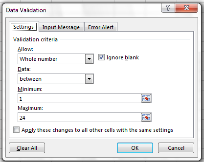
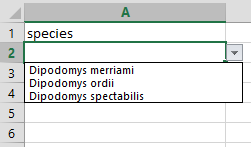
Let’s try this out by setting the plot column in our spreadsheet to only allow plot values that are integers between 1 and 24.
- Select the
plot_idcolumn - On the
Datatab selectData Validation - In the
Allowbox selectWhole number - Set the minimum and maximum values to 1 and 24.
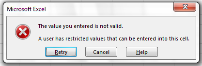
Now let’s try entering a new value in the plot column that isn’t a valid plot. The spreadsheet stops us from entering the wrong value and asks us if we would like to try again.
You can also customize the resulting message to be more informative by entering
your own message in the Input Message tab
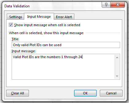
or allow invalid data to result in a warning rather than an error by modifying the Style
option on the Error Alert tab.
Quality assurance can make data entry easier as well as more robust. For example, if you use a list of options to restrict data entry, the spreadsheet will provide you with a drop-downlist of the available items. So, instead of trying to remember how to spell Dipodomys spectabilis, you can select the right option from the list.
Quality Control
Tip: Before doing any quality control operations, save your original file with the formulas and a name indicating it is the original data. Create a separate file with appropriate naming and versioning, and ensure your data is stored as values and not as formulas. Because formulas refer to other cells, and you may be moving cells around, you may compromise the integrity of your data if you do not take this step!
readMe (README) files: As you start manipulating your data files, create a readMe document / text file to keep track of your files and document your manipulations so that they may be easily understood and replicated, either by your future self or by an independent researcher. Your readMe file should document all of the files in your data set (including documentation), describe their content and format, and lay out the organizing principles of folders and subfolders. For each of the separate files listed, it is a good idea to document the manipulations or analyses that were carried out on those data. Cornell University’s Research Data Management Service Group provides detailed guidelines for how to write a good readMe file, along with an adaptable template.
Sorting
Bad values often sort to the bottom or top of the column. For example, if your data should be numeric, then alphabetical and null data will group at the ends of the sorted data. Sort your data by each field, one at a time. Scan through each column, but pay the most attention to the top and the bottom of a column. If your dataset is well-structured and does not contain formulas, sorting should never affect the integrity of your dataset.
Remember to expand your sort in order to prevent data corruption. Expanding your sort ensures that the all the data in one row move together instead of only sorting a single column in isolation. Sorting by only a single column will scramble your data - a single row will no longer represent an individual observation.
Exercise
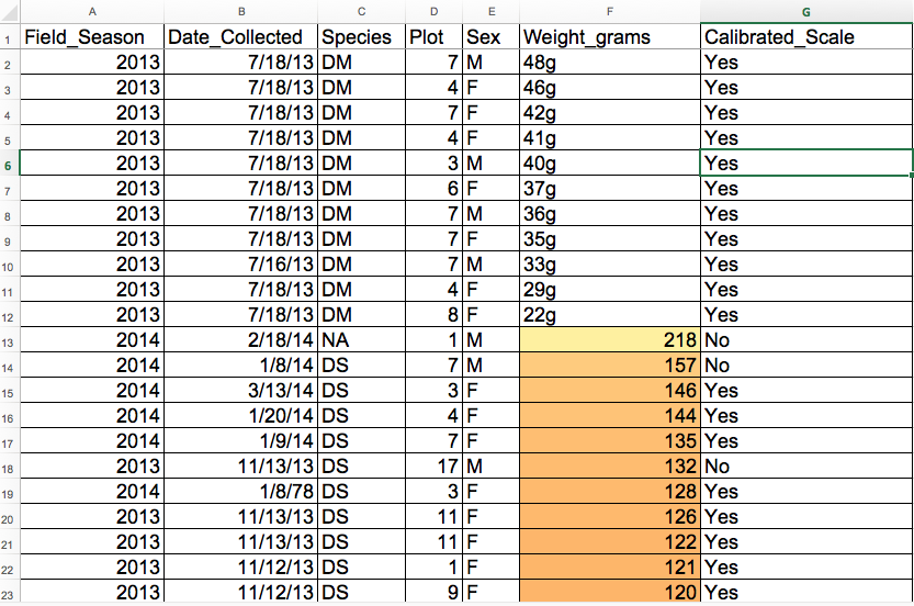
We’ve combined all of the tables from the messy data into a single table in a single tab. Download this semi-cleaned data file to your computer: survey_sorting_exercise
Once downloaded, sort the
Weight_gramscolumn in your spreadsheet program fromLargest to Smallest.What do you notice?
Solution
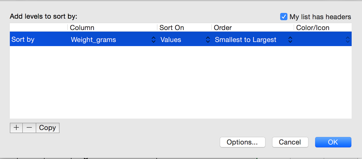
Click the Sort button on the data tab in Excel. A pop-up will appear. Make sure you select
Expand the selection.
The following window will display, choose the column you want to sort as well as the sort order.
Note how the odd values sort to the top and bottom of the tabular data. The cells containing no data values sort to the bottom of the tabular data, while the cells where the letter “g” was included can be found towards the top. This is a powerful way to check your data for outliers and odd values.
Conditional formatting
Conditional formatting basically can do something like color code your values by some criteria or lowest to highest. This makes it easy to scan your data for outliers.
Conditional formatting should be used with caution, but it can be a great way to flag inconsistent values when entering data.
Exercise
- Make sure the Weight_grams column is highlighted.
- In the main Excel menu bar, click
Home>Conditional Formatting...choose a formatting rule.- Apply any
2-Color Scaleformatting rule.- Now we can scan through and different colors will stand out. Do you notice any strange values?
Solution
Cells that contain non-numerical values are not colored. This includes both the cells where the letter “g” was included and the empty cells.
It is nice to be able to do these scans in spreadsheets, but we also can do these checks in a programming language like R, or in OpenRefine or SQL.
Key Points
Always copy your original spreadsheet file and work with a copy so you don’t affect the raw data.
Use data validation to prevent accidentally entering invalid data.
Use sorting to check for invalid data.
Use conditional formatting (cautiously) to check for invalid data.
Exporting data
Overview
Teaching: 10 min
Exercises: 0 minQuestions
How can we export data from spreadsheets in a way that is useful for downstream applications?
Objectives
Store spreadsheet data in universal file formats.
Export data from a spreadsheet to a CSV file.
Storing the data you’re going to work with for your analyses in Excel
default file format (*.xls or *.xlsx - depending on the Excel
version) isn’t a good idea. Why?
-
Because it is a proprietary format, and it is possible that in the future, technology won’t exist (or will become sufficiently rare) to make it inconvenient, if not impossible, to open the file.
-
Other spreadsheet software may not be able to open files saved in a proprietary Excel format.
-
Different versions of Excel may handle data differently, leading to inconsistencies.
-
Finally, more journals and grant agencies are requiring you to deposit your data in a data repository, and most of them don’t accept Excel format. It needs to be in one of the formats discussed below.
-
The above points also apply to other formats such as open data formats used by LibreOffice / Open Office. These formats are not static and do not get parsed the same way by different software packages.
As an example of inconsistencies in data storage, do you remember how we talked about how Excel stores dates earlier? It turns out that there are multiple defaults for different versions of the software, and you can switch between them all. So, say you’re compiling Excel-stored data from multiple sources. There are dates in each file - Excel interprets them as their own internally consistent serial numbers. When you combine the data, Excel will take the serial number from the place you’re importing it from, and interpret it using the rule set for the version of Excel you’re using. Essentially, you could be adding errors to your data, and it wouldn’t necessarily be flagged by any data cleaning methods if your ranges overlap.
Storing data in a universal, open, and static format will help deal with this problem. Try tab-delimited (tab separated values or TSV) or comma-delimited (comma separated values or CSV). CSV files are plain text files where the columns are separated by commas, hence ‘comma separated values’ or CSV. The advantage of a CSV file over an Excel/SPSS/etc. file is that we can open and read a CSV file using just about any software, including plain text editors like TextEdit or NotePad. Data in a CSV file can also be easily imported into other formats and environments, such as SQLite and R. We’re not tied to a certain version of a certain expensive program when we work with CSV files, so it’s a good format to work with for maximum portability and endurance. Most spreadsheet programs can save to delimited text formats like CSV easily, although they may give you a warning during the file export.
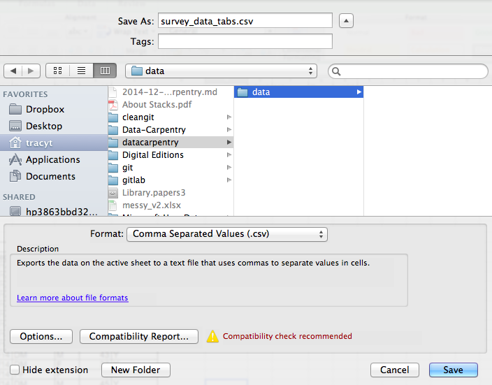
To save a file you have opened in Excel in CSV format:
- From the top menu select ‘File’ and ‘Save as’.
- In the ‘Format’ field, from the list, select ‘Comma Separated Values’ (
*.csv). - Double check the file name and the location where you want to save it and hit ‘Save’.
An important note for backwards compatibility: you can open CSV files in Excel!
A Note on Cross-platform Operability
By default, most coding and statistical environments expect UNIX-style line endings (ASCII LF character) as representing line breaks. However, Windows uses an alternate line ending signifier (ASCII CR LF characters) by default for legacy compatibility with Teletype-based systems.
As such, when exporting to CSV using Excel, your data in text format will look like this:
data1,data2
1,2 4,5
When opening your CSV file in Excel again, it will parse it as follows:

However, if you open your CSV file on a different system that does not parse the CR character it will interpret your CSV file differently:
Your data in text format then look like this:
data1
data2
1
2
…
You will then see a weird character or possibly the string CR or \r:

thus causing terrible things to happen to your data. For example, 2\r is not a valid integer, and thus will throw an error (if you’re lucky) when you attempt to operate on it in R or Python. Note that this happens on Excel for OSX as well as Windows, due to legacy Windows compatibility.
There are a handful of solutions for enforcing uniform UNIX-style line endings on your exported CSV files:
- When exporting from Excel, save as a “Windows comma separated (.csv)” file
-
If you store your data file under version control using Git, edit the
.git/configfile in your repository to automatically translate\r\nline endings into\n. Add the following to the file (see the detailed tutorial):[filter "cr"] clean = LC_CTYPE=C awk '{printf(\"%s\\n\", $0)}' | LC_CTYPE=C tr '\\r' '\\n' smudge = tr '\\n' '\\r'`
.gitattributes that contains the line:
*.csv filter=cr
- Use dos2unix (available on OSX, *nix, and Cygwin) on local files to standardize line endings.
A note on R and .xlsx
There are R packages that can read .xls or .xlsx files (as well as
Google spreadsheets). It is even possible to access different
worksheets in the .xlsx documents.
But
- some of these only work on Windows
- this equates to replacing a (simple but manual) export to
csvwith additional complexity/dependencies in the data analysis R code - data formatting best practice still apply
- Is there really a good reason why
csv(or similar) is not adequate?
Caveats on commas
In some datasets, the data values themselves may include commas (,). In that case, the software which you use (including Excel) will most likely incorrectly display the data in columns. This is because the commas which are a part of the data values will be interpreted as delimiters.
If you are working with data that contains commas, you likely will need to use another delimiter when working in a spreadsheet. In this case, consider using tabs as your delimiter and working with TSV files. TSV files can be exported from spreadsheet programs in the same way as CSV files. For more of a discussion on data formats and potential issues with commas within datasets see the discussion page.
Key Points
Data stored in common spreadsheet formats will often not be read correctly into data analysis software, introducing errors into your data.
Exporting data from spreadsheets to formats like CSV or TSV puts it in a format that can be used consistently by most programs.
Before we start
Overview
Teaching: 30 min
Exercises: 0 minQuestions
What is Python and why should I learn it?
Objectives
Present motivations for using Python.
Organize files and directories for a set of analyses as a Python project, and understand the purpose of the working directory.
How to work with Jupyter Notebook and Spyder.
Know where to find help.
Demonstrate how to provide sufficient information for troubleshooting with the Python user community.
What is Python?
Python is a general purpose programming language that supports rapid development of data analytics applications. The word “Python” is used to refer to both, the programming language and the tool that executes the scripts written in Python language.
Its main advantages are:
- Free
- Open-source
- Available on all major platforms (macOS, Linux, Windows)
- Supported by Python Software Foundation
- Supports multiple programming paradigms
- Has large community
- Rich ecosystem of third-party packages
So, why do you need Python for data analysis?
-
Easy to learn: Python is easier to learn than other programming languages. This is important because lower barriers mean it is easier for new members of the community to get up to speed.
-
Reproducibility: Reproducibility is the ability to obtain the same results using the same dataset(s) and analysis.
Data analysis written as a Python script can be reproduced on any platform. Moreover, if you collect more or correct existing data, you can quickly re-run your analysis!
An increasing number of journals and funding agencies expect analyses to be reproducible, so knowing Python will give you an edge with these requirements.
-
Versatility: Python is a versatile language that integrates with many existing applications to enable something completely amazing. For example, one can use Python to generate manuscripts, so that if you need to update your data, analysis procedure, or change something else, you can quickly regenerate all the figures and your manuscript will be updated automatically.
Python can read text files, connect to databases, and many other data formats, on your computer or on the web.
-
Interdisciplinary and extensible: Python provides a framework that allows anyone to combine approaches from different research (but not only) disciplines to best suit your analysis needs.
-
Python has a large and welcoming community: Thousands of people use Python daily. Many of them are willing to help you through mailing lists and websites, such as Stack Overflow and Anaconda community portal.
-
Free and Open-Source Software (FOSS)… and Cross-Platform: We know we have already said that but it is worth repeating.
Knowing your way around Anaconda
Anaconda distribution of Python includes a lot of its popular packages, such as the IPython console, Jupyter Notebook, and Spyder IDE. Have a quick look around the Anaconda Navigator. You can launch programs from the Navigator or use the command line.
The Jupyter Notebook is an open-source web application that allows you to create and share documents that allow one to create documents that combine code, graphs, and narrative text. Spyder is an Integrated Development Environment that allows one to write Python scripts and interact with the Python software from within a single interface.
Anaconda also comes with a package manager called conda, which makes it easy to install and update additional packages.
Research Project: Best Practices
It is a good idea to keep a set of related data, analyses, and text in a single folder. All scripts and text files within this folder can then use relative paths to the data files. Working this way makes it a lot easier to move around your project and share it with others.
Organizing your working directory
Using a consistent folder structure across your projects will help you keep things organized, and will also make it easy to find/file things in the future. This can be especially helpful when you have multiple projects. In general, you may wish to create separate directories for your scripts, data, and documents.
-
data/: Use this folder to store your raw data. For the sake of transparency and provenance, you should always keep a copy of your raw data. If you need to cleanup data, do it programmatically (i.e. with scripts) and make sure to separate cleaned up data from the raw data. For example, you can store raw data in files./data/raw/and clean data in./data/clean/. -
documents/: Use this folder to store outlines, drafts, and other text. -
scripts/: Use this folder to store your (Python) scripts for data cleaning, analysis, and plotting that you use in this particular project.
You may need to create additional directories depending on your project needs, but these should form
the backbone of your project’s directory. For this workshop, we will need a data/ folder to store
our raw data, and we will later create a data_output/ folder when we learn how to export data as
CSV files.
What is Programming and Coding?
Programming is the process of writing “programs” that a computer can execute and produce some (useful) output. Programming is a multi-step process that involves the following steps:
- Identifying the aspects of the real-world problem that can be solved computationally
- Identifying (the best) computational solution
- Implementing the solution in a specific computer language
- Testing, validating, and adjusting implemented solution.
While “Programming” refers to all of the above steps, “Coding” refers to step 3 only: “Implementing the solution in a specific computer language”. It’s important to note that “the best” computational solution must consider factors beyond the computer. Who is using the program, what resources/funds does your team have for this project, and the available timeline all shape and mold what “best” may be.
If you are working with Jupyter notebook:
You can type Python code into a code cell and then execute the code by pressing
Shift+Return.
Output will be printed directly under the input cell.
You can recognise a code cell by the In[ ]: at the beginning of the cell and output by Out[ ]:.
Pressing the + button in the menu bar will add a new cell.
All your commands as well as any output will be saved with the notebook.
If you are working with Spyder:
You can either use the console or use script files (plain text files that contain your code). The console pane (in Spyder, the bottom right panel) is the place where commands written in the Python language can be typed and executed immediately by the computer. It is also where the results will be shown. You can execute commands directly in the console by pressing Return, but they will be “lost” when you close the session. Spyder uses the IPython console by default.
Since we want our code and workflow to be reproducible, it is better to type the commands in the script editor, and save them as a script. This way, there is a complete record of what we did, and anyone (including our future selves!) has an easier time reproducing the results on their computer.
Spyder allows you to execute commands directly from the script editor by using the run buttons on top. To run the entire script click Run file or press F5, to run the current line click Run selection or current line or press F9, other run buttons allow to run script cells or go into debug mode. When using F9, the command on the current line in the script (indicated by the cursor) or all of the commands in the currently selected text will be sent to the console and executed.
At some point in your analysis you may want to check the content of a variable or the structure of an object, without necessarily keeping a record of it in your script. You can type these commands and execute them directly in the console. Spyder provides the Ctrl+Shift+E and Ctrl+Shift+I shortcuts to allow you to jump between the script and the console panes.
If Python is ready to accept commands, the IPython console shows an In [..]: prompt with the
current console line number in []. If it receives a command (by typing, copy-pasting or sent from
the script editor), Python will execute it, display the results in the Out [..]: cell, and come
back with a new In [..]: prompt waiting for new commands.
If Python is still waiting for you to enter more data because it isn’t complete yet, the console
will show a ...: prompt. It means that you haven’t finished entering a complete command. This can
be because you have not typed a closing parenthesis (), ], or }) or quotation mark. When this
happens, and you thought you finished typing your command, click inside the console window and press
Esc; this will cancel the incomplete command and return you to the In [..]: prompt.
How to learn more after the workshop?
The material we cover during this workshop will give you an initial taste of how you can use Python to analyze data for your own research. However, you will need to learn more to do advanced operations such as cleaning your dataset, using statistical methods, or creating beautiful graphics. The best way to become proficient and efficient at python, as with any other tool, is to use it to address your actual research questions. As a beginner, it can feel daunting to have to write a script from scratch, and given that many people make their code available online, modifying existing code to suit your purpose might make it easier for you to get started.
Seeking help
- check under the Help menu
- type
help() - type
?objectorhelp(object)to get information about an object - Python documentation
- Pandas documentation
Finally, a generic Google or internet search “Python task” will often either send you to the appropriate module documentation or a helpful forum where someone else has already asked your question.
I am stuck… I get an error message that I don’t understand. Start by googling the error message. However, this doesn’t always work very well, because often, package developers rely on the error catching provided by Python. You end up with general error messages that might not be very helpful to diagnose a problem (e.g. “subscript out of bounds”). If the message is very generic, you might also include the name of the function or package you’re using in your query.
However, you should check Stack Overflow. Search using the [python] tag. Most questions have already
been answered, but the challenge is to use the right words in the search to find the answers:
https://stackoverflow.com/questions/tagged/python?tab=Votes
Asking for help
The key to receiving help from someone is for them to rapidly grasp your problem. You should make it as easy as possible to pinpoint where the issue might be.
Try to use the correct words to describe your problem. For instance, a package is not the same thing as a library. Most people will understand what you meant, but others have really strong feelings about the difference in meaning. The key point is that it can make things confusing for people trying to help you. Be as precise as possible when describing your problem.
If possible, try to reduce what doesn’t work to a simple reproducible example. If you can reproduce the problem using a very small data frame instead of your 50,000 rows and 10,000 columns one, provide the small one with the description of your problem. When appropriate, try to generalize what you are doing so even people who are not in your field can understand the question. For instance, instead of using a subset of your real dataset, create a small (3 columns, 5 rows) generic one.
Where to ask for help?
- The person sitting next to you during the workshop. Don’t hesitate to talk to your neighbor during the workshop, compare your answers, and ask for help. You might also be interested in organizing regular meetings following the workshop to keep learning from each other.
- Your friendly colleagues: if you know someone with more experience than you, they might be able and willing to help you.
- Stack Overflow: if your question hasn’t been answered before and is well crafted, chances are you will get an answer in less than 5 min. Remember to follow their guidelines on how to ask a good question.
- Python mailing lists
More resources
Key Points
Python is an open source and platform independent programming language.
Jupyter Notebook and the Spyder IDE are great tools to code in and interact with Python. With the large Python community it is easy to find help on the internet.
Short Introduction to Programming in Python
Overview
Teaching: 30 min
Exercises: 0 minQuestions
What is Python?
Why should I learn Python?
Objectives
Describe the advantages of using programming vs. completing repetitive tasks by hand.
Define the following data types in Python: strings, integers, and floats.
Perform mathematical operations in Python using basic operators.
Define the following as it relates to Python: lists, tuples, and dictionaries.
Let`s get started
Open up Jupyter Notebook. Go to the folder where your data is stored, this should be Dekstop/data-carpentry. To run a cell in Jupyter, put a value on the last line of the cell and run the cell (shift+enter), the value will be pringted below the cell:
3.145
Interpreter
Python is an interpreted language which can be used in two ways:
- “Interactively”: when you use it as an “advanced calculator” executing one command at a time.
2 + 2
4
print("Hello World")
Hello World
- “Scripting” Mode: executing a series of “commands” saved in text file, usually with a
.pyextension after the name of your file:
%run "counter_example_script.py"
Hello world
I count to 5
0
1
2
3
4
5
my counting is done
Introduction to Python built-in data types
Strings, integers, and floats
One of the most basic things we can do in Python is assign values to variables:
text = "Data Carpentry"  # An example of a string
number = 42  # An example of an integer
pi_value = 3.1415  # An example of a float
Here we’ve assigned data to the variables text, number and pi_value,
using the assignment operator =. To review the value of a variable, we
can type the name of the variable into the interpreter and press Return:
text
"Data Carpentry"
Everything in Python has a type. To get the type of something, we can pass it
to the built-in function type:
type(text)
<class 'str'>
type(number)
<class 'int'>
type(pi_value)
<class 'float'>
The variable text is of type str, short for “string”. Strings hold
sequences of characters, which can be letters, numbers, punctuation
or more exotic forms of text (even emoji!).
We can also see the value of something using another built-in function, print:
print(text)
Data Carpentry
print(number)
42
This may seem redundant, but in fact it’s the only way to display output in a script:
example.py
# A Python script file
# Comments in Python start with #
# The next line assigns the string "Data Carpentry" to the variable "text".
text = "Data Carpentry"

# The next line does nothing!
text

# The next line uses the print function to print out the value we assigned to "text"
print(text)
Running the script
$ python example.py
Data Carpentry
Notice that “Data Carpentry” is printed only once.
Tip: print and type are built-in functions in Python. Later in this
lesson, we will introduce methods and user-defined functions. The Python
documentation is excellent for reference on the differences between them.
Operators
We can perform mathematical calculations in Python using the basic operators
+, -, /, *, %:
2 + 2 # Addition
4
6 * 7 # Multiplication
42
2 ** 16 # Power
65536
13 % 5 # Modulo
3
We can also use comparison and logic operators:
<, >, ==, !=, <=, >= and statements of identity such as
and, or, not. The data type returned by this is
called a boolean.
3 > 4
False
True and True
True
True or False
True
True and False
False
Sequences: Lists and Tuples
Lists
Lists are a common data structure to hold an ordered sequence of elements. Each element can be accessed by an index. Note that Python indexes start with 0 instead of 1:
numbers = [1, 2, 3]
numbers[0]
1
A for loop can be used to access the elements in a list or other Python data
structure one at a time:
for num in numbers:
    print(num)
1
2
3
Indentation is very important in Python. Note that the second line in the
example above is indented. Just like three chevrons >>> indicate an
interactive prompt in Python, the three dots ... are Python’s prompt for
multiple lines. This is Python’s way of marking a block of code. [Note: you
do not type >>> or ....]
To add elements to the end of a list, we can use the append method. Methods
are a way to interact with an object (a list, for example). We can invoke a
method using the dot . followed by the method name and a list of arguments
in parentheses. Let’s look at an example using append:
numbers.append(4)
print(numbers)
[1, 2, 3, 4]
To find out what methods are available for an
object, we can use the built-in help command:
help(numbers)

Help on list object:

class list(object)
 |  list() -> new empty list
 |  list(iterable) -> new list initialized from iterable's items
 ...
Tuples
A tuple is similar to a list in that it’s an ordered sequence of elements.
However, tuples can not be changed once created (they are “immutable”). Tuples
are created by placing comma-separated values inside parentheses ().
# Tuples use parentheses
a_tuple = (1, 2, 3)
another_tuple = ('blue', 'green', 'red')

# Note: lists use square brackets
a_list = [1, 2, 3]
Tuples vs. Lists
- What happens when you execute
a_list[1] = 5?- What happens when you execute
a_tuple[2] = 5?- What does
type(a_tuple)tell you abouta_tuple?
Dictionaries
A dictionary is a container that holds pairs of objects - keys and values.
translation = {'one': 'first', 'two': 'second'}
translation['one']
'first'
Dictionaries work a lot like lists - except that you index them with keys. You can think about a key as a name or unique identifier for the value it corresponds to.
rev = {'first': 'one', 'second': 'two'}
rev['first']
'one'
To add an item to the dictionary we assign a value to a new key:
rev = {'first': 'one', 'second': 'two'}
rev['third'] = 'three'
rev
{'first': 'one', 'second': 'two', 'third': 'three'}
Using for loops with dictionaries is a little more complicated. We can do
this in two ways:
for key, value in rev.items():
    print(key, '->', value)
'first' -> one
'second' -> two
'third' -> three
or
for key in rev.keys():
    print(key, '->', rev[key])
'first' -> one
'second' -> two
'third' -> three
Changing dictionaries
- First, print the value of the
revdictionary to the screen.- Reassign the value that corresponds to the key
secondso that it no longer reads “two” but instead2.- Print the value of
revto the screen again to see if the value has changed.
Functions
Defining a section of code as a function in Python is done using the def
keyword. For example a function that takes two arguments and returns their sum
can be defined as:
def add_function(a, b):
    result = a + b
    return result

z = add_function(20, 22)
print(z)
42
Key Points
Python is an interpreted language which can be used interactively (executing one command at a time) or in scripting mode (executing a series of commands saved in file).
One can assign a value to a variable in Python. Those variables can be of several types, such as string, integer, floating point and complex numbers.
Lists and tuples are similar in that they are ordered lists of elements; they differ in that a tuple is immutable (cannot be changed).
Dictionaries are data structures that provide mappings between keys and values.
Starting With Data
Overview
Teaching: 30 min
Exercises: 30 minQuestions
How can I import data in Python?
What is Pandas?
Why should I use Pandas to work with data?
Objectives
Navigate the workshop directory and download a dataset.
Explain what a library is and what libraries are used for.
Describe what the Python Data Analysis Library (Pandas) is.
Load the Python Data Analysis Library (Pandas).
Use
read_csvto read tabular data into Python.Describe what a DataFrame is in Python.
Access and summarize data stored in a DataFrame.
Define indexing as it relates to data structures.
Perform basic mathematical operations and summary statistics on data in a Pandas DataFrame.
Create simple plots.
Working With Pandas DataFrames in Python
We can automate the process of performing data manipulations in Python. It’s efficient to spend time building the code to perform these tasks because once it’s built, we can use it over and over on different datasets that use a similar format. This makes our methods easily reproducible. We can also easily share our code with colleagues and they can replicate the same analysis.
Starting in the same spot
To help the lesson run smoothly, let’s ensure everyone is in the same directory. This should help us avoid path and file name issues. At this time please navigate to the workshop directory. If you are working in IPython Notebook be sure that you start your notebook in the workshop directory.
A quick aside that there are Python libraries like OS Library that can work with our directory structure, however, that is not our focus today.
Our Data
For this lesson, we will be using the Portal Teaching data, a subset of the data from Ernst et al Long-term monitoring and experimental manipulation of a Chihuahuan Desert ecosystem near Portal, Arizona, USA.
We will be using files from the Portal Project Teaching Database.
This section will use the surveys.csv file that can be downloaded here:
https://ndownloader.figshare.com/files/2292172
We are studying the species and weight of animals caught in sites in our study
area. The dataset is stored as a .csv file: each row holds information for a
single animal, and the columns represent:
| Column | Description |
|---|---|
| record_id | Unique id for the observation |
| month | month of observation |
| day | day of observation |
| year | year of observation |
| plot_id | ID of a particular site |
| species_id | 2-letter code |
| sex | sex of animal (“M”, “F”) |
| hindfoot_length | length of the hindfoot in mm |
| weight | weight of the animal in grams |
The first few rows of our first file look like this:
record_id,month,day,year,plot_id,species_id,sex,hindfoot_length,weight
1,7,16,1977,2,NL,M,32,
2,7,16,1977,3,NL,M,33,
3,7,16,1977,2,DM,F,37,
4,7,16,1977,7,DM,M,36,
5,7,16,1977,3,DM,M,35,
6,7,16,1977,1,PF,M,14,
7,7,16,1977,2,PE,F,,
8,7,16,1977,1,DM,M,37,
9,7,16,1977,1,DM,F,34,
About Libraries
A library in Python contains a set of tools (called functions) that perform tasks on our data. Importing a library is like getting a piece of lab equipment out of a storage locker and setting it up on the bench for use in a project. Once a library is set up, it can be used or called to perform the task(s) it was built to do.
Pandas in Python
One of the best options for working with tabular data in Python is to use the Python Data Analysis Library (a.k.a. Pandas). The Pandas library provides data structures, produces high quality plots with matplotlib and integrates nicely with other libraries that use NumPy (which is another Python library) arrays.
Python doesn’t load all of the libraries available to it by default. We have to
add an import statement to our code in order to use library functions. To import
a library, we use the syntax import libraryName. If we want to give the
library a nickname to shorten the command, we can add as nickNameHere. An
example of importing the pandas library using the common nickname pd is below.
import pandas as pd
Each time we call a function that’s in a library, we use the syntax
LibraryName.FunctionName. Adding the library name with a . before the
function name tells Python where to find the function. In the example above, we
have imported Pandas as pd. This means we don’t have to type out pandas each
time we call a Pandas function.
Reading CSV Data Using Pandas
We will begin by locating and reading our survey data which are in CSV format. CSV stands for
Comma-Separated Values and is a common way to store formatted data. Other symbols may also be used, so
you might see tab-separated, colon-separated or space separated files. It is quite easy to replace
one separator with another, to match your application. The first line in the file often has headers
to explain what is in each column. CSV (and other separators) make it easy to share data, and can be
imported and exported from many applications, including Microsoft Excel. For more details on CSV
files, see the Data Organisation in Spreadsheets lesson.
We can use Pandas’ read_csv function to pull the file directly into a DataFrame.
So What’s a DataFrame?
Pandas provides an object called DataFrame. Dataframes represent tabular data. They are a 2-dimensional data structure. They include columns, each of which is a Series with a name, and all columns share the same index (An index refers to the position of an element in the data structure.). We import a csv table into a data frame using the read_csv function.
A DataFrame is a 2-dimensional data structure that can store data of different
types (including characters, integers, floating point values, factors and more)
in columns. It is similar to a spreadsheet or an SQL table or the data.frame in
R. A DataFrame always has an index (0-based). An index refers to the position of
an element in the data structure.
# Note that pd.read_csv is used because we imported pandas as pd
pd.read_csv("data/surveys.csv")
The above command yields the output below:
record_id  month  day  year  plot_id species_id sex  hindfoot_length  weight
0          1      7   16  1977        2         NL   M               32   NaN
1          2      7   16  1977        3         NL   M               33   NaN
2          3      7   16  1977        2         DM   F               37   NaN
3          4      7   16  1977        7         DM   M               36   NaN
4          5      7   16  1977        3         DM   M               35   NaN
...
35544      35545     12   31  2002       15     AH  NaN              NaN  NaN
35545      35546     12   31  2002       15     AH  NaN              NaN  NaN
35546      35547     12   31  2002       10     RM    F               15   14
35547      35548     12   31  2002        7     DO    M               36   51
35548      35549     12   31  2002        5     NaN  NaN             NaN  NaN

[35549 rows x 9 columns]
We can see that there were 35,549 rows parsed. Each row has 9
columns. The first column is the index of the DataFrame. The index is used to
identify the position of the data, but it is not an actual column of the DataFrame.
It looks like the read_csv function in Pandas read our file properly. However,
we haven’t saved any data to memory so we can work with it. We need to assign the
DataFrame to a variable. Remember that a variable is a name for a value, such as x,
or data. We can create a new object with a variable name by assigning a value to it using =.
Let’s call the imported survey data surveys_df:
surveys_df = pd.read_csv("data/surveys.csv")
Notice when you assign the imported DataFrame to a variable, Python does not
produce any output on the screen. We can view the value of the surveys_df
object by typing its name into the Python command prompt.
surveys_df
which prints contents like above.
Note: if the output is too wide to print on your narrow terminal window, you may see something slightly different as the large set of data scrolls past. You may see simply the last column of data:
17        NaN
18        NaN
19        NaN
20        NaN
21        NaN
22        NaN
23        NaN
24        NaN
25        NaN
26        NaN
27        NaN
28        NaN
29        NaN
...       ...
35519    36.0
35520    48.0
35521    45.0
35522    44.0
35523    27.0
35524    26.0
35525    24.0
35526    43.0
35527     NaN
35528    25.0
35529     NaN
35530     NaN
35531    43.0
35532    48.0
35533    56.0
35534    53.0
35535    42.0
35536    46.0
35537    31.0
35538    68.0
35539    23.0
35540    31.0
35541    29.0
35542    34.0
35543     NaN
35544     NaN
35545     NaN
35546    14.0
35547    51.0
35548     NaN

[35549 rows x 9 columns]
Never fear, all the data is there, if you scroll up. Selecting just a few rows, so it is easier to fit on one window, you can see that pandas has neatly formatted the data to fit our screen:
surveys_df.head() # The head() method displays the first several lines of a file. It
                  # is discussed below.
   record_id  month  day  year  plot_id species_id sex  hindfoot_length  \
5          6      7   16  1977        1         PF   M             14.0
6          7      7   16  1977        2         PE   F              NaN
7          8      7   16  1977        1         DM   M             37.0
8          9      7   16  1977        1         DM   F             34.0
9         10      7   16  1977        6         PF   F             20.0

   weight
5     NaN
6     NaN
7     NaN
8     NaN
9     NaN
Exploring Our Species Survey Data
Again, we can use the type function to see what kind of thing surveys_df is:
type(surveys_df)
<class 'pandas.core.frame.DataFrame'>
As expected, it’s a DataFrame (or, to use the full name that Python uses to refer
to it internally, a pandas.core.frame.DataFrame).
What kind of things does surveys_df contain? DataFrames have an attribute
called dtypes that answers this:
surveys_df.dtypes
record_id            int64
month                int64
day                  int64
year                 int64
plot_id              int64
species_id          object
sex                 object
hindfoot_length    float64
weight             float64
dtype: object
All the values in a column have the same type. For example, months have type
int64, which is a kind of integer. Cells in the month column cannot have
fractional values, but the weight and hindfoot_length columns can, because they
have type float64. The object type doesn’t have a very helpful name, but in
this case it represents strings (such as ‘M’ and ‘F’ in the case of sex).
We’ll talk a bit more about what the different formats mean in a different lesson.
Useful Ways to View DataFrame objects in Python
There are many ways to summarize and access the data stored in DataFrames, using attributes and methods provided by the DataFrame object.
To access an attribute, use the DataFrame object name followed by the attribute
name df_object.attribute. Using the DataFrame surveys_df and attribute
columns, an index of all the column names in the DataFrame can be accessed
with surveys_df.columns.
Methods are called in a similar fashion using the syntax df_object.method().
As an example, surveys_df.head() gets the first few rows in the DataFrame
surveys_df using the head() method. With a method, we can supply extra
information in the parens to control behaviour.
Let’s look at the data using these.
Challenge - DataFrames
Using our DataFrame
surveys_df, try out the attributes & methods below to see what they return.
surveys_df.columns
surveys_df.shapeTake note of the output ofshape- what format does it return the shape of the DataFrame in?HINT: More on tuples, here.
surveys_df.head()Also, what doessurveys_df.head(15)do?surveys_df.tail()
Calculating Statistics From Data In A Pandas DataFrame
We’ve read our data into Python. Next, let’s perform some quick summary statistics to learn more about the data that we’re working with. We might want to know how many animals were collected in each site, or how many of each species were caught. We can perform summary stats quickly using groups. But first we need to figure out what we want to group by.
Let’s begin by exploring our data:
# Look at the column names
surveys_df.columns
which returns:
Index(['record_id', 'month', 'day', 'year', 'plot_id', 'species_id', 'sex',
       'hindfoot_length', 'weight'],
      dtype='object')
Let’s get a list of all the species. The pd.unique function tells us all of
the unique values in the species_id column.
Accessing a single column returns a Series (1 dimensional) does not have a column name: my_dataframe[‘longitude’] Accessing multiple columns, (2 dimensional) list of columns names + indexing operator (column name): my_dataframe[[‘date’,’cruise’]]
pd.unique(surveys_df['species_id'])
which returns:
array(['NL', 'DM', 'PF', 'PE', 'DS', 'PP', 'SH', 'OT', 'DO', 'OX', 'SS',
       'OL', 'RM', nan, 'SA', 'PM', 'AH', 'DX', 'AB', 'CB', 'CM', 'CQ',
       'RF', 'PC', 'PG', 'PH', 'PU', 'CV', 'UR', 'UP', 'ZL', 'UL', 'CS',
       'SC', 'BA', 'SF', 'RO', 'AS', 'SO', 'PI', 'ST', 'CU', 'SU', 'RX',
       'PB', 'PL', 'PX', 'CT', 'US'], dtype=object)
Challenge - Statistics
Create a list of unique site ID’s (“plot_id”) found in the surveys data. Call it
site_names. How many unique sites are there in the data? How many unique species are in the data?What is the difference between
len(site_names)andsurveys_df['plot_id'].nunique()?
Groups in Pandas
We often want to calculate summary statistics grouped by subsets or attributes within fields of our data. For example, we might want to calculate the average weight of all individuals per site.
We can calculate basic statistics for all records in a single column using the syntax below:
surveys_df['weight'].describe()
gives output
count    32283.000000
mean        42.672428
std         36.631259
min          4.000000
25%         20.000000
50%         37.000000
75%         48.000000
max        280.000000
Name: weight, dtype: float64
We can also extract one specific metric if we wish:
surveys_df['weight'].min()
surveys_df['weight'].max()
surveys_df['weight'].mean()
surveys_df['weight'].std()
surveys_df['weight'].count()
But if we want to summarize by one or more variables, for example sex, we can
use Pandas’ .groupby method. Once we’ve created a groupby DataFrame, we
can quickly calculate summary statistics by a group of our choice.
# Group data by sex
grouped_data = surveys_df.groupby('sex')
The pandas function describe will return descriptive stats including: mean,
median, max, min, std and count for a particular column in the data. Pandas’
describe function will only return summary values for columns containing
numeric data.
# Summary statistics for all numeric columns by sex
grouped_data.describe()
# Provide the mean for each numeric column by sex
grouped_data.mean()
grouped_data.mean() OUTPUT:
        record_id     month        day         year    plot_id  \
sex
F    18036.412046  6.583047  16.007138  1990.644997  11.440854
M    17754.835601  6.392668  16.184286  1990.480401  11.098282

     hindfoot_length     weight
sex
F          28.836780  42.170555
M          29.709578  42.995379
The groupby command is powerful in that it allows us to quickly generate
summary stats.
Challenge - Summary Data
- How many recorded individuals are female
Fand how many maleM?- What happens when you group by two columns using the following syntax and then calculate mean values?
grouped_data2 = surveys_df.groupby(['plot_id', 'sex'])grouped_data2.mean()- Summarize weight values for each site in your data. HINT: you can use the following syntax to only create summary statistics for one column in your data.
by_site['weight'].describe()Did you get #3 right?
A Snippet of the Output from challenge 3 looks like:
 site
 1     count    1903.000000
       mean       51.822911
       std        38.176670
       min         4.000000
       25%        30.000000
       50%        44.000000
       75%        53.000000
       max       231.000000
         ...
Quickly Creating Summary Counts in Pandas
Let’s next count the number of samples for each species. We can do this in a few
ways, but we’ll use groupby combined with a count() method.
# Count the number of samples by species
species_counts = surveys_df.groupby('species_id')['record_id'].count()
print(species_counts)
Or, we can also count just the rows that have the species “DO”:
surveys_df.groupby('species_id')['record_id'].count()['DO']
Challenge - Make a list
What’s another way to create a list of species and associated
countof the records in the data? Hint: you can performcount,min, etc. functions on groupby DataFrames in the same way you can perform them on regular DataFrames.
Basic Math Functions
If we wanted to, we could perform math on an entire column of our data. For example let’s multiply all weight values by 2. A more practical use of this might be to normalize the data according to a mean, area, or some other value calculated from our data.
# Multiply all weight values by 2
surveys_df['weight']*2
Quick & Easy Plotting Data Using Pandas
We can plot our summary stats using Pandas, too.
# Make sure figures appear inline in Ipython Notebook
%matplotlib inline
# Create a quick bar chart
species_counts.plot(kind='bar');
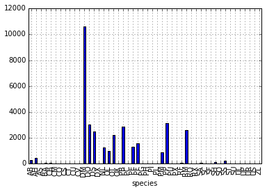 Count per species site
We can also look at how many animals were captured in each site:
total_count = surveys_df.groupby('plot_id')['record_id'].nunique()
# Let's plot that too
total_count.plot(kind='bar');
Challenge - Plots
- Create a plot of average weight across all species per site.
- Create a plot of total males versus total females for the entire dataset.
Summary Plotting Challenge
Create a stacked bar plot, with weight on the Y axis, and the stacked variable being sex. The plot should show total weight by sex for each site. Some tips are below to help you solve this challenge:
- For more information on pandas plots, see pandas’ documentation page on visualization.
- You can use the code that follows to create a stacked bar plot but the data to stack need to be in individual columns. Here’s a simple example with some data where ‘a’, ‘b’, and ‘c’ are the groups, and ‘one’ and ‘two’ are the subgroups.
d = {'one' : pd.Series([1., 2., 3.], index=['a', 'b', 'c']), 'two' : pd.Series([1., 2., 3., 4.], index=['a', 'b', 'c', 'd'])}
pd.DataFrame(d)
shows the following data
      one  two
  a    1    1
  b    2    2
  c    3    3
  d  NaN    4
We can plot the above with
# Plot stacked data so columns 'one' and 'two' are stacked
my_df = pd.DataFrame(d)
my_df.plot(kind='bar', stacked=True, title="The title of my graph")
- You can use the
.unstack()method to transform grouped data into columns for each plotting. Try running.unstack()on some DataFrames above and see what it yields.Start by transforming the grouped data (by site and sex) into an unstacked layout, then create a stacked plot.
Solution to Summary Challenge
First we group data by site and by sex, and then calculate a total for each site.
by_site_sex = surveys_df.groupby(['plot_id', 'sex'])
site_sex_count = by_site_sex['weight'].sum()
This calculates the sums of weights for each sex within each site as a table
site  sex
plot_id  sex
1        F      38253
         M      59979
2        F      50144
         M      57250
3        F      27251
         M      28253
4        F      39796
         M      49377
<other sites removed for brevity>
Below we’ll use
.unstack()on our grouped data to figure out the total weight that each sex contributed to each site.by_site_sex = surveys_df.groupby(['plot_id', 'sex']) site_sex_count = by_site_sex['weight'].sum() site_sex_count.unstack()The
unstackmethod above will display the following output:sex F M plot_id 1 38253 59979 2 50144 57250 3 27251 28253 4 39796 49377 <other sites removed for brevity>Now, create a stacked bar plot with that data where the weights for each sex are stacked by site.
Rather than display it as a table, we can plot the above data by stacking the values of each sex as follows:
by_site_sex = surveys_df.groupby(['plot_id', 'sex'])
site_sex_count = by_site_sex['weight'].sum()
spc = site_sex_count.unstack()
s_plot = spc.plot(kind='bar', stacked=True, title="Total weight by site and sex")
s_plot.set_ylabel("Weight")
s_plot.set_xlabel("Plot")
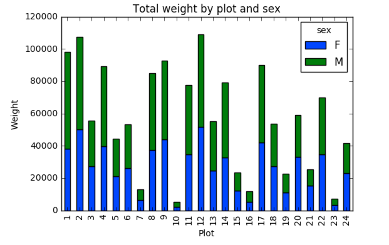
Key Points
Libraries enable us to extend the functionality of Python.
Pandas is a popular library for working with data.
A Dataframe is a Pandas data structure that allows one to access data by column (name or index) or row.
Aggregating data using the
groupby()function enables you to generate useful summaries of data quickly.Plots can be created from DataFrames or subsets of data that have been generated with
groupby().
Data Types and Formats
Overview
Teaching: 20 min
Exercises: 25 minQuestions
What types of data can be contained in a DataFrame?
Why is the data type important?
Objectives
Describe how information is stored in a Python DataFrame.
Define the two main types of data in Python: text and numerics.
Examine the structure of a DataFrame.
Modify the format of values in a DataFrame.
Describe how data types impact operations.
Define, manipulate, and interconvert integers and floats in Python.
Analyze datasets having missing/null values (NaN values).
Write manipulated data to a file.
The format of individual columns and rows will impact analysis performed on a dataset read into Python. For example, you can’t perform mathematical calculations on a string (text formatted data). This might seem obvious, however sometimes numeric values are read into Python as strings. In this situation, when you then try to perform calculations on the string-formatted numeric data, you get an error.
In this lesson we will review ways to explore and better understand the structure and format of our data.
Types of Data
How information is stored in a DataFrame or a Python object affects what we can do with it and the outputs of calculations as well. There are two main types of data that we will explore in this lesson: numeric and text data types.
Numeric Data Types
Numeric data types include integers and floats. A floating point (known as a float) number has decimal points even if that decimal point value is 0. For example: 1.13, 2.0, 1234.345. If we have a column that contains both integers and floating point numbers, Pandas will assign the entire column to the float data type so the decimal points are not lost.
An integer will never have a decimal point. Thus if we wanted to store 1.13 as
an integer it would be stored as 1. Similarly, 1234.345 would be stored as 1234. You
will often see the data type Int64 in Python which stands for 64 bit integer. The 64
refers to the memory allocated to store data in each cell which effectively
relates to how many digits it can store in each “cell”. Allocating space ahead of time
allows computers to optimize storage and processing efficiency.
Text Data Type
Text data type is known as Strings in Python, or Objects in Pandas. Strings can contain numbers and / or characters. For example, a string might be a word, a sentence, or several sentences. A Pandas object might also be a plot name like ‘plot1’. A string can also contain or consist of numbers. For instance, ‘1234’ could be stored as a string, as could ‘10.23’. However strings that contain numbers can not be used for mathematical operations!
Pandas and base Python use slightly different names for data types. More on this is in the table below:
| Pandas Type | Native Python Type | Description |
|---|---|---|
| object | string | The most general dtype. Will be assigned to your column if column has mixed types (numbers and strings). |
| int64 | int | Numeric characters. 64 refers to the memory allocated to hold this character. |
| float64 | float | Numeric characters with decimals. If a column contains numbers and NaNs (see below), pandas will default to float64, in case your missing value has a decimal. |
| datetime64, timedelta[ns] | N/A (but see the datetime module in Python’s standard library) | Values meant to hold time data. Look into these for time series experiments. |
Checking the format of our data
Now that we’re armed with a basic understanding of numeric and text data
types, let’s explore the format of our survey data. We’ll be working with the
same surveys.csv dataset that we’ve used in previous lessons.
# Make sure pandas is loaded
import pandas as pd

# Note that pd.read_csv is used because we imported pandas as pd
surveys_df = pd.read_csv("data/surveys.csv")
Remember that we can check the type of an object like this:
type(surveys_df)
pandas.core.frame.DataFrame
Next, let’s look at the structure of our surveys data. In pandas, we can check
the type of one column in a DataFrame using the syntax
dataFrameName[column_name].dtype:
surveys_df['sex'].dtype
dtype('O')
A type ‘O’ just stands for “object” which in Pandas’ world is a string (text).
surveys_df['record_id'].dtype
dtype('int64')
The type int64 tells us that Python is storing each value within this column
as a 64 bit integer. We can use the dat.dtypes command to view the data type
for each column in a DataFrame (all at once).
surveys_df.dtypes
which returns:
record_id            int64
month                int64
day                  int64
year                 int64
plot_id              int64
species_id          object
sex                 object
hindfoot_length    float64
weight             float64
dtype: object
Note that most of the columns in our Survey data are of type int64. This means
that they are 64 bit integers. But the weight column is a floating point value
which means it contains decimals. The species_id and sex columns are objects which
means they contain strings.
Working With Integers and Floats
So we’ve learned that computers store numbers in one of two ways: as integers or as floating-point numbers (or floats). Integers are the numbers we usually count with. Floats have fractional parts (decimal places). Let’s next consider how the data type can impact mathematical operations on our data. Addition, subtraction, division and multiplication work on floats and integers as we’d expect.
print(5+5)
10
print(24-4)
20
If we divide one integer by another, we get a float. The result on Python 3 is different than in Python 2, where the result is an integer (integer division).
print(5/9)
0.5555555555555556
print(10/3)
3.3333333333333335
We can also convert a floating point number to an integer or an integer to floating point number. Notice that Python by default rounds down when it converts from floating point to integer.
# Convert a to an integer
a = 7.83
int(a)
7
# Convert b to a float
b = 7
float(b)
7.0
Working With Our Survey Data
Getting back to our data, we can modify the format of values within our data, if
we want. For instance, we could convert the record_id field to floating point
values.
# Convert the record_id field from an integer to a float
surveys_df['record_id'] = surveys_df['record_id'].astype('float64')
surveys_df['record_id'].dtype
dtype('float64')
Changing Types
Try converting the column
plot_idto floats usingsurveys_df.plot_id.astype("float")Next try converting
weightto an integer. What goes wrong here? What is Pandas telling you? We will talk about some solutions to this later.
Missing Data Values - NaN
What happened in the last challenge activity? Notice that this throws a value error:
ValueError: Cannot convert NA to integer. If we look at the weight column in the surveys
data we notice that there are NaN (Not a Number) values. NaN values are undefined
values that cannot be represented mathematically. Pandas, for example, will read
an empty cell in a CSV or Excel sheet as a NaN. NaNs have some desirable properties: if we
were to average the weight column without replacing our NaNs, Python would know to skip
over those cells.
surveys_df['weight'].mean()
42.672428212991356
Dealing with missing data values is always a challenge. It’s sometimes hard to know why values are missing - was it because of a data entry error? Or data that someone was unable to collect? Should the value be 0? We need to know how missing values are represented in the dataset in order to make good decisions. If we’re lucky, we have some metadata that will tell us more about how null values were handled.
For instance, in some disciplines, like Remote Sensing, missing data values are often defined as -9999. Having a bunch of -9999 values in your data could really alter numeric calculations. Often in spreadsheets, cells are left empty where no data are available. Pandas will, by default, replace those missing values with NaN. However it is good practice to get in the habit of intentionally marking cells that have no data, with a no data value! That way there are no questions in the future when you (or someone else) explores your data.
Where Are the NaN’s?
Let’s explore the NaN values in our data a bit further. Using the tools we learned in lesson 02, we can figure out how many rows contain NaN values for weight. We can also create a new subset from our data that only contains rows with weight values > 0 (i.e., select meaningful weight values):
len(surveys_df[pd.isnull(surveys_df.weight)])
# How many rows have weight values?
len(surveys_df[surveys_df.weight > 0])
We can replace all NaN values with zeroes using the .fillna() method (after
making a copy of the data so we don’t lose our work):
df1 = surveys_df.copy()
# Fill all NaN values with 0
df1['weight'] = df1['weight'].fillna(0)
However NaN and 0 yield different analysis results. The mean value when NaN values are replaced with 0 is different from when NaN values are simply thrown out or ignored.
df1['weight'].mean()
38.751976145601844
We can fill NaN values with any value that we chose. The code below fills all NaN values with a mean for all weight values.
df1['weight'] = surveys_df['weight'].fillna(surveys_df['weight'].mean())
We could also chose to create a subset of our data, only keeping rows that do not contain NaN values.
The point is to make conscious decisions about how to manage missing data. This is where we think about how our data will be used and how these values will impact the scientific conclusions made from the data.
Python gives us all of the tools that we need to account for these issues. We just need to be cautious about how the decisions that we make impact scientific results.
Counting
Count the number of missing values per column.
Hint
The method
.count()gives you the number of non-NA observations per column. Try looking to the.isnull()method.
Writing Out Data to CSV
We’ve learned about using manipulating data to get desired outputs. But we’ve also discussed keeping data that has been manipulated separate from our raw data. Something we might be interested in doing is working with only the columns that have full data. First, let’s reload the data so we’re not mixing up all of our previous manipulations.
surveys_df = pd.read_csv("data/surveys.csv")
Next, let’s drop all the rows that contain missing values. We will use the command dropna.
By default, dropna removes rows that contain missing data for even just one column.
df_na = surveys_df.dropna()
If you now type df_na, you should observe that the resulting DataFrame has 30676 rows
and 9 columns, much smaller than the 35549 row original.
We can now use the to_csv command to export a DataFrame in CSV format. Note that the code
below will by default save the data into the current working directory. We can
save it to a different folder by adding the foldername and a slash before the filename:
df.to_csv('foldername/out.csv'). We use ‘index=False’ so that
pandas doesn’t include the index number for each line.
# Write DataFrame to CSV
df_na.to_csv('data_output/surveys_complete.csv', index=False)
We will use this data file later in the workshop. Check out your working directory to make sure the CSV wrote out properly, and that you can open it! If you want, try to bring it back into Python to make sure it imports properly.
Recap
What we’ve learned:
- How to explore the data types of columns within a DataFrame
- How to change the data type
- What NaN values are, how they might be represented, and what this means for your work
- How to replace NaN values, if desired
- How to use
to_csvto write manipulated data to a file.
Key Points
Pandas uses other names for data types than Python, for example:
objectfor textual data.A column in a DataFrame can only have one data type.
The data type in a DataFrame’s single column can be checked using
dtype.Make conscious decisions about how to manage missing data.
A DataFrame can be saved to a CSV file using the
to_csvfunction.
Indexing, Slicing and Subsetting DataFrames in Python
Overview
Teaching: 30 min
Exercises: 30 minQuestions
How can I access specific data within my data set?
How can Python and Pandas help me to analyse my data?
Objectives
Describe what 0-based indexing is.
Manipulate and extract data using column headings and index locations.
Employ slicing to select sets of data from a DataFrame.
Employ label and integer-based indexing to select ranges of data in a dataframe.
Reassign values within subsets of a DataFrame.
Create a copy of a DataFrame.
Query / select a subset of data using a set of criteria using the following operators:
==,!=,>,<,>=,<=.Locate subsets of data using masks.
Describe BOOLEAN objects in Python and manipulate data using BOOLEANs.
In the first episode of this lesson, we read a CSV file into a pandas’ DataFrame. We learned how to:
- save a DataFrame to a named object,
- perform basic math on data,
- calculate summary statistics, and
- create plots based on the data we loaded into pandas.
In this lesson, we will explore ways to access different parts of the data using:
- indexing,
- slicing, and
- subsetting.
Loading our data
We will continue to use the surveys dataset that we worked with in the last episode. Let’s reopen and read in the data again:
# Make sure pandas is loaded
import pandas as pd

# Read in the survey CSV
surveys_df = pd.read_csv("data/surveys.csv")
Indexing and Slicing in Python
We often want to work with subsets of a DataFrame object. There are different ways to accomplish this including: using labels (column headings), numeric ranges, or specific x,y index locations.
Selecting data using Labels (Column Headings)
We use square brackets [] to select a subset of a Python object. For example,
we can select all data from a column named species_id from the surveys_df
DataFrame by name. There are two ways to do this:
# TIP: use the .head() method we saw earlier to make output shorter
# Method 1: select a 'subset' of the data using the column name
surveys_df['species_id']

# Method 2: use the column name as an 'attribute'; gives the same output
surveys_df.species_id
We can also create a new object that contains only the data within the
species_id column as follows:
# Creates an object, surveys_species, that only contains the `species_id` column
surveys_species = surveys_df['species_id']
We can pass a list of column names too, as an index to select columns in that order. This is useful when we need to reorganize our data.
NOTE: If a column name is not contained in the DataFrame, an exception (error) will be raised.
# Select the species and plot columns from the DataFrame
surveys_df[['species_id', 'plot_id']]

# What happens when you flip the order?
surveys_df[['plot_id', 'species_id']]

# What happens if you ask for a column that doesn't exist?
surveys_df['speciess']
Python tells us what type of error it is in the traceback, at the bottom it says
KeyError: 'speciess' which means that speciess is not a valid column name (nor a valid key in
the related Python data type dictionary).
Reminder
The Python language and its modules (such as Pandas) define reserved words that should not be used as identifiers when assigning objects and variable names. Examples of reserved words in Python include Boolean values
TrueandFalse, operatorsand,or, andnot, among others. The full list of reserved words for Python version 3 is provided at https://docs.python.org/3/reference/lexical_analysis.html#identifiers.When naming objects and variables, it’s also important to avoid using the names of built-in data structures and methods. For example, a list is a built-in data type. It is possible to use the word ‘list’ as an identifier for a new object, for example
list = ['apples', 'oranges', 'bananas']. However, you would then be unable to create an empty list usinglist()or convert a tuple to a list usinglist(sometuple).
Extracting Range based Subsets: Slicing
Reminder
Python uses 0-based indexing.
Let’s remind ourselves that Python uses 0-based
indexing. This means that the first element in an object is located at position
0. This is different from other tools like R and Matlab that index elements
within objects starting at 1.
# Create a list of numbers:
a = [1, 2, 3, 4, 5]
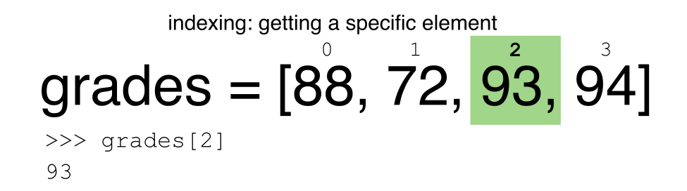
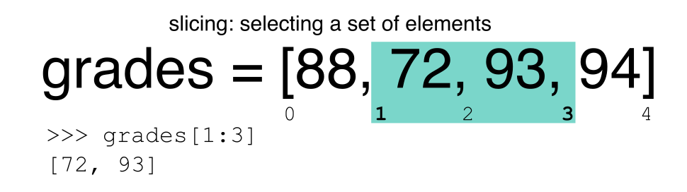
Challenge - Extracting data
What value does the code below return?
a[0]How about this:
a[5]In the example above, calling
a[5]returns an error. Why is that?What about?
a[len(a)]
Slicing Subsets of Rows in Python
Slicing using the [] operator selects a set of rows and/or columns from a
DataFrame. To slice out a set of rows, you use the following syntax:
data[start:stop]. When slicing in pandas the start bound is included in the
output. The stop bound is one step BEYOND the row you want to select. So if you
want to select rows 0, 1 and 2 your code would look like this:
# Select rows 0, 1, 2 (row 3 is not selected)
surveys_df[0:3]
The stop bound in Python is different from what you might be used to in languages like Matlab and R.
# Select the first 5 rows (rows 0, 1, 2, 3, 4)
surveys_df[:5]

# Select the last element in the list
# (the slice starts at the last element, and ends at the end of the list)
surveys_df[-1:]
We can also reassign values within subsets of our DataFrame.
But before we do that, let’s look at the difference between the concept of copying objects and the concept of referencing objects in Python.
Copying Objects vs Referencing Objects in Python
Let’s start with an example:
# Using the 'copy() method'
true_copy_surveys_df = surveys_df.copy()

# Using the '=' operator
ref_surveys_df = surveys_df
You might think that the code ref_surveys_df = surveys_df creates a fresh
distinct copy of the surveys_df DataFrame object. However, using the =
operator in the simple statement y = x does not create a copy of our
DataFrame. Instead, y = x creates a new variable y that references the
same object that x refers to. To state this another way, there is only
one object (the DataFrame), and both x and y refer to it.
In contrast, the copy() method for a DataFrame creates a true copy of the
DataFrame.
Let’s look at what happens when we reassign the values within a subset of the DataFrame that references another DataFrame object:
# Assign the value `0` to the first three rows of data in the DataFrame
ref_surveys_df[0:3] = 0
Let’s try the following code:
# ref_surveys_df was created using the '=' operator
ref_surveys_df.head()

# surveys_df is the original dataframe
surveys_df.head()
What is the difference between these two dataframes?
When we assigned the first 3 columns the value of 0 using the
ref_surveys_df DataFrame, the surveys_df DataFrame is modified too.
Remember we created the reference ref_survey_df object above when we did
ref_survey_df = surveys_df. Remember surveys_df and ref_surveys_df
refer to the same exact DataFrame object. If either one changes the object,
the other will see the same changes to the reference object.
To review and recap:
-
Copy uses the dataframe’s
copy()methodtrue_copy_surveys_df = surveys_df.copy() -
A Reference is created using the
=operatorref_surveys_df = surveys_df
Okay, that’s enough of that. Let’s create a brand new clean dataframe from the original data CSV file.
surveys_df = pd.read_csv("data/surveys.csv")
Slicing Subsets of Rows and Columns in Python
We can select specific ranges of our data in both the row and column directions using either label or integer-based indexing.
locis primarily label based indexing. Integers may be used but they are interpreted as a label.ilocis primarily integer based indexing
To select a subset of rows and columns from our DataFrame, we can use the
iloc method. For example, we can select month, day and year (columns 2, 3
and 4 if we start counting at 1), like this:
# iloc[row slicing, column slicing]
surveys_df.iloc[0:3, 1:4]
which gives the output
   month  day  year
0      7   16  1977
1      7   16  1977
2      7   16  1977
Notice that we asked for a slice from 0:3. This yielded 3 rows of data. When you ask for 0:3, you are actually telling Python to start at index 0 and select rows 0, 1, 2 up to but not including 3.
Let’s explore some other ways to index and select subsets of data:
# Select all columns for rows of index values 0 and 10
surveys_df.loc[[0, 10], :]

# What does this do?
surveys_df.loc[0, ['species_id', 'plot_id', 'weight']]

# What happens when you type the code below?
surveys_df.loc[[0, 10, 35549], :]
NOTE: Labels must be found in the DataFrame or you will get a KeyError.
Indexing by labels loc differs from indexing by integers iloc.
With loc, both the start bound and the stop bound are inclusive. When using
loc, integers can be used, but the integers refer to the
index label and not the position. For example, using loc and select 1:4
will get a different result than using iloc to select rows 1:4.
We can also select a specific data value using a row and
column location within the DataFrame and iloc indexing:
# Syntax for iloc indexing to finding a specific data element
dat.iloc[row, column]
In this iloc example,
surveys_df.iloc[2, 6]
gives the output
'F'
Remember that Python indexing begins at 0. So, the index location [2, 6] selects the element that is 3 rows down and 7 columns over in the DataFrame.
Challenge - Range
What happens when you execute:
surveys_df[0:1]surveys_df[:4]surveys_df[:-1]What happens when you call:
surveys_df.iloc[0:4, 1:4]surveys_df.loc[0:4, 1:4]
- How are the two commands different?
Subsetting Data using Criteria
We can also select a subset of our data using criteria. For example, we can select all rows that have a year value of 2002:
surveys_df[surveys_df.year == 2002]
Which produces the following output:
record_id  month  day  year  plot_id species_id  sex  hindfoot_length  weight
33320      33321      1   12  2002        1         DM    M     38      44
33321      33322      1   12  2002        1         DO    M     37      58
33322      33323      1   12  2002        1         PB    M     28      45
33323      33324      1   12  2002        1         AB  NaN    NaN     NaN
33324      33325      1   12  2002        1         DO    M     35      29
...
35544      35545     12   31  2002       15         AH  NaN    NaN     NaN
35545      35546     12   31  2002       15         AH  NaN    NaN     NaN
35546      35547     12   31  2002       10         RM    F     15      14
35547      35548     12   31  2002        7         DO    M     36      51
35548      35549     12   31  2002        5        NaN  NaN    NaN     NaN

[2229 rows x 9 columns]
Or we can select all rows that do not contain the year 2002:
surveys_df[surveys_df.year != 2002]
We can define sets of criteria too:
surveys_df[(surveys_df.year >= 1980) & (surveys_df.year <= 1985)]
Python Syntax Cheat Sheet
We can use the syntax below when querying data by criteria from a DataFrame. Experiment with selecting various subsets of the “surveys” data.
- Equals:
== - Not equals:
!= - Greater than, less than:
>or< - Greater than or equal to
>= - Less than or equal to
<=
Challenge - Queries
Select a subset of rows in the
surveys_dfDataFrame that contain data from the year 1999 and that contain weight values less than or equal to 8. How many rows did you end up with? What did your neighbor get?You can use the
isincommand in Python to query a DataFrame based upon a list of values as follows:surveys_df[surveys_df['species_id'].isin([listGoesHere])]Use the
isinfunction to find all plots that contain particular species in the “surveys” DataFrame. How many records contain these values?
Experiment with other queries. Create a query that finds all rows with a weight value > or equal to 0.
The
~symbol in Python can be used to return the OPPOSITE of the selection that you specify in Python. It is equivalent to is not in. Write a query that selects all rows with sex NOT equal to ‘M’ or ‘F’ in the “surveys” data.
Using masks to identify a specific condition
A mask can be useful to locate where a particular subset of values exist or
don’t exist - for example, NaN, or “Not a Number” values. To understand masks,
we also need to understand BOOLEAN objects in Python.
Boolean values include True or False. For example,
# Set x to 5
x = 5

# What does the code below return?
x > 5

# How about this?
x == 5
When we ask Python whether x is greater than 5, it returns False.
This is Python’s way to say “No”. Indeed, the value of x is 5,
and 5 is not greater than 5.
To create a boolean mask:
- Set the True / False criteria (e.g.
values > 5 = True) - Python will then assess each value in the object to determine whether the value meets the criteria (True) or not (False).
- Python creates an output object that is the same shape as the original
object, but with a
TrueorFalsevalue for each index location.
Let’s try this out. Let’s identify all locations in the survey data that have
null (missing or NaN) data values. We can use the isnull method to do this.
The isnull method will compare each cell with a null value. If an element
has a null value, it will be assigned a value of True in the output object.
pd.isnull(surveys_df)
A snippet of the output is below:
      record_id  month    day   year plot_id species_id    sex  hindfoot_length weight
0         False  False  False  False   False      False  False   False      True
1         False  False  False  False   False      False  False   False      True
2         False  False  False  False   False      False  False   False      True
3         False  False  False  False   False      False  False   False      True
4         False  False  False  False   False      False  False   False      True

[35549 rows x 9 columns]
To select the rows where there are null values, we can use the mask as an index to subset our data as follows:
# To select just the rows with NaN values, we can use the 'any()' method
surveys_df[pd.isnull(surveys_df).any(axis=1)]
Note that the weight column of our DataFrame contains many null or NaN
values. We will explore ways of dealing with this in Lesson 03.
We can run isnull on a particular column too. What does the code below do?
# What does this do?
empty_weights = surveys_df[pd.isnull(surveys_df['weight'])]['weight']
print(empty_weights)
Let’s take a minute to look at the statement above. We are using the Boolean
object pd.isnull(surveys_df['weight']) as an index to surveys_df. We are
asking Python to select rows that have a NaN value of weight.
Challenge - Putting it all together
Create a new DataFrame that only contains observations with sex values that are not female or male. Assign each sex value in the new DataFrame to a new value of ‘x’. Determine the number of null values in the subset.
Create a new DataFrame that contains only observations that are of sex male or female and where weight values are greater than 0. Create a stacked bar plot of average weight by plot with male vs female values stacked for each plot.
Key Points
In Python, portions of data can be accessed using indices, slices, column headings, and condition-based subsetting.
Python uses 0-based indexing, in which the first element in a list, tuple or any other data structure has an index of 0.
Pandas enables common data exploration steps such as data indexing, slicing and conditional subsetting.
Combining DataFrames with Pandas
Overview
Teaching: 20 min
Exercises: 25 minQuestions
Can I work with data from multiple sources?
How can I combine data from different data sets?
Objectives
Combine data from multiple files into a single DataFrame using merge and concat.
Combine two DataFrames using a unique ID found in both DataFrames.
Employ
to_csvto export a DataFrame in CSV format.Join DataFrames using common fields (join keys).
In many “real world” situations, the data that we want to use come in multiple
files. We often need to combine these files into a single DataFrame to analyze
the data. The pandas package provides various methods for combining
DataFrames including
merge and concat.
To work through the examples below, we first need to load the species and surveys files into pandas DataFrames. In iPython:
import pandas as pd
surveys_df = pd.read_csv("data/surveys.csv",
                         keep_default_na=False, na_values=[""])
surveys_df

       record_id  month  day  year  plot species  sex  hindfoot_length weight
0              1      7   16  1977     2      NA    M               32  NaN
1              2      7   16  1977     3      NA    M               33  NaN
2              3      7   16  1977     2      DM    F               37  NaN
3              4      7   16  1977     7      DM    M               36  NaN
4              5      7   16  1977     3      DM    M               35  NaN
...          ...    ...  ...   ...   ...     ...  ...              ...  ...
35544      35545     12   31  2002    15      AH  NaN              NaN  NaN
35545      35546     12   31  2002    15      AH  NaN              NaN  NaN
35546      35547     12   31  2002    10      RM    F               15   14
35547      35548     12   31  2002     7      DO    M               36   51
35548      35549     12   31  2002     5     NaN  NaN              NaN  NaN

[35549 rows x 9 columns]

species_df = pd.read_csv("data/species.csv",
                         keep_default_na=False, na_values=[""])
species_df
  species_id             genus          species     taxa
0          AB        Amphispiza        bilineata     Bird
1          AH  Ammospermophilus          harrisi   Rodent
2          AS        Ammodramus       savannarum     Bird
3          BA           Baiomys          taylori   Rodent
4          CB   Campylorhynchus  brunneicapillus     Bird
..        ...               ...              ...      ...
49         UP            Pipilo              sp.     Bird
50         UR            Rodent              sp.   Rodent
51         US           Sparrow              sp.     Bird
52         ZL       Zonotrichia       leucophrys     Bird
53         ZM           Zenaida         macroura     Bird

[54 rows x 4 columns]
Take note that the read_csv method we used can take some additional options which
we didn’t use previously. Many functions in Python have a set of options that
can be set by the user if needed. In this case, we have told pandas to assign
empty values in our CSV to NaN keep_default_na=False, na_values=[""].
More about all of the read_csv options here.
Concatenating DataFrames
We can use the concat function in pandas to append either columns or rows from
one DataFrame to another. Let’s grab two subsets of our data to see how this
works.
# Read in first 10 lines of surveys table
survey_sub = surveys_df.head(10)
# Grab the last 10 rows
survey_sub_last10 = surveys_df.tail(10)
# Reset the index values to the second dataframe appends properly
survey_sub_last10 = survey_sub_last10.reset_index(drop=True)
# drop=True option avoids adding new index column with old index values
When we concatenate DataFrames, we need to specify the axis. axis=0 tells
pandas to stack the second DataFrame UNDER the first one. It will automatically
detect whether the column names are the same and will stack accordingly.
axis=1 will stack the columns in the second DataFrame to the RIGHT of the
first DataFrame. To stack the data vertically, we need to make sure we have the
same columns and associated column format in both datasets. When we stack
horizontally, we want to make sure what we are doing makes sense (i.e. the data are
related in some way).
# Stack the DataFrames on top of each other
vertical_stack = pd.concat([survey_sub, survey_sub_last10], axis=0)

# Place the DataFrames side by side
horizontal_stack = pd.concat([survey_sub, survey_sub_last10], axis=1)
Row Index Values and Concat
Have a look at the vertical_stack dataframe? Notice anything unusual?
The row indexes for the two data frames survey_sub and survey_sub_last10
have been repeated. We can reindex the new dataframe using the reset_index() method.
Writing Out Data to CSV
We can use the to_csv command to do export a DataFrame in CSV format. Note that the code
below will by default save the data into the current working directory. We can
save it to a different folder by adding the foldername and a slash to the file
vertical_stack.to_csv('foldername/out.csv'). We use the ‘index=False’ so that
pandas doesn’t include the index number for each line.
# Write DataFrame to CSV
vertical_stack.to_csv('data_output/out.csv', index=False)
Check out your working directory to make sure the CSV wrote out properly, and that you can open it! If you want, try to bring it back into Python to make sure it imports properly.
# For kicks read our output back into Python and make sure all looks good
new_output = pd.read_csv('data_output/out.csv', keep_default_na=False, na_values=[""])
Challenge - Combine Data
In the data folder, there are two survey data files:
surveys2001.csvandsurveys2002.csv. Read the data into Python and combine the files to make one new data frame. Create a plot of average plot weight by year grouped by sex. Export your results as a CSV and make sure it reads back into Python properly.
Joining DataFrames
When we concatenated our DataFrames we simply added them to each other - stacking them either vertically or side by side. Another way to combine DataFrames is to use columns in each dataset that contain common values (a common unique id). Combining DataFrames using a common field is called “joining”. The columns containing the common values are called “join key(s)”. Joining DataFrames in this way is often useful when one DataFrame is a “lookup table” containing additional data that we want to include in the other.
NOTE: This process of joining tables is similar to what we do with tables in an SQL database.
For example, the species.csv file that we’ve been working with is a lookup
table. This table contains the genus, species and taxa code for 55 species. The
species code is unique for each line. These species are identified in our survey
data as well using the unique species code. Rather than adding 3 more columns
for the genus, species and taxa to each of the 35,549 line Survey data table, we
can maintain the shorter table with the species information. When we want to
access that information, we can create a query that joins the additional columns
of information to the Survey data.
Storing data in this way has many benefits including:
- It ensures consistency in the spelling of species attributes (genus, species and taxa) given each species is only entered once. Imagine the possibilities for spelling errors when entering the genus and species thousands of times!
- It also makes it easy for us to make changes to the species information once without having to find each instance of it in the larger survey data.
- It optimizes the size of our data.
Joining Two DataFrames
To better understand joins, let’s grab the first 10 lines of our data as a
subset to work with. We’ll use the .head method to do this. We’ll also read
in a subset of the species table.
# Read in first 10 lines of surveys table
survey_sub = surveys_df.head(10)

# Import a small subset of the species data designed for this part of the lesson.
# It is stored in the data folder.
species_sub = pd.read_csv('data/speciesSubset.csv', keep_default_na=False, na_values=[""])
In this example, species_sub is the lookup table containing genus, species, and
taxa names that we want to join with the data in survey_sub to produce a new
DataFrame that contains all of the columns from both species_df and
survey_df.
Identifying join keys
To identify appropriate join keys we first need to know which field(s) are shared between the files (DataFrames). We might inspect both DataFrames to identify these columns. If we are lucky, both DataFrames will have columns with the same name that also contain the same data. If we are less lucky, we need to identify a (differently-named) column in each DataFrame that contains the same information.
>>> species_sub.columns

Index([u'species_id', u'genus', u'species', u'taxa'], dtype='object')

>>> survey_sub.columns

Index([u'record_id', u'month', u'day', u'year', u'plot_id', u'species_id',
       u'sex', u'hindfoot_length', u'weight'], dtype='object')
In our example, the join key is the column containing the two-letter species
identifier, which is called species_id.
Now that we know the fields with the common species ID attributes in each DataFrame, we are almost ready to join our data. However, since there are different types of joins, we also need to decide which type of join makes sense for our analysis.
Inner joins
The most common type of join is called an inner join. An inner join combines two DataFrames based on a join key and returns a new DataFrame that contains only those rows that have matching values in both of the original DataFrames.
Inner joins yield a DataFrame that contains only rows where the value being joined exists in BOTH tables. An example of an inner join, adapted from Jeff Atwood’s blogpost about SQL joins is below:

The pandas function for performing joins is called merge and an Inner join is
the default option:
merged_inner = pd.merge(left=survey_sub, right=species_sub, left_on='species_id', right_on='species_id')
# In this case `species_id` is the only column name in  both dataframes, so if we skipped `left_on`
# And `right_on` arguments we would still get the same result

# What's the size of the output data?
merged_inner.shape
merged_inner
   record_id  month  day  year  plot_id species_id sex  hindfoot_length  \
0          1      7   16  1977        2         NL   M               32
1          2      7   16  1977        3         NL   M               33
2          3      7   16  1977        2         DM   F               37
3          4      7   16  1977        7         DM   M               36
4          5      7   16  1977        3         DM   M               35
5          8      7   16  1977        1         DM   M               37
6          9      7   16  1977        1         DM   F               34
7          7      7   16  1977        2         PE   F              NaN

   weight       genus   species    taxa
0     NaN     Neotoma  albigula  Rodent
1     NaN     Neotoma  albigula  Rodent
2     NaN   Dipodomys  merriami  Rodent
3     NaN   Dipodomys  merriami  Rodent
4     NaN   Dipodomys  merriami  Rodent
5     NaN   Dipodomys  merriami  Rodent
6     NaN   Dipodomys  merriami  Rodent
7     NaN  Peromyscus  eremicus  Rodent
The result of an inner join of survey_sub and species_sub is a new DataFrame
that contains the combined set of columns from survey_sub and species_sub. It
only contains rows that have two-letter species codes that are the same in
both the survey_sub and species_sub DataFrames. In other words, if a row in
survey_sub has a value of species_id that does not appear in the species_id
column of species, it will not be included in the DataFrame returned by an
inner join. Similarly, if a row in species_sub has a value of species_id
that does not appear in the species_id column of survey_sub, that row will not
be included in the DataFrame returned by an inner join.
The two DataFrames that we want to join are passed to the merge function using
the left and right argument. The left_on='species' argument tells merge
to use the species_id column as the join key from survey_sub (the left
DataFrame). Similarly , the right_on='species_id' argument tells merge to
use the species_id column as the join key from species_sub (the right
DataFrame). For inner joins, the order of the left and right arguments does
not matter.
The result merged_inner DataFrame contains all of the columns from survey_sub
(record id, month, day, etc.) as well as all the columns from species_sub
(species_id, genus, species, and taxa).
Notice that merged_inner has fewer rows than survey_sub. This is an
indication that there were rows in surveys_df with value(s) for species_id that
do not exist as value(s) for species_id in species_df.
Left joins
What if we want to add information from species_sub to survey_sub without
losing any of the information from survey_sub? In this case, we use a different
type of join called a “left outer join”, or a “left join”.
Like an inner join, a left join uses join keys to combine two DataFrames. Unlike
an inner join, a left join will return all of the rows from the left
DataFrame, even those rows whose join key(s) do not have values in the right
DataFrame. Rows in the left DataFrame that are missing values for the join
key(s) in the right DataFrame will simply have null (i.e., NaN or None) values
for those columns in the resulting joined DataFrame.
Note: a left join will still discard rows from the right DataFrame that do not
have values for the join key(s) in the left DataFrame.
A left join is performed in pandas by calling the same merge function used for
inner join, but using the how='left' argument:
merged_left = pd.merge(left=survey_sub, right=species_sub, how='left', left_on='species_id', right_on='species_id')
merged_left
   record_id  month  day  year  plot_id species_id sex  hindfoot_length  \
0          1      7   16  1977        2         NL   M               32
1          2      7   16  1977        3         NL   M               33
2          3      7   16  1977        2         DM   F               37
3          4      7   16  1977        7         DM   M               36
4          5      7   16  1977        3         DM   M               35
5          6      7   16  1977        1         PF   M               14
6          7      7   16  1977        2         PE   F              NaN
7          8      7   16  1977        1         DM   M               37
8          9      7   16  1977        1         DM   F               34
9         10      7   16  1977        6         PF   F               20

   weight       genus   species    taxa
0     NaN     Neotoma  albigula  Rodent
1     NaN     Neotoma  albigula  Rodent
2     NaN   Dipodomys  merriami  Rodent
3     NaN   Dipodomys  merriami  Rodent
4     NaN   Dipodomys  merriami  Rodent
5     NaN         NaN       NaN     NaN
6     NaN  Peromyscus  eremicus  Rodent
7     NaN   Dipodomys  merriami  Rodent
8     NaN   Dipodomys  merriami  Rodent
9     NaN         NaN       NaN     NaN
The result DataFrame from a left join (merged_left) looks very much like the
result DataFrame from an inner join (merged_inner) in terms of the columns it
contains. However, unlike merged_inner, merged_left contains the same
number of rows as the original survey_sub DataFrame. When we inspect
merged_left, we find there are rows where the information that should have
come from species_sub (i.e., species_id, genus, and taxa) is
missing (they contain NaN values):
merged_left[ pd.isnull(merged_left.genus) ]
   record_id  month  day  year  plot_id species_id sex  hindfoot_length  \
5          6      7   16  1977        1         PF   M               14
9         10      7   16  1977        6         PF   F               20

   weight genus species taxa
5     NaN   NaN     NaN  NaN
9     NaN   NaN     NaN  NaN
These rows are the ones where the value of species_id from survey_sub (in this
case, PF) does not occur in species_sub.
Other join types
The pandas merge function supports two other join types:
- Right (outer) join: Invoked by passing
how='right'as an argument. Similar to a left join, except all rows from therightDataFrame are kept, while rows from theleftDataFrame without matching join key(s) values are discarded. - Full (outer) join: Invoked by passing
how='outer'as an argument. This join type returns the all pairwise combinations of rows from both DataFrames; i.e., the result DataFrame willNaNwhere data is missing in one of the dataframes. This join type is very rarely used.
Final Challenges
Challenge - Distributions
Create a new DataFrame by joining the contents of the
surveys.csvandspecies.csvtables. Then calculate and plot the distribution of:
- taxa by plot
- taxa by sex by plot
Challenge - Diversity Index
- In the data folder, there is a
plots.csvfile that contains information about the type associated with each plot. Use that data to summarize the number of plots by plot type.Calculate a diversity index of your choice for control vs rodent exclosure plots. The index should consider both species abundance and number of species. You might choose to use the simple biodiversity index described here which calculates diversity as:
the number of species in the plot / the total number of individuals in the plot = Biodiversity index.
Key Points
Pandas’
mergeandconcatcan be used to combine subsets of a DataFrame, or even data from different files.
joinfunction combines DataFrames based on index or column.Joining two DataFrames can be done in multiple ways (left, right, and inner) depending on what data must be in the final DataFrame.
to_csvcan be used to write out DataFrames in CSV format.
Software installation using conda
Overview
Teaching: 15 min
Exercises: 15 minQuestions
How do I install and manage all the Python libraries that I want to use?
How do I interact with Python?
Objectives
Explain the advantages of Anaconda over other Python distributions.
Extend the number of packages available via conda using conda-forge.
Create a conda environment with the libraries needed for these lessons.
Methods for installing packages
The setup instructions for Python for Ecologists state that we need to install the package called plotnine.
Now that we’ve identified a Python library we want to use, how do we go about installing it?
Our first impulse might be to use the Python package installer (pip), but until recently pip only worked for libraries written in pure Python. This was a major limitation for the data science community, because many scientific Python libraries have C and/or Fortran dependencies. To spare people the pain of installing these dependencies, a number of scientific Python “distributions” have been released over the years. These come with the most popular data science libraries and their dependencies pre-installed, and some also come with a package manager to assist with installing additional libraries that weren’t pre-installed. This tutorial focuses on conda, which is the package manager associated with the very popular Anaconda distribution.
Introducing conda
According to the latest documentation,
Anaconda comes with over 250 of the most widely used data science libraries (and their dependencies) pre-installed.
In addition, there are several thousand libraries available via the conda install command,
which can be executed using the Bash Shell or Anaconda Prompt (Windows only). Linux and Mac users can open a Terminal window and execute the bash commands that way.
It is also possible to install packages using the Anaconda Navigator graphical user interface in the “Environments” section an searching for the packages you want to install.
conda in the shell on windows
If you’re on a Windows machine and the
condacommand isn’t available at the Bash Shell, you’ll need to open the Anaconda Prompt program (via the Windows start menu) and run the commandconda init bash(this only needs to be done once). After that, your Bash Shell will be configured to usecondagoing forward.
For instance, the popular xarray library could be installed using the following command,
$ conda install xarray
(Use conda search -f {package_name} to find out if a package you want is available.)
OR using Anaconda Navigator:
Miniconda
If you don’t want to install the entire Anaconda distribution, you can install Miniconda instead. It essentially comes with conda and nothing else.
Live demo
Let’s try installing our required package plotnine together. Open up an Anaconda Prompt (or Terminal if on Mac) and follow along.
Note that whenever lessons have a “Bash” section like the one shown below it means use an Anaconda Prompt (windows) or Terminal (Mac or Linux).
$ conda install -y -c conda-forge plotnine
Advanced conda
For a relatively small/niche field of research like atmosphere and ocean science, one of the most important features that Anaconda provides is the Anaconda Cloud website, where the community can contribute conda installation packages. This is critical because many of our libraries have a small user base, which means they’ll never make it into the top few thousand data science libraries supported by Anaconda.
You can search Anaconda Cloud to find the command needed to install the package. For instance, here is the search result for the iris package:
As you can see, there are often multiple versions of the same package up on Anaconda Cloud.
To try and address this duplication problem,
conda-forge has been launched,
which aims to be a central repository that contains just a single (working) version
of each package on Anaconda Cloud.
You can therefore expand the selection of packages available via conda install
beyond the chosen few thousand by adding the conda-forge channel:
$ conda config --add channels conda-forge
OR
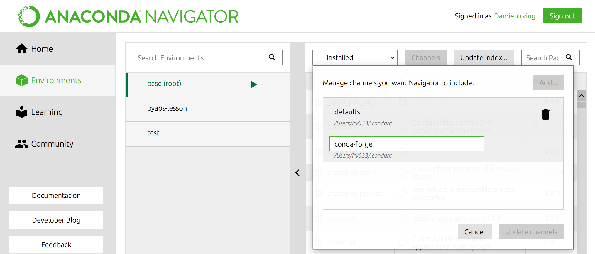
We recommend not adding any other third-party channels unless absolutely necessary, because mixing packages from multiple channels can cause headaches like binary incompatibilities.
Software installation for the lessons
xarray
netCDF4 (xarray requires this to read netCDF files),
cartopy (to help with geographic plot projections),
cmocean (for nice color palettes),
cmdline_provenance
(to keep track of our data processing steps)
and jupyter (so we can use the jupyter notebook).
plotnine
We could install these libraries from Anaconda Navigator (not shown) or using the Terminal in Mac/Linux or Anaconda Prompt (Windows):
$ conda install jupyter xarray netCDF4 cartopy

$ conda install -c conda-forge cmocean cmdline_provenance plotnine
If we then list all the libraries that we’ve got installed, we can see that jupyter, xarray, netCDF4, cartopy, cmocean, cmdline_provenance, plotnine and their dependencies are now there:
$ conda list
(This list can also be viewed in the environments tab of the Navigator.)
Creating separate environments
If you’ve got multiple data science projects on the go, installing all your packages in the same conda environment can get a little messy. (By default they are installed in the root/base environment.) It’s therefore common practice to create separate conda environments for the various projects you’re working on.
For instance, we could create an environment called
pyaos-lessonfor this lesson. The process of creating a new environment can be managed in the environments tab of the Anaconda Navigator or via the following Bash Shell / Anaconda Prompt commands:$ conda create -n pyaos-lesson jupyter xarray netCDF4 cartopy cmocean cmdline_provenance $ conda activate pyaos-lesson(it’s
conda deactivateto exit)You can have lots of different environments,
$ conda info --envs# conda environments: # base * /anaconda3 pyaos-lesson /anaconda3/envs/pyaos-lesson test /anaconda3/envs/testthe details of which can be exported to a YAML configuration file:
$ conda env export -n pyaos-lesson -f pyaos-lesson.yml
$ cat pyaos-lesson.yml
name: pyaos-lesson channels: - conda-forge - defaults dependencies: - cartopy=0.16.0=py36h81b52dc_1 - certifi=2018.4.16=py36_0 - cftime=1.0.1=py36h7eb728f_0 - ...Other people (or you on a different computer) can then re-create that exact environment using the YAML file:
$ conda env create -f pyaos-lesson.ymlFor ease of sharing the YAML file, it can be uploaded to your account at the Anaconda Cloud website,
$ conda env upload -f pyaos-lesson.ymlso that others can re-create the environment by simply refering to your Anaconda username:
$ conda env create damienirving/pyaos-lesson
$ conda activate pyaos-lesson
The ease with which others can recreate your environment (on any operating system) is a huge breakthough for reproducible research.
To delete the environment:
$ conda env remove -n pyaos-lesson
Interacting with Python
Now that we know which Python libraries we want to use and how to install them, we need to decide how we want to interact with Python.
The most simple way to use Python is to type code directly into the interpreter. This can be accessed from the bash shell:
$ python
Python 3.7.1 (default, Dec 14 2018, 13:28:58)
[Clang 4.0.1 (tags/RELEASE_401/final)] :: Anaconda, Inc. on darwin
Type "help", "copyright", "credits" or "license" for more information.
>>> print("hello world")
hello world
>>> exit()
$
The >>> prompt indicates that you are now talking to the Python interpreter.
A more powerful alternative to the default Python interpreter is IPython (Interactive Python). The online documentation outlines all the special features that come with IPython, but as an example, it lets you execute bash shell commands without having to exit the IPython interpreter:
$ ipython
Python 3.7.1 (default, Dec 14 2018, 13:28:58)
Type 'copyright', 'credits' or 'license' for more information
IPython 7.2.0 -- An enhanced Interactive Python. Type '?' for help.

In [1]: print("hello world")
hello world

In [2]: ls
data/                              script_template.py
plot_precipitation_climatology.py

In [3]: exit
$
(The IPython interpreter can also be accessed via the Anaconda Navigator by running the QtConsole.)
While entering commands to the Python or IPython interpreter line-by-line is great for quickly testing something, it’s clearly impractical for developing longer bodies of code and/or interactively exploring data. As such, Python users tend to do most of their code development and data exploration using either an Integrated Development Environment (IDE) or Jupyter Notebook:
- Two of the most common IDEs are Spyder and PyCharm (the former comes with Anaconda) and will look very familiar to anyone who has used MATLAB or R-Studio.
- Jupyter Notebooks run in your web browser and allow users to create and share documents that contain live code, equations, visualizations and narrative text.
We are going to use the Jupyter Notebook to explore our precipitation data
(and the plotting functionality of xarray) in the next few lessons.
A notebook can be launched from our data-carpentry directory
using the Bash Shell:
$ cd ~/Desktop/data-carpentry
$ jupyter notebook &
(The & allows you to come back and use the bash shell without closing
your notebook first.)
Alternatively, you can launch Jupyter Notebook from the Anaconda Navigator
and navigate to the data-carpentry directory before creating a new
Python 3 notebook:
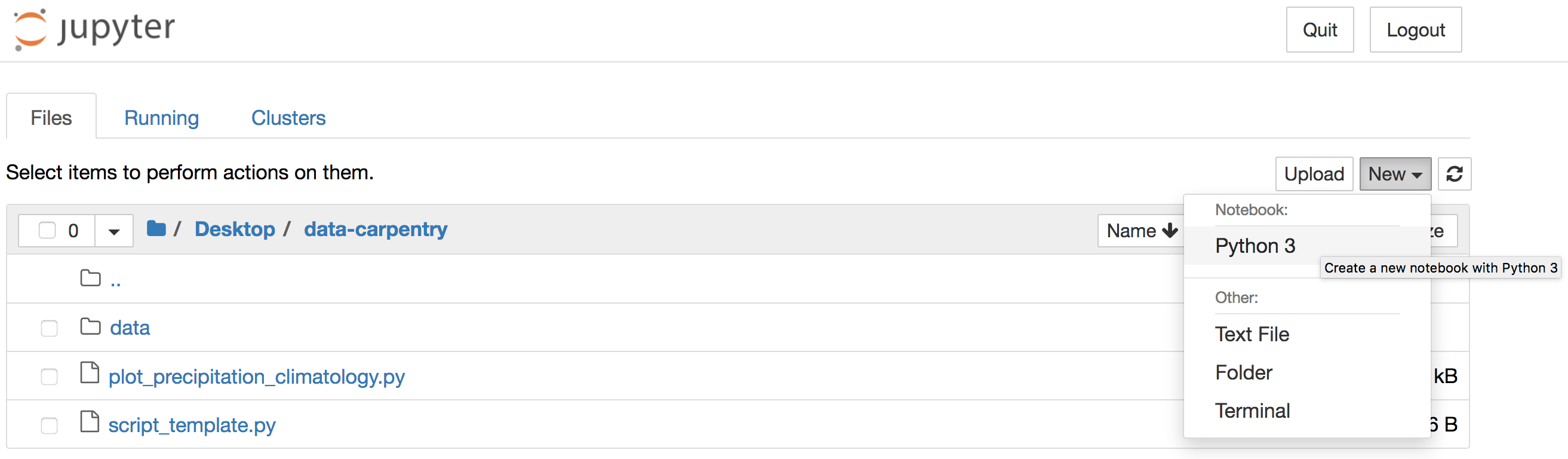
JupyterLab
The Jupyter team have recently launched JupyterLab which combines the Jupyter Notebook with many of the features common to an IDE.
Install the Python libraries required for week 2
Go ahead and install jupyter, xarray, cartopy and cmocean using either the Anaconda Navigator, Bash Shell or Anaconda Prompt (Windows).
(You may like to create a separate
pyaos-lessonconda environment, but this is not necessary to complete the lessons.)Solution
The setup menu at the top of the page contains a series of drop-down boxes explaining how to install the Python libraries on different operating systems. Use the “default” instructions unless you want to create the separate
pyaos-lessonconda environment.
Launch a Jupyer Notebook
In preparation for the next lesson, open a new Jupyter Notebook in your
data-carpentrydirectory by enteringjupyter notebook &at the Bash Shell or by clicking the Jupyter Notebook launch button in the Anaconda Navigator.If you use the Navigator, the Jupyter interface will open in a new tab of your default web browser. Use that interface to navigate to the
data-carpentrydirectory that you created specifically for these lessons before clicking to create a new Python 3 notebook:
Once your notebook is open, import xarray, catropy, matplotlib and numpy using the following Python commands:
import xarray as xr
import cartopy.crs as ccrs
import matplotlib.pyplot as plt
import numpy as np
(Hint: Hold down the shift and return keys to execute a code cell in a Jupyter Notebook.)
Key Points
install plotnine, a required pakcage for our lessons.
xarray and iris are the core Python libraries used in the atmosphere and ocean sciences.
Use conda to install and manage your Python environments.
Data Ingest and Visualization - Matplotlib and Pandas
Overview
Teaching: 40 min
Exercises: 65 minQuestions
What other tools can I use to create plots apart from ggplot?
Why should I use Python to create plots?
Objectives
Import the pyplot toolbox to create figures in Python.
Use matplotlib to make adjustments to Pandas or plotnine objects.
Putting it all together
Up to this point, we have walked through tasks that are often involved in handling and processing data using the workshop-ready cleaned files that we have provided. In this wrap-up exercise, we will perform many of the same tasks with real data sets. This lesson also covers data visualization.
As opposed to the previous ones, this lesson does not give step-by-step directions to each of the tasks. Use the lesson materials you’ve already gone through as well as the Python documentation to help you along.
Obtain data
There are many repositories online from which you can obtain data. We are
providing you with one data file to use with these exercises, but feel free to
use any data that is relevant to your research. The file
bouldercreek_09_2013.txt
contains stream discharge data, summarized at
15 minute intervals (in cubic feet per second) for a streamgage on Boulder
Creek at North 75th Street (USGS gage06730200) for 1-30 September 2013. If you’d
like to use this dataset, please find it in the data folder.
Clean up your data and open it using Python and Pandas
To begin, import your data file into Python using Pandas. Did it fail? Your data file probably has a header that Pandas does not recognize as part of the data table. Remove this header, but do not simply delete it in a text editor! Use either a shell script or Python to do this - you wouldn’t want to do it by hand if you had many files to process.
If you are still having trouble importing the data as a table using Pandas, check the documentation. You can open the docstring in an ipython notebook using a question mark. For example:
import pandas as pd
pd.read_csv?
Look through the function arguments to see if there is a default value that is
different from what your file requires (Hint: the problem is most likely the
delimiter or separator. Common delimiters are ',' for comma, ' ' for space,
and '\t' for tab).
Create a DataFrame that includes only the values of the data that are useful to you. In the streamgage file, those values might be the date, time, and discharge measurements. Convert any measurements in imperial units into SI units. You can also change the name of the columns in the DataFrame like this:
df = pd.DataFrame({'1stcolumn':[100,200], '2ndcolumn':[10,20]}) # this just creates a DataFrame for the example!
print('With the old column names:\n') # the \n makes a new line, so it's easier to see
print(df)

df.columns = ['FirstColumn', 'SecondColumn'] # rename the columns!
print('\n\nWith the new column names:\n')
print(df)
With the old column names:

   1stcolumn  2ndcolumn
0        100         10
1        200         20


With the new column names:

   FirstColumn  SecondColumn
0          100            10
1          200            20
Navigating the vast landscape of python visualization tools
There are some amazing plotting packages out there and a rich ecosystem of tools. It can be daunting to pick one for your purpose. pyviz.org is one resource that aims to help you figure out what to use.
“The PyViz.org website is an open platform for helping users decide on the best open-source (OSS) Python data visualization tools for their purposes, with links, overviews, comparisons, and examples.”
Matplotlib package
Matplotlib is a Python package that is widely used throughout the scientific Python community to create high-quality and publication-ready graphics. It supports a wide range of raster and vector graphics formats including PNG, PostScript, EPS, PDF and SVG.
Moreover, matplotlib is the actual engine behind the plotting capabilities of both Pandas and plotnine packages. For example, when we call the .plot method on Pandas data objects, we actually use the matplotlib package.
First, import the pyplot toolbox:
import matplotlib.pyplot as plt
Now, let’s read data and plot it!
surveys = pd.read_csv("data/surveys.csv")
my_plot = surveys.plot("hindfoot_length", "weight", kind="scatter")
plt.show() # not necessary in Jupyter Notebooks
Tip
By default, matplotlib creates a figure in a separate window. When using Jupyter notebooks, we can make figures appear in-line within the notebook by executing:
%matplotlib inline
The returned object is a matplotlib object (check it yourself with type(my_plot)),
to which we may make further adjustments and refinements using other matplotlib methods.
Tip
Matplotlib itself can be overwhelming, so a useful strategy is to do as much as you easily can in a convenience layer, i.e. start creating the plot in Pandas or plotnine, and then use matplotlib for the rest.
We will cover a few basic commands for creating and formatting plots with matplotlib in this lesson. A great resource for help creating and styling your figures is the matplotlib gallery (http://matplotlib.org/gallery.html), which includes plots in many different styles and the source codes that create them.
plt pyplot versus object-based matplotlib
Matplotlib integrates nicely with the NumPy package and can use NumPy arrays as input to the available plot functions. Consider the following example data, created with NumPy by drawing 1000 samples from a normal distribution with a mean value of 0 and a standard deviation of 0.1:
import numpy as np
sample_data = np.random.normal(0, 0.1, 1000)
To plot a histogram of our draws from the normal distribution, we can use the hist function directly:
plt.hist(sample_data)
Tip: Cross-Platform Visualization of Figures
Jupyter Notebooks make many aspects of data analysis and visualization much simpler. This includes doing some of the labor of visualizing plots for you. But, not every one of your collaborators will be using a Jupyter Notebook. The
.show()command allows you to visualize plots when working at the command line, with a script, or at the IPython interpreter. In the previous example, addingplt.show()after the creation of the plot will enable your colleagues who aren’t using a Jupyter notebook to reproduce your work on their platform.
or create matplotlib figure and axis objects first and subsequently add a histogram with 30
data bins:
fig, ax = plt.subplots()  # initiate an empty figure and axis matplotlib object
ax.hist(sample_data, 30)
Although the latter approach requires a little bit more code to create the same plot, the advantage is that it gives us full control over the plot and we can add new items such as labels, grid lines, title, and other visual elements. For example, we can add additional axes to the figure and customize their labels:
fig, ax1 = plt.subplots() # prepare a matplotlib figure
ax1.hist(sample_data, 30)

# Add a plot of a Beta distribution
a = 5
b = 10
beta_draws = np.random.beta(a, b)
# adapt the labels
ax1.set_ylabel('density')
ax1.set_xlabel('value')

# add additional axes to the figure
ax2 = fig.add_axes([0.125, 0.575, 0.3, 0.3])
#ax2 = fig.add_axes([left, bottom, right, top])
ax2.hist(beta_draws)
Challenge - Drawing from distributions
Have a look at
numpy.randomdocumentation. Choose a distribution you have no familiarity with, and try to sample from and visualize it.
Link matplotlib, Pandas and plotnine
When we create a plot using pandas or plotnine, both libraries use matplotlib to create those plots. The plots created in pandas or plotnine are matplotlib objects, which enables us to use some of the advanced plotting options available in the matplotlib library. Because the objects output by pandas and plotnine can be read by matplotlib, we have many more options than any one library can provide, offering a consistent environment to make publication-quality visualizations.
fig, ax1 = plt.subplots() # prepare a matplotlib figure

surveys.plot("hindfoot_length", "weight", kind="scatter", ax=ax1)

# Provide further adaptations with matplotlib:
ax1.set_xlabel("Hindfoot length")
ax1.tick_params(labelsize=16, pad=8)
fig.suptitle('Scatter plot of weight versus hindfoot length', fontsize=15)
To retrieve the matplotlib figure object from plotnine for customization, use the draw() function in plotnine:
import plotnine as p9
myplot = (p9.ggplot(data=surveys,
                    mapping=p9.aes(x='hindfoot_length', y='weight')) +
              p9.geom_point())

# convert output plotnine to a matplotlib object
my_plt_version = myplot.draw()

# Provide further adaptations with matplotlib:
p9_ax = my_plt_version.axes[0] # each subplot is an item in a list
p9_ax.set_xlabel("Hindfoot length")
p9_ax.tick_params(labelsize=16, pad=8)
p9_ax.set_title('Scatter plot of weight versus hindfoot length', fontsize=15)
plt.show() # not necessary in Jupyter Notebooks
Challenge - Pandas and matplotlib
Load the streamgage data set with Pandas, subset the week of the 2013 Front Range flood (September 11 through 15) and create a hydrograph (line plot) of the discharge data using Pandas, linking it to an empty maptlotlib
axobject. Create a second axis that displays the whole dataset. Adapt the title and axes’ labels using matplotlib.Answers
discharge = pd.read_csv("data/bouldercreek_09_2013.txt",
                        skiprows=27, delimiter="\t",
                        names=["agency", "site_id", "datetime",
                               "timezone", "discharge", "discharge_cd"])
discharge["datetime"] = pd.to_datetime(discharge["datetime"])
front_range = discharge[(discharge["datetime"] >= "2013-09-09") &
                        (discharge["datetime"] < "2013-09-15")]

fig, ax = plt.subplots()
front_range.plot(x ="datetime", y="discharge", ax=ax)
ax.set_xlabel("") # no label
ax.set_ylabel("Discharge, cubic feet per second")
ax.set_title(" Front Range flood event 2013")
discharge = pd.read_csv("../data/bouldercreek_09_2013.txt",
                      skiprows=27, delimiter="\t",
                      names=["agency", "site_id", "datetime",
                             "timezone", "flow_rate", "height"])
fig, ax = plt.subplots()
flood = discharge[(discharge["datetime"] >= "2013-09-11") &
                  (discharge["datetime"] < "2013-09-15")]

ax2 = fig.add_axes([0.65, 0.575, 0.25, 0.3])
flood.plot(x ="datetime", y="flow_rate", ax=ax)
discharge.plot(x ="datetime", y="flow_rate", ax=ax2)
ax2.legend().set_visible(False)
ax.set_xlabel("") # no label
ax.set_ylabel("Discharge, cubic feet per second")
ax.legend().set_visible(False)
ax.set_title(" Front Range flood event 2013")
discharge = pd.read_csv("../data/bouldercreek_09_2013.txt",
                      skiprows=27, delimiter="\t",
                      names=["agency", "site_id", "datetime",
                             "timezone", "flow_rate", "height"])
fig, ax = plt.subplots()
flood = discharge[(discharge["datetime"] >= "2013-09-11") &
                  (discharge["datetime"] < "2013-09-15")]

ax2 = fig.add_axes([0.65, 0.575, 0.25, 0.3])
flood.plot(x ="datetime", y="flow_rate", ax=ax)
discharge.plot(x ="datetime", y="flow_rate", ax=ax2)
ax2.legend().set_visible(False)

ax.set_xlabel("") # no label
ax.set_ylabel("Discharge, cubic feet per second")
ax.legend().set_visible(False)
ax.set_title(" Front Range flood event 2013")
Saving matplotlib figures
Once satisfied with the resulting plot, you can save the plot with the .savefig(*args) method from matplotlib:
fig.savefig("my_plot_name.png")
which will save the fig created using Pandas/matplotlib as a png file with the name my_plot_name
Tip: Saving figures in different formats
Matplotlib recognizes the extension used in the filename and supports (on most computers) png, pdf, ps, eps and svg formats.
Challenge - Saving figure to file
Check the documentation of the
savefigmethod and check how you can comply to journals requiring figures asAnswers
fig.savefig("my_plot_name.pdf", dpi=300)
Make other types of plots:
Matplotlib can make many other types of plots in much the same way that it makes two-dimensional line plots. Look through the examples in
http://matplotlib.org/users/screenshots.html and try a few of them (click on the
“Source code” link and copy and paste into a new cell in ipython notebook or
save as a text file with a .py extension and run in the command line).
Challenge - Final Plot
Display your data using one or more plot types from the example gallery. Which ones to choose will depend on the content of your own data file. If you are using the streamgage file
bouldercreek_09_2013.txt, you could make a histogram of the number of days with a given mean discharge, use bar plots to display daily discharge statistics, or explore the different ways matplotlib can handle dates and times for figures.
Key Points
Matplotlib is the engine behind plotnine and Pandas plots.
The object-based nature of matplotlib plots enables their detailed customization after they have been created.
Export plots to a file using the
savefigmethod.
Making Plots With plotnine
Overview
Teaching: 40 min
Exercises: 50 minQuestions
How can I visualize data in Python?
What is ‘grammar of graphics’?
Objectives
Create a
plotnineobject.Set universal plot settings.
Modify an existing plotnine object.
Change the aesthetics of a plot such as color.
Edit the axis labels.
Build complex plots using a step-by-step approach.
Create scatter plots, box plots, and time series plots.
Use the facet_wrap and facet_grid commands to create a collection of plots splitting the data by a factor variable.
Create customized plot styles to meet their needs.
Disclaimer
Python has powerful built-in plotting capabilities such as matplotlib, but for
this episode, we will be using the plotnine
package, which facilitates the creation of highly-informative plots of
structured data based on the R implementation of ggplot2
and The Grammar of Graphics
by Leland Wilkinson. The plotnine
package is built on top of Matplotlib and interacts well with Pandas.
Reminder
plotnineis not included in the standard Anaconda installation and needs to be installed separately. If you haven’t done so already, you can find installation instructions on the Setup page.
Just as with the other packages, plotnine needs to be imported. It is good
practice to not just load an entire package such as from plotnine import *,
but to use an abbreviation as we used pd for Pandas:
%matplotlib inline
import plotnine as p9
From now on, the functions of plotnine are available using p9.. For the
exercise, we will use the surveys.csv data set, with the NA values removed
import pandas as pd

surveys_complete = pd.read_csv('data/surveys.csv')
surveys_complete = surveys_complete.dropna()
Plotting with plotnine
The plotnine package (cfr. other packages conform The Grammar of Graphics) supports the creation of complex plots from data in a
dataframe. It uses default settings, which help creating publication quality
plots with a minimal amount of settings and tweaking.
plotnine graphics are built step by step by adding new elements adding
different elements on top of each other using the + operator. Putting the
individual steps together in brackets () provides Python-compatible syntax.
To build a plotnine graphic we need to:
- Bind the plot to a specific data frame using the
dataargument:
(p9.ggplot(data=surveys_complete))
As we have not defined anything else, just an empty figure is available and presented.
- Define aesthetics (
aes), by selecting variables used in the plot andmappingthem to a presentation such as plotting size, shape, color, etc. You can interpret this as: which of the variables will influence the plotted objects/geometries:
(p9.ggplot(data=surveys_complete,
           mapping=p9.aes(x='weight', y='hindfoot_length')))
The most important aes mappings are: x, y, alpha, color, colour,
fill, linetype, shape, size and stroke.
- Still no specific data is plotted, as we have to define what kind of geometry
will be used for the plot. The most straightforward is probably using points.
Points is one of the
geomsoptions, the graphical representation of the data in the plot. Others are lines, bars,… To add a geom to the plot use+operator:
(p9.ggplot(data=surveys_complete,
           mapping=p9.aes(x='weight', y='hindfoot_length'))
    + p9.geom_point()
)
The + in the plotnine package is particularly useful because it allows you
to modify existing plotnine objects. This means you can easily set up plot
templates and conveniently explore different types of plots, so the above
plot can also be generated with code like this:
# Create
surveys_plot = p9.ggplot(data=surveys_complete,
                         mapping=p9.aes(x='weight', y='hindfoot_length'))

# Draw the plot
surveys_plot + p9.geom_point()
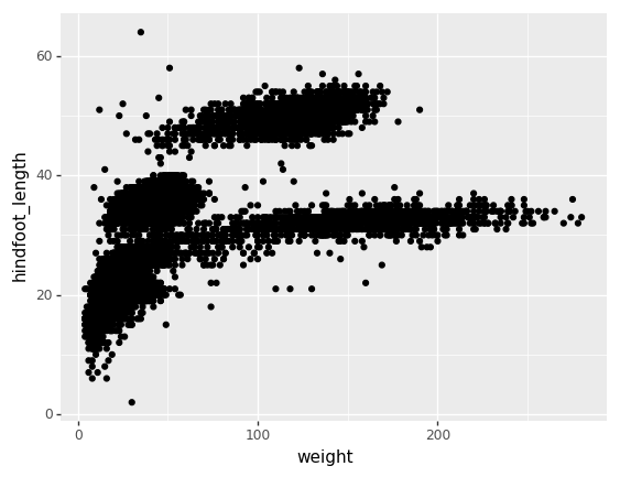
Challenge - bar chart
Working on the
surveys_completedata set, use theplot-idcolumn to create abar-plot that counts the number of records for each plot. (Check the documentation of the bar geometry to handle the counts)Answers
(p9.ggplot(data=surveys_complete,
           mapping=p9.aes(x='plot_id'))
    + p9.geom_bar()
)
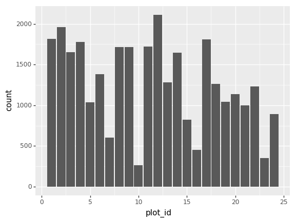
Notes:
- Anything you put in the
ggplot()function can be seen by any geom layers that you add (i.e., these are universal plot settings). This includes thexandyaxis you set up inaes(). - You can also specify aesthetics for a given
geomindependently of the aesthetics defined globally in theggplot()function.
Building your plots iteratively
Building plots with plotnine is typically an iterative process. We start by
defining the dataset we’ll use, lay the axes, and choose a geom. Hence, the
data, aes and geom-* are the elementary elements of any graph:
(p9.ggplot(data=surveys_complete,
           mapping=p9.aes(x='weight', y='hindfoot_length'))
    + p9.geom_point()
)
Then, we start modifying this plot to extract more information from it. For instance, we can add transparency (alpha) to avoid overplotting:
(p9.ggplot(data=surveys_complete,
           mapping=p9.aes(x='weight', y='hindfoot_length'))
    + p9.geom_point(alpha=0.1)
)
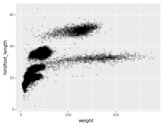
We can also add colors for all the points
(p9.ggplot(data=surveys_complete,
           mapping=p9.aes(x='weight', y='hindfoot_length'))
    + p9.geom_point(alpha=0.1, color='blue')
)
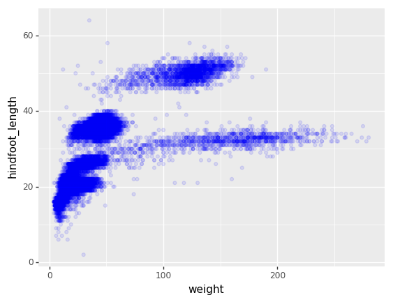
Or to color each species in the plot differently, map the species_id column
to the color aesthetic:
(p9.ggplot(data=surveys_complete,
           mapping=p9.aes(x='weight',
                          y='hindfoot_length',
                          color='species_id'))
    + p9.geom_point(alpha=0.1)
)

Apart from the adaptations of the arguments and settings of the data, aes
and geom-* elements, additional elements can be added as well, using the +
operator:
- Changing the labels:
(p9.ggplot(data=surveys_complete,
           mapping=p9.aes(x='weight', y='hindfoot_length', color='species_id'))
    + p9.geom_point(alpha=0.1)
    + p9.xlab("Weight (g)")
)
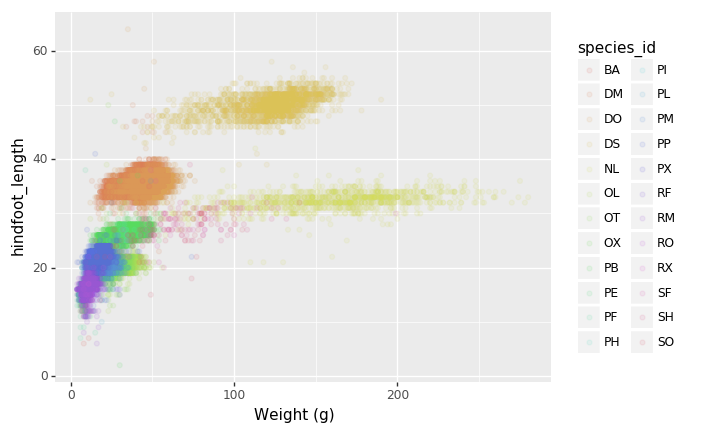
- Defining scale for colors, axes,… For example, a log-version of the x-axis could support the interpretation of the lower numbers:
(p9.ggplot(data=surveys_complete,
           mapping=p9.aes(x='weight', y='hindfoot_length', color='species_id'))
    + p9.geom_point(alpha=0.1)
    + p9.xlab("Weight (g)")
    + p9.scale_x_log10()
)
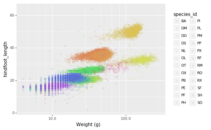
- Changing the theme (
theme_*) or some specific theming (theme) elements. Usually plots with white background look more readable when printed. We can set the background to white using the functiontheme_bw().
(p9.ggplot(data=surveys_complete,
           mapping=p9.aes(x='weight', y='hindfoot_length', color='species_id'))
    + p9.geom_point(alpha=0.1)
    + p9.xlab("Weight (g)")
    + p9.scale_x_log10()
    + p9.theme_bw()
    + p9.theme(text=p9.element_text(size=16))
)
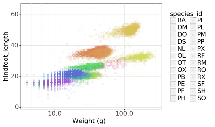
Challenge - Bar plot adaptations
Adapt the bar plot of the previous exercise by mapping the
sexvariable to the color fill of the bar chart. Change thescaleof the color fill by providing the colorsblueandorangemanually (see API reference to find the appropriate function).Answers
(p9.ggplot(data=surveys_complete,
           mapping=p9.aes(x='plot_id',
                          fill='sex'))
    + p9.geom_bar()
    + p9.scale_fill_manual(["blue", "orange"])
)
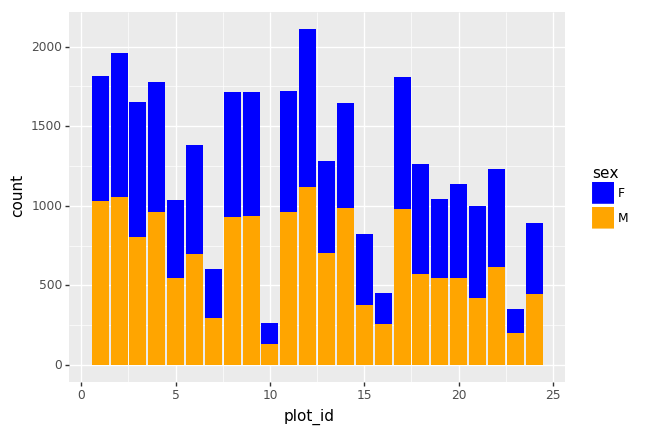
Plotting distributions
Visualizing distributions is a common task during data exploration and
analysis. To visualize the distribution of weight within each species_id
group, a boxplot can be used:
(p9.ggplot(data=surveys_complete,
           mapping=p9.aes(x='species_id',
                          y='weight'))
    + p9.geom_boxplot()
)
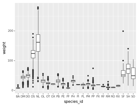
By adding points of the individual observations to the boxplot, we can have a better idea of the number of measurements and of their distribution:
(p9.ggplot(data=surveys_complete,
           mapping=p9.aes(x='species_id',
                          y='weight'))
    + p9.geom_jitter(alpha=0.2)
    + p9.geom_boxplot(alpha=0.)
)
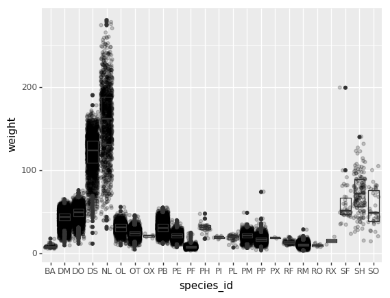
Challenge - distributions
Boxplots are useful summaries, but hide the shape of the distribution. For example, if there is a bimodal distribution, this would not be observed with a boxplot. An alternative to the boxplot is the violin plot (sometimes known as a beanplot), where the shape (of the density of points) is drawn.
In many types of data, it is important to consider the scale of the observations. For example, it may be worth changing the scale of the axis to better distribute the observations in the space of the plot.
- Replace the box plot with a violin plot, see
geom_violin()- Represent weight on the log10 scale, see
scale_y_log10()- Add color to the datapoints on your boxplot according to the plot from which the sample was taken (
plot_id)Hint: Check the class for
plot_id. By usingfactor()within theaesmapping of a variable,plotninewill handle the values as category values.Answers
(p9.ggplot(data=surveys_complete,
           mapping=p9.aes(x='species_id',
                          y='weight',
                          color='factor(plot_id)'))
    + p9.geom_jitter(alpha=0.3)
    + p9.geom_violin(alpha=0, color="0.7")
    + p9.scale_y_log10()
)
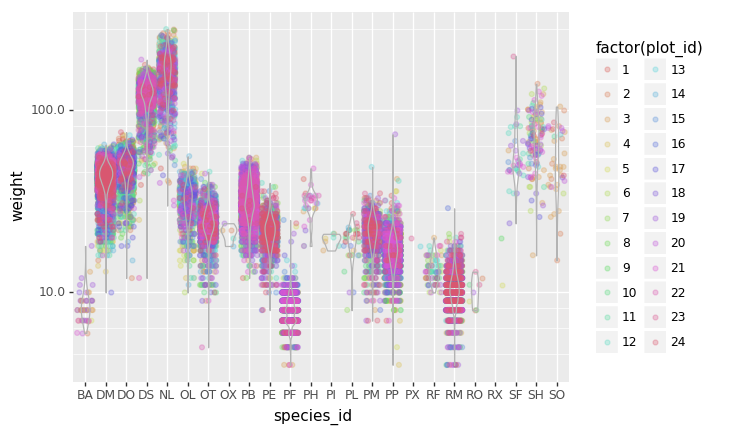
Plotting time series data
Let’s calculate number of counts per year for each species. To do that we need
to group data first and count the species (species_id) within each group.
yearly_counts = surveys_complete.groupby(['year', 'species_id'])['species_id'].count()
yearly_counts
When checking the result of the previous calculation, we actually have both the
year and the species_id as a row index. We can reset this index to use both
as column variable:
yearly_counts = yearly_counts.reset_index(name='counts')
yearly_counts
Timelapse data can be visualised as a line plot (geom_line) with years on x
axis and counts on the y axis.
(p9.ggplot(data=yearly_counts,
           mapping=p9.aes(x='year',
                          y='counts'))
    + p9.geom_line()
)
Unfortunately this does not work, because we plot data for all the species
together. We need to tell plotnine to draw a line for each species by
modifying the aesthetic function and map the species_id to the color:
(p9.ggplot(data=yearly_counts,
           mapping=p9.aes(x='year',
                          y='counts',
                          color='species_id'))
    + p9.geom_line()
)
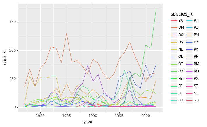
Faceting
As any other library supporting the Grammar of Graphics, plotnine has a
special technique called faceting that allows to split one plot into multiple
plots based on a factor variable included in the dataset.
Consider our scatter plot of the weight versus the hindfoot_length from the
previous sections:
(p9.ggplot(data=surveys_complete,
           mapping=p9.aes(x='weight',
                          y='hindfoot_length',
                          color='species_id'))
    + p9.geom_point(alpha=0.1)
)
We can now keep the same code and at the facet_wrap on a chosen variable to
split out the graph and make a separate graph for each of the groups in that
variable. As an example, use sex:
(p9.ggplot(data=surveys_complete,
           mapping=p9.aes(x='weight',
                          y='hindfoot_length',
                          color='species_id'))
    + p9.geom_point(alpha=0.1)
    + p9.facet_wrap("sex")
)
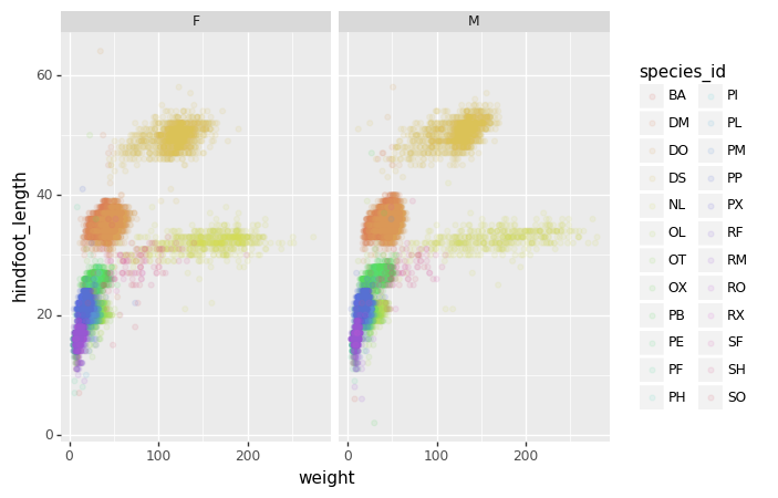
We can apply the same concept on any of the available categorical variables:
(p9.ggplot(data=surveys_complete,
           mapping=p9.aes(x='weight',
                          y='hindfoot_length',
                          color='species_id'))
    + p9.geom_point(alpha=0.1)
    + p9.facet_wrap("plot_id")
)
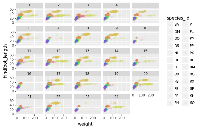
The facet_wrap geometry extracts plots into an arbitrary number of dimensions
to allow them to cleanly fit on one page. On the other hand, the facet_grid
geometry allows you to explicitly specify how you want your plots to be
arranged via formula notation (rows ~ columns; a . can be used as a
placeholder that indicates only one row or column).
# only select the years of interest
survey_2000 = surveys_complete[surveys_complete["year"].isin([2000, 2001])]

(p9.ggplot(data=survey_2000,
           mapping=p9.aes(x='weight',
                          y='hindfoot_length',
                          color='species_id'))
    + p9.geom_point(alpha=0.1)
    + p9.facet_grid("year ~ sex")
)
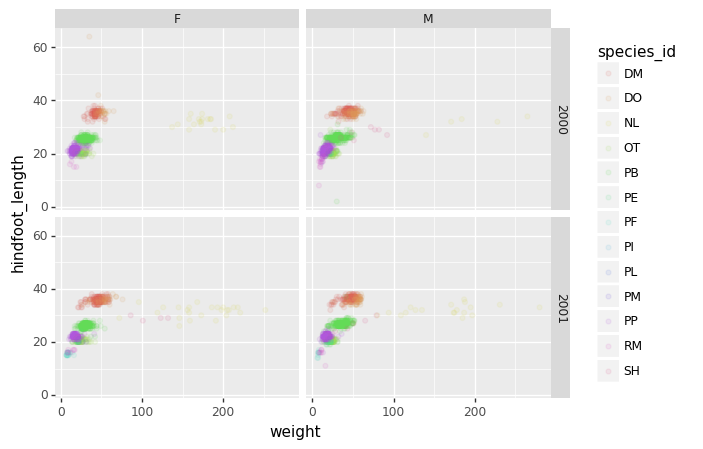
Challenge - facetting
Create a separate plot for each of the species that depicts how the average weight of the species changes through the years.
Answers
yearly_weight = surveys_complete.groupby(['year', 'species_id'])['weight'].mean().reset_index()
(p9.ggplot(data=yearly_weight, mapping=p9.aes(x='year', y='weight'))
    + p9.geom_line()
    + p9.facet_wrap("species_id")
)
Challenge - facetting
Based on the previous exercise, visually compare how the weights of male and females has changed through time by creating a separate plot for each sex and an individual color assigned to each
species_id.Answers
yearly_weight = surveys_complete.groupby(['year', 'species_id', 'sex'])['weight'].mean().reset_index()

(p9.ggplot(data=yearly_weight,
           mapping=p9.aes(x='year',
                          y='weight',
                          color='species_id'))
    + p9.geom_line()
    + p9.facet_wrap("sex")
)
Further customization
As the syntax of plotnine follows the original R package ggplot2, the
documentation of ggplot2 can provide information and inspiration to customize
graphs. Take a look at the ggplot2 cheat sheet, and think of ways to
improve the plot. You can write down some of your ideas as comments in the Etherpad.
The theming options provide a rich set of visual adaptations. Consider the following example of a bar plot with the counts per year.
(p9.ggplot(data=surveys_complete,
           mapping=p9.aes(x='factor(year)'))
    + p9.geom_bar()
)
Notice that we use the year here as a categorical variable by using the
factor functionality. However, by doing so, we have the individual year
labels overlapping with each other. The theme functionality provides a way to
rotate the text of the x-axis labels:
(p9.ggplot(data=surveys_complete,
           mapping=p9.aes(x='factor(year)'))
    + p9.geom_bar()
    + p9.theme_bw()
    + p9.theme(axis_text_x = p9.element_text(angle=90))
)
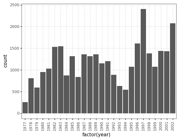
When you like a specific set of theme-customizations you created, you can save them as an object to easily apply them to other plots you may create:
my_custom_theme = p9.theme(axis_text_x = p9.element_text(color="grey", size=10,
                                                         angle=90, hjust=.5),
                           axis_text_y = p9.element_text(color="grey", size=10))
(p9.ggplot(data=surveys_complete,
           mapping=p9.aes(x='factor(year)'))
    + p9.geom_bar()
    + my_custom_theme
)
Challenge - customization
Please take another five minutes to either improve one of the plots generated in this exercise or create a beautiful graph of your own.
Here are some ideas:
- See if you can change thickness of lines for the line plot .
- Can you find a way to change the name of the legend? What about its labels?
- Use a different color palette (see http://www.cookbook-r.com/Graphs/Colors_(ggplot2))
After creating your plot, you can save it to a file in your favourite format.
You can easily change the dimension (and its resolution) of your plot by
adjusting the appropriate arguments (width, height and dpi):
my_plot = (p9.ggplot(data=surveys_complete,
           mapping=p9.aes(x='weight', y='hindfoot_length'))
    + p9.geom_point()
)
my_plot.save("scatterplot.png", width=10, height=10, dpi=300)
Key Points
The
data,aesvariables and ageometryare the main elements of a plotnine graphWith the
+operator, additionalscale_*,theme_*,xlab/ylabandfacet_*elements are added
Refresher
Overview
Teaching: 30 min
Exercises: 0 minQuestions
Objectives
Takeaways
Spreadsheets
- Never modify your raw data. Always make a copy before making any changes.
- Keep track of all of the steps you take to clean your data in a plain text file.
- Organize your data according to tidy data principles. The main takeaway here is that data should be both human and machine readable: Avoid using multiple tables within one spreadsheet, avoid spreading data across multiple tabs, record zeros as zeros, use an appropriate null value to record missing data, don’t use formatting to convey information or to make your spreadsheet look pretty, place comments in a separate column, record units in column headers, include only one piece of information in a cell, avoid spaces, numbers and special characters in column headers, avoid special characters in your data, record metadata in a separate plain text file. Store dates as strings preferibly in the ISO 8601 format. Export your table to a csv.
Python
One can assign a value to a variable in Python. Those variables can be of several types, such as string, integer, floating point and complex numbers.
Python Data structures:
- list:
another_list = ["blue", "green", "red"]- Lists contains an ordered sequence of elements. Each element can be accessed by an index. - tuple:
another_tuple = ("blue", "green", "red")- Tuples are order lists of elements, but immutable - Dictionary:
another_dict = {'first': 'one', 'second': 'two', 'third': 'three'}- Dictionaries are data structures that provide mappings between keys and values
Python uses 0-based indexing, in which the first element in a list, tuple or any other data structure has an index of 0.
Libraries enable us to extend the functionality of Python.
Pandas
One of the best options for working with tabular data in Python is the library Pandas (Python Data Analysis Library).
Pandas provides an object called DataFrame, this object represents tabular data. Dataframes are a 2-dimensional data structure and can store data of different types (including characters, integers, floating point values, factors and more) in columns.
Aggregating data using the groupby() function enables you to generate useful summaries of data quickly.
Dataframes can be subsetted in different ways including using labels (column headings), numeric ranges, or specific x,y index locations.
- dataframe[“column_name”]
- dataframe []
Data from multiple files can be combined into a single DataFrame using merge and concat.
Plotting
Matplotlib is a Python package that is widely used throughout the scientific Python community to create high-quality and publication-ready graphics.
Useful resources:
- Matplotlib gallery: https://matplotlib.org/gallery.html
- The PyViz.org website is an open platform for helping users decide on the best open-source (OSS) Python data visualization tools for their purposes, with links, overviews, comparisons, and examples.”
The plotnine package is built on top of Matplotlib and interacts well with Pandas, it supports the creation of complex plots from data in a dataframe. Plotnine graphics are built step by step by adding new elements adding different elements on top of each other using the + operator. Putting the individual steps together in brackets () provides Python-compatible syntax.
Setting up your Anaconda environment
Python is a popular language for research computing, and great for general-purpose programming as well. Installing all of its research packages individually can be a bit difficult, so we recommend Anaconda, an all-in-one installer. There are different version of the python language, but we use the latast one in this workshop Python version 3.x (e.g., 3.6 is fine).
The new MacOS “Catalina” proved to be difficult to install anaconda. These are links that users found useful in troubleshooting installing Anaconda with Mac Catalina:
Anaconda Navigator vs Conda
Once Anaconda is installed, interacting with the program can either happen using the user interface “Anaconda Navigator” or the command-line program “conda”:
- The command-line program conda is both a package manager and an environment manager. This helps data scientists ensure that each version of each package has all the dependencies it requires and works correctly. Windows users need the open “Anaconda Prompt” to be able to use the command-line easily, Mac and Linus user can open the command prompt directly.
- Anaconda Navigator is a, point-and-click way to work with packages and environments without needing to type conda commands in a terminal window. You can use it to find the packages you want, install them in an environment, run the packages, and update them.
Anaconda Environment
A conda environment is a directory that contains a specific collection of conda packages that you have installed. In order to run, many scientific packages depend on specific versions of other packages. Data scientists often use multiple versions of many packages and use multiple environments to separate these different versions. When an environment is not specified from the beginning and you isntall a package, it gets installend in the base environment.
Explore your conda set-up (command line instructions):
- Check the environments that you have installed:
conda env list - Activating an existing environment:
- Windows
activate environment_name - LINUX, macOS:
source activate environment_name
- Windows
- List all packages and versions installed in active environment:
conda list
Installing Packages
Note: Packages get installed in the environment that at that moment is active. Activate the required environment first before installing a package.
Some packages that you use in python are getting installend when anaconda, and can directly be imported in a script or notebook. Some packages can not be imported and need to be installed first.
- Installing a package:
conda install PACKAGENAME
The command above looks for the package on a default location where python packages get uploaded. However, sometimes packages are stored on a different location. The location where Conda searches for the package is called a channel. The pacage “plotnine” for example is not available on the default location and therefore need to have the channel specified where Conda should look for the package: conda install -c conda-forge plotnine
Jupyter Notebook
To correctly open jupyter notebook:
- Activate the environment that you want it to use first
- Type jupyter notebook in the command line to open up jupyter notebook
- Browse to the location that you want the notebook to open in i.e. the working folder/folder where your data is stored in. Our data should be on your desktop in the folder data-carpentry/data. But open the notebook in the folder data-carpentry.
Check installs
Check if your installs are running by importing the libraries in a jupyter notebook.
List all packages and versions installed in active environment: conda list
Where should your data be?
Desktop
- Data-carpentry
- data
Key Points
Data Workflows and Automation
Overview
Teaching: 40 min
Exercises: 50 minQuestions
Can I automate operations in Python?
What are functions and why should I use them?
Objectives
Describe why for loops are used in Python.
Employ for loops to automate data analysis.
Write unique filenames in Python.
Build reusable code in Python.
Write functions using conditional statements (if, then, else).
So far, we’ve used Python and the pandas library to explore and manipulate individual datasets by hand, much like we would do in a spreadsheet. The beauty of using a programming language like Python, though, comes from the ability to automate data processing through the use of loops and functions.
For loops
Loops allow us to repeat a workflow (or series of actions) a given number of times or while some condition is true. We would use a loop to automatically process data that’s stored in multiple files (daily values with one file per year, for example). Loops lighten our work load by performing repeated tasks without our direct involvement and make it less likely that we’ll introduce errors by making mistakes while processing each file by hand.
Let’s write a simple for loop that simulates what a kid might see during a visit to the zoo:
animals = ['lion', 'tiger', 'crocodile', 'vulture', 'hippo']
print(animals)
['lion', 'tiger', 'crocodile', 'vulture', 'hippo']
for creature in animals:
    print(creature)
lion
tiger
crocodile
vulture
hippo
The line defining the loop must start with for and end with a colon, and the
body of the loop must be indented.
In this example, creature is the loop variable that takes the value of the next
entry in animals every time the loop goes around. We can call the loop variable
anything we like. After the loop finishes, the loop variable will still exist
and will have the value of the last entry in the collection:
animals = ['lion', 'tiger', 'crocodile', 'vulture', 'hippo']
for creature in animals:
    pass
print('The loop variable is now: ' + creature)
The loop variable is now: hippo
We are not asking Python to print the value of the loop variable anymore, but
the for loop still runs and the value of creature changes on each pass through
the loop. The statement pass in the body of the loop means “do nothing”.
Challenge - Loops
What happens if we don’t include the
passstatement?Rewrite the loop so that the animals are separated by commas, not new lines (Hint: You can concatenate strings using a plus sign. For example,
print(string1 + string2)outputs ‘string1string2’).
Automating data processing using For Loops
The file we’ve been using so far, surveys.csv, contains 25 years of data and is
very large. We would like to separate the data for each year into a separate
file.
Let’s start by making a new directory inside the folder data to store all of
these files using the module os:
import os

os.mkdir('data/yearly_files')
The command os.mkdir is equivalent to mkdir in the shell. Just so we are
sure, we can check that the new directory was created within the data folder:
os.listdir('data')
['plots.csv',
 'portal_mammals.sqlite',
 'species.csv',
 'survey2001.csv',
 'survey2002.csv',
 'surveys.csv',
 'surveys2002_temp.csv',
 'yearly_files']
The command os.listdir is equivalent to ls in the shell.
In previous lessons, we saw how to use the library pandas to load the species data into memory as a DataFrame, how to select a subset of the data using some criteria, and how to write the DataFrame into a CSV file. Let’s write a script that performs those three steps in sequence for the year 2002:
import pandas as pd

# Load the data into a DataFrame
surveys_df = pd.read_csv('data/surveys.csv')

# Select only data for the year 2002
surveys2002 = surveys_df[surveys_df.year == 2002]

# Write the new DataFrame to a CSV file
surveys2002.to_csv('data/yearly_files/surveys2002.csv')
To create yearly data files, we could repeat the last two commands over and over, once for each year of data. Repeating code is neither elegant nor practical, and is very likely to introduce errors into your code. We want to turn what we’ve just written into a loop that repeats the last two commands for every year in the dataset.
Let’s start by writing a loop that prints the names of the files we want to create - the dataset we are using covers 1977 through 2002, and we’ll create a separate file for each of those years. Listing the filenames is a good way to confirm that the loop is behaving as we expect.
We have seen that we can loop over a list of items, so we need a list of years to loop over. We can get the years in our DataFrame with:
surveys_df['year']
0        1977
1        1977
2        1977
3        1977
         ...
35545    2002
35546    2002
35547    2002
35548    2002
but we want only unique years, which we can get using the unique method
which we have already seen.
surveys_df['year'].unique()
array([1977, 1978, 1979, 1980, 1981, 1982, 1983, 1984, 1985, 1986, 1987,
       1988, 1989, 1990, 1991, 1992, 1993, 1994, 1995, 1996, 1997, 1998,
       1999, 2000, 2001, 2002], dtype=int64)
Putting this into our for loop we get
for year in surveys_df['year'].unique():
   filename='data/yearly_files/surveys' + str(year) + '.csv'
   print(filename)
data/yearly_files/surveys1977.csv
data/yearly_files/surveys1978.csv
data/yearly_files/surveys1979.csv
data/yearly_files/surveys1980.csv
data/yearly_files/surveys1981.csv
data/yearly_files/surveys1982.csv
data/yearly_files/surveys1983.csv
data/yearly_files/surveys1984.csv
data/yearly_files/surveys1985.csv
data/yearly_files/surveys1986.csv
data/yearly_files/surveys1987.csv
data/yearly_files/surveys1988.csv
data/yearly_files/surveys1989.csv
data/yearly_files/surveys1990.csv
data/yearly_files/surveys1991.csv
data/yearly_files/surveys1992.csv
data/yearly_files/surveys1993.csv
data/yearly_files/surveys1994.csv
data/yearly_files/surveys1995.csv
data/yearly_files/surveys1996.csv
data/yearly_files/surveys1997.csv
data/yearly_files/surveys1998.csv
data/yearly_files/surveys1999.csv
data/yearly_files/surveys2000.csv
data/yearly_files/surveys2001.csv
data/yearly_files/surveys2002.csv
We can now add the rest of the steps we need to create separate text files:
# Load the data into a DataFrame
surveys_df = pd.read_csv('data/surveys.csv')

for year in surveys_df['year'].unique():

    # Select data for the year
    surveys_year = surveys_df[surveys_df.year == year]

    # Write the new DataFrame to a CSV file
    filename = 'data/yearly_files/surveys' + str(year) + '.csv'
    surveys_year.to_csv(filename)
Look inside the yearly_files directory and check a couple of the files you
just created to confirm that everything worked as expected.
Writing Unique File Names
Notice that the code above created a unique filename for each year.
filename = 'data/yearly_files/surveys' + str(year) + '.csv'
Let’s break down the parts of this name:
- The first part is some text that specifies the directory to store our
data file in (data/yearly_files/) and the first part of the file name
(surveys):
'data/yearly_files/surveys' - We can concatenate this with the value of a variable, in this case
yearby using the plus+sign and the variable we want to add to the file name:+ str(year) - Then we add the file extension as another text string:
+ '.csv'
Notice that we use single quotes to add text strings. The variable is not
surrounded by quotes. This code produces the string
data/yearly_files/surveys2002.csv which contains the path to the new filename
AND the file name itself.
Challenge - Modifying loops
Some of the surveys you saved are missing data (they have null values that show up as NaN - Not A Number - in the DataFrames and do not show up in the text files). Modify the for loop so that the entries with null values are not included in the yearly files.
Let’s say you only want to look at data from a given multiple of years. How would you modify your loop in order to generate a data file for only every 5th year, starting from 1977?
Instead of splitting out the data by years, a colleague wants to do analyses each species separately. How would you write a unique CSV file for each species?
Building reusable and modular code with functions
Suppose that separating large data files into individual yearly files is a task that we frequently have to perform. We could write a for loop like the one above every time we needed to do it but that would be time consuming and error prone. A more elegant solution would be to create a reusable tool that performs this task with minimum input from the user. To do this, we are going to turn the code we’ve already written into a function.
Functions are reusable, self-contained pieces of code that are called with a single command. They can be designed to accept arguments as input and return values, but they don’t need to do either. Variables declared inside functions only exist while the function is running and if a variable within the function (a local variable) has the same name as a variable somewhere else in the code, the local variable hides but doesn’t overwrite the other.
Every method used in Python (for example, print) is a function, and the
libraries we import (say, pandas) are a collection of functions. We will only
use functions that are housed within the same code that uses them, but
we can also write functions that can be used by different programs.
Functions are declared following this general structure:
def this_is_the_function_name(input_argument1, input_argument2):

    # The body of the function is indented
    # This function prints the two arguments to screen
    print('The function arguments are:', input_argument1, input_argument2, '(this is done inside the function!)')

    # And returns their product
    return input_argument1 * input_argument2
The function declaration starts with the word def, followed by the function
name and any arguments in parenthesis, and ends in a colon. The body of the
function is indented just like loops are. If the function returns something when
it is called, it includes a return statement at the end.
This is how we call the function:
product_of_inputs = this_is_the_function_name(2, 5)
The function arguments are: 2 5 (this is done inside the function!)
print('Their product is:', product_of_inputs, '(this is done outside the function!)')
Their product is: 10 (this is done outside the function!)
Challenge - Functions
- Change the values of the arguments in the function and check its output
- Try calling the function by giving it the wrong number of arguments (not 2) or not assigning the function call to a variable (no
product_of_inputs =)- Declare a variable inside the function and test to see where it exists (Hint: can you print it from outside the function?)
- Explore what happens when a variable both inside and outside the function have the same name. What happens to the global variable when you change the value of the local variable?
We can now turn our code for saving yearly data files into a function. There are many different “chunks” of this code that we can turn into functions, and we can even create functions that call other functions inside them. Let’s first write a function that separates data for just one year and saves that data to a file:
def one_year_csv_writer(this_year, all_data):
    """
    Writes a csv file for data from a given year.

    this_year -- year for which data is extracted
    all_data -- DataFrame with multi-year data
    """

    # Select data for the year
    surveys_year = all_data[all_data.year == this_year]

    # Write the new DataFrame to a csv file
    filename = 'data/yearly_files/function_surveys' + str(this_year) + '.csv'
    surveys_year.to_csv(filename)
The text between the two sets of triple double quotes is called a docstring and contains the documentation for the function. It does nothing when the function is running and is therefore not necessary, but it is good practice to include docstrings as a reminder of what the code does. Docstrings in functions also become part of their ‘official’ documentation:
one_year_csv_writer?
one_year_csv_writer(2002, surveys_df)
We changed the root of the name of the CSV file so we can distinguish it from
the one we wrote before. Check the yearly_files directory for the file. Did it
do what you expect?
What we really want to do, though, is create files for multiple years without
having to request them one by one. Let’s write another function that replaces
the entire for loop by looping through a sequence of years and repeatedly
calling the function we just wrote, one_year_csv_writer:
def yearly_data_csv_writer(start_year, end_year, all_data):
    """
    Writes separate CSV files for each year of data.

    start_year -- the first year of data we want
    end_year -- the last year of data we want
    all_data -- DataFrame with multi-year data
    """

    # "end_year" is the last year of data we want to pull, so we loop to end_year+1
    for year in range(start_year, end_year+1):
        one_year_csv_writer(year, all_data)
Because people will naturally expect that the end year for the files is the last
year with data, the for loop inside the function ends at end_year + 1. By
writing the entire loop into a function, we’ve made a reusable tool for whenever
we need to break a large data file into yearly files. Because we can specify the
first and last year for which we want files, we can even use this function to
create files for a subset of the years available. This is how we call this
function:
# Load the data into a DataFrame
surveys_df = pd.read_csv('data/surveys.csv')

# Create CSV files
yearly_data_csv_writer(1977, 2002, surveys_df)
BEWARE! If you are using IPython Notebooks and you modify a function, you MUST re-run that cell in order for the changed function to be available to the rest of the code. Nothing will visibly happen when you do this, though, because defining a function without calling it doesn’t produce an output. Any cells that use the now-changed functions will also have to be re-run for their output to change.
Challenge: More functions
- Add two arguments to the functions we wrote that take the path of the directory where the files will be written and the root of the file name. Create a new set of files with a different name in a different directory.
- How could you use the function
yearly_data_csv_writerto create a CSV file for only one year? (Hint: think about the syntax forrange)- Make the functions return a list of the files they have written. There are many ways you can do this (and you should try them all!): either of the functions can print to screen, either can use a return statement to give back numbers or strings to their function call, or you can use some combination of the two. You could also try using the
oslibrary to list the contents of directories.- Explore what happens when variables are declared inside each of the functions versus in the main (non-indented) body of your code. What is the scope of the variables (where are they visible)? What happens when they have the same name but are given different values?
The functions we wrote demand that we give them a value for every argument.
Ideally, we would like these functions to be as flexible and independent as
possible. Let’s modify the function yearly_data_csv_writer so that the
start_year and end_year default to the full range of the data if they are
not supplied by the user. Arguments can be given default values with an equal
sign in the function declaration. Any arguments in the function without default
values (here, all_data) is a required argument and MUST come before the
argument with default values (which are optional in the function call).
def yearly_data_arg_test(all_data, start_year=1977, end_year=2002):
    """
    Modified from yearly_data_csv_writer to test default argument values!

    start_year -- the first year of data we want (default 1977)
    end_year -- the last year of data we want (default 2002)
    all_data -- DataFrame with multi-year data
    """

    return start_year, end_year


start, end = yearly_data_arg_test(surveys_df, 1988, 1993)
print('Both optional arguments:\t', start, end)

start, end = yearly_data_arg_test(surveys_df)
print('Default values:\t\t\t', start, end)
Both optional arguments:	1988 1993
Default values:		1977 2002
The “\t” in the print statements are tabs, used to make the text align and be
easier to read.
But what if our dataset doesn’t start in 1977 and end in 2002? We can modify the function so that it looks for the start and end years in the dataset if those dates are not provided:
def yearly_data_arg_test(all_data, start_year=None, end_year=None):
    """
    Modified from yearly_data_csv_writer to test default argument values!

    all_data -- DataFrame with multi-year data
    start_year -- the first year of data we want, Check all_data! (default None)
    end_year -- the last year of data we want; Check all_data! (default None)
    """

    if start_year is None:
        start_year = min(all_data.year)
    if end_year is None:
        end_year = max(all_data.year)

    return start_year, end_year


start, end = yearly_data_arg_test(surveys_df, 1988, 1993)
print('Both optional arguments:\t', start, end)

start, end = yearly_data_arg_test(surveys_df)
print('Default values:\t\t\t', start, end)
Both optional arguments:	1988 1993
Default values:		1977 2002
The default values of the start_year and end_year arguments in the function
yearly_data_arg_test are now None. This is a built-in constant in Python
that indicates the absence of a value - essentially, that the variable exists in
the namespace of the function (the directory of variable names) but that it
doesn’t correspond to any existing object.
Challenge - Variables
What type of object corresponds to a variable declared as
None? (Hint: create a variable set toNoneand use the functiontype())Compare the behavior of the function
yearly_data_arg_testwhen the arguments haveNoneas a default and when they do not have default values.What happens if you only include a value for
start_yearin the function call? Can you write the function call with only a value forend_year? (Hint: think about how the function must be assigning values to each of the arguments - this is related to the need to put the arguments without default values before those with default values in the function definition!)
If Statements
The body of the test function now has two conditionals (if statements) that
check the values of start_year and end_year. If statements execute a segment
of code when some condition is met. They commonly look something like this:
a = 5

if a<0:  # Meets first condition?

    # if a IS less than zero
    print('a is a negative number')

elif a>0:  # Did not meet first condition. meets second condition?

    # if a ISN'T less than zero and IS more than zero
    print('a is a positive number')

else:  # Met neither condition

    # if a ISN'T less than zero and ISN'T more than zero
    print('a must be zero!')
Which would return:
a is a positive number
Change the value of a to see how this function works. The statement elif
means “else if”, and all of the conditional statements must end in a colon.
The if statements in the function yearly_data_arg_test check whether there is an
object associated with the variable names start_year and end_year. If those
variables are None, the if statements return the boolean True and execute whatever
is in their body. On the other hand, if the variable names are associated with
some value (they got a number in the function call), the if statements return False
and do not execute. The opposite conditional statements, which would return
True if the variables were associated with objects (if they had received value
in the function call), would be if start_year and if end_year.
As we’ve written it so far, the function yearly_data_arg_test associates
values in the function call with arguments in the function definition just based
on their order. If the function gets only two values in the function call, the
first one will be associated with all_data and the second with start_year,
regardless of what we intended them to be. We can get around this problem by
calling the function using keyword arguments, where each of the arguments in the
function definition is associated with a keyword and the function call passes
values to the function using these keywords:
start, end = yearly_data_arg_test(surveys_df)
print('Default values:\t\t\t', start, end)

start, end = yearly_data_arg_test(surveys_df, 1988, 1993)
print('No keywords:\t\t\t', start, end)

start, end = yearly_data_arg_test(surveys_df, start_year=1988, end_year=1993)
print('Both keywords, in order:\t', start, end)

start, end = yearly_data_arg_test(surveys_df, end_year=1993, start_year=1988)
print('Both keywords, flipped:\t\t', start, end)

start, end = yearly_data_arg_test(surveys_df, start_year=1988)
print('One keyword, default end:\t', start, end)

start, end = yearly_data_arg_test(surveys_df, end_year=1993)
print('One keyword, default start:\t', start, end)
Default values:		1977 2002
No keywords:		1988 1993
Both keywords, in order:	1988 1993
Both keywords, flipped:	1988 1993
One keyword, default end:	1988 2002
One keyword, default start:	1977 1993
Challenge - Modifying functions
Rewrite the
one_year_csv_writerandyearly_data_csv_writerfunctions to have keyword arguments with default valuesModify the functions so that they don’t create yearly files if there is no data for a given year and display an alert to the user (Hint: use conditional statements to do this. For an extra challenge, use
trystatements!)The code below checks to see whether a directory exists and creates one if it doesn’t. Add some code to your function that writes out the CSV files, to check for a directory to write to.
if 'dir_name_here' in os.listdir('.'):
   print('Processed directory exists')
else:
   os.mkdir('dir_name_here')
   print('Processed directory created')
- The code that you have written so far to loop through the years is good, however it is not necessarily reproducible with different datasets. For instance, what happens to the code if we have additional years of data in our CSV files? Using the tools that you learned in the previous activities, make a list of all years represented in the data. Then create a loop to process your data, that begins at the earliest year and ends at the latest year using that list.
HINT: you can create a loop with a list as follows:
for years in year_list:
Key Points
Loops help automate repetitive tasks over sets of items.
Loops combined with functions provide a way to process data more efficiently than we could by hand.
Conditional statements enable execution of different operations on different data.
Functions enable code reuse.
Introduction to netCDF
Overview
Teaching: 15 min
Exercises: 0 minQuestions
What is NetCDF format?
Why using Xarray for NetCDF files in Python
Objectives
Undertanding how NetCDF is stored.
Describe the components of a NetCDF file.
What is NetCDF?
These lessons work with raster or “gridded” data that are stored as a uniform grid of values using the netCDF file format. This is the most common data format and file type in the atmosphere and ocean sciences; essentially all output from weather, climate and ocean models is gridded data stored as a series of netCDF files. Satellite data is also often provided in NetCDF format.
Network Common Data Form (NetCDF) files are in binary format that are platform independent and self-describing (files contain a header and file metadata in the form of name/value attributes). This file format was developed by the Unidata project at the University Corporation for Atmospheric Research (UCAR).
Advantages
- One of the major advantages is that it is self describing, i.e. the metadata is stored within the file.
- It is a binary format, which are more efficient. In terms of memory, storing values using numeric formats such as IEEE 754, rather than as text characters, tends to use less memory. In addition, binary formats also offer advantages in terms of speed of access. Easy to use, compact, machine independent.
Storage of NetCDF data
The data in a netCDF file is stored in the form of arrays. The data stored in an array needs to be of the same type (homogeneous).
Temperature varying over time at a location is stored as a one-dimensional array. You can think of it as a list containing elements of the same data type (i.e. integers, floats).
An example of a 2-dimensional array is temperature over an area for a given time. A Pandas DataFrame is also a 2-dimensional data structure, but it differs from an array: a DataFrame can store hetergenous data elements, and you can access it as a spreadsheet (using the columnnames and rows).
Three-dimensional (3D) data, like temperature over an area varying with time. Think of this as a Pandas DataFrame where the “columns” (variables) have more than one dimension.
Four-dimensional (4D) data, like temperature over an area varying with time and altitude, is stored as a series of two-dimensional arrays.
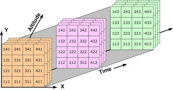
Basic components of a NetCDF file
A netCDF file contains dimensions, variables, and attributes. These components are used together to capture the meaning of data and relations among data fields in an array-oriented dataset. The following figure shows the structure of a netCDF file using the CDL (network Common Data form Language) notation. CDL is the ASCII format used to describe the content of a NetCDF file.
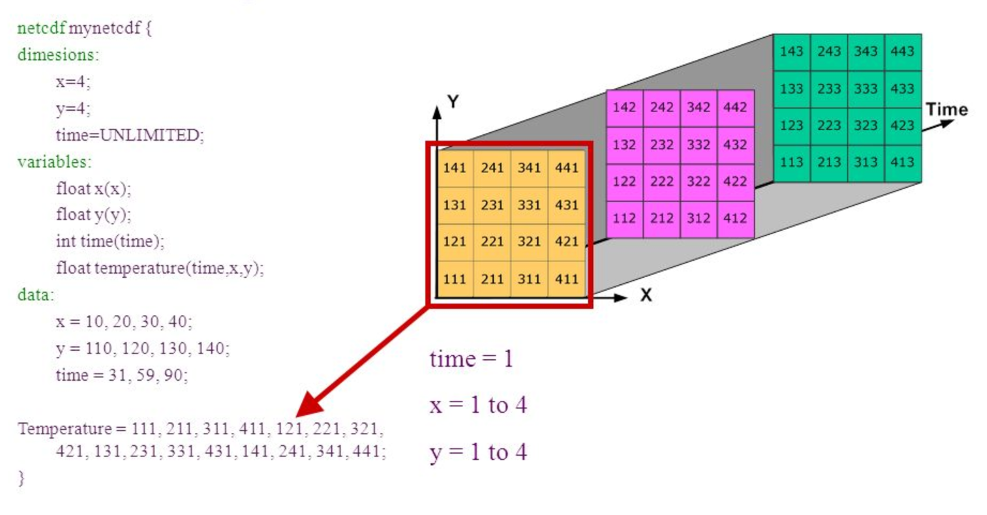
Dimensions
A NetCDF dimension is a named integer used to specify the shape of one or more of the multi-dimensional variables contained in a netCDF file. A dimension may be used to represent a real physical dimension, for example, time, latitude, longitude, or height; or more abstract quantities like station or model-run ID.
Every NetCDF dimension has both a name and a size.
- A dimension name is an arbitrary sequence of alphanumeric characters (as well as the underscore character,
_',and the hyphen character,-') beginning with a letter. Case is distinguished in netCDF names. - A dimension size is an arbitrary positive integer, except that one dimension in a netCDF file can have the size UNLIMITED. Such a dimension is called the unlimited dimension or the record dimension. A variable with an unlimited dimension can grow to any length along that dimension.
Variables
A variable represents an array of values of the same type. Variables are used to store the bulk of the data in a netCDF file.
A variable has a name, data type, and shape described by its list of dimensions specified when the variable is created. The number of dimensions is the rank (also known as dimensionality). A scalar variable has a rank of 0, a vector has a rank of 1, and a matrix has a rank of 2.
A variable can also have associated attributes that can be added, deleted, or changed after the variable is created.
Examples of variables are: temperature, salinity, oxygen, etc.
Coordinate variables
A one-dimensional variable with the same name as a dimension is a coordinate variable. It is associated with a dimension of one or more data variables and typically defines a physical coordinate corresponding to that dimension. 2D coordinate fiels will not be defined as dimensions.
Coordinate variables have no special meaning to the netCDF library. However, the software using this library should handle coordinate variables in a specialized way.
Attributes
NetCDF attributes are used to store ancillary data or metadata. Most attributes provide information about a specific variable. These attributes are identified by the name of the variable together with the name of the attribute.
Attributes that provide information about the entire netCDF file are global attributes. These attributes are identified by the attribute name together with a blank variable name (in CDL) or a special null variable ID (in C or Fortran).
What tools to use NetCDF with
Setting up a Notebook and loading NetCDF data using Python libraries is not the only way of accessing these data. Other tools are:
Command Line Interfaces
- Ncdump: Ncdump is the netCDF file reader that is bundled with Unidata’s netCDF product. To obtain it, visit the UCAR Unidata Web site.
- NetCDF Operators (NCO): The NCO are a suite of programs known as operators in which each operator is a standalone, command line program which is executed at the UNIX command prompt. To learn more and to download the operators, visit the NCO Hompage.
- Climate data operatores (CDO - https://code.mpimet.mpg.de/projects/cdo), also a collection of command-line operators to manipulate and analyze NetCDf data. It is not as popular as NCO, but still used.
GUI Interfaces
- Ncview: Ncview is a netCDF visual browser that allows the user to visually inspect NetCDF data files. To download ncview, visit David Pierce’s Ncview Web page.
- IDL NetCDF Reader: For users who are familiar with IDL, David Fanning has created a netCDF browser in IDL: ncdf_browser.pro. To download this procedure, visit the NCDF Browser section of David Fanning’s Web site.
- Panoply: Panoply is a JAVA application developed by NASA for viewing netCDF files. For more information and to download a copy, visit NASA’s Panoply netCDF Viewer Web page.
- NcBrowse: NcBrowse is a Java application that offers flexible, interactive graphical displays of data and its attributes from a wide range of netCDF data file conventions. For more information and to download a copy, visit NcBrowse: A Graphical NetCDF File Browser Web site
CMIP data
This is the dataset that we will be using for our class and is very known and widely used by oceanographers. The dataset is regular, linear, gridded data. It represent the mean monthly prescipitation flux (kg m-2 s-1) on a global scale.
CMIP (Coupled Model Intercomparison Projec) provides a community-based infrastructure in support of climate model diagnosis, validation, intercomparison, documentation and data access. This framework enables a diverse community of scientists to analyze GCMs in a systematic fashion, a process which serves to facilitate model improvement.
The acronym GCM originally stood for General Circulation Model. Recently, a second meaning came into use, namely Global Climate Model. While these do not refer to the same thing, General Circulation Models are typically the tools used for modelling climate, and hence the two terms are sometimes used interchangeably. However, the term “global climate model” is ambiguous and may refer to an integrated framework that incorporates multiple components including a general circulation model, or may refer to the general class of climate models that use a variety of means to represent the climate mathematically.
Python Libraries
There are 2 main libraries that are being used in Python to work with NetCDF data: xarray and iris. In this course we will use xarray, this library took the pandas concept and extended it to gridded data. Working with this package in Python is similar to the concepts and ideas as the Pandas library for tabular data. The Iris library has a more unique syntax.
The cartopy library is the package used to plot our data, it is designed for geospatial data processing in order to produce maps and other geospatial data analyses.
Sources:
CMIP5 Database: https://esgf-node.llnl.gov/projects/cmip5/
CMIP5 datastructure: https://portal.enes.org/data/enes-model-data/cmip5/datastructure
Tools: https://nsidc.org/data/netcdf/tools.html
Explanation file name: https://scienceofdoom.com/2020/05/16/extracting-rainfall-data-from-cmip5-models/
Terminology: http://cfconventions.org/Data/cf-conventions/cf-conventions-1.7/cf-conventions.html#terminology
Key Points
NetCDF is a format to store gridded data and widely use in climate science.
A netCDF file contains dimensions, variables, and attributes.
Xarray is a library to work with NetCDF data in Python.
CMIP data is used in climate modelling.
Visualising CMIP data
Overview
Teaching: 20 min
Exercises: 40 minQuestions
How can I create a quick plot of my CMIP data?
Objectives
Import the xarray library and use the functions it contains.
Convert precipitation units to mm/day.
Calculate and plot the precipitation climatology.
Use the cmocean library to find colormaps designed for ocean science.
As a first step towards making a visual comparison of the CSIRO-Mk3-6-0 and ACCESS1-3 historical precipitation climatology, we are going to create a quick plot of the ACCESS1-3 data.
access_pr_file = 'data/pr_Amon_ACCESS1-3_historical_r1i1p1_200101-200512.nc'
We will need a number of the libraries introduced in the previous lesson.
import xarray as xr
import cartopy.crs as ccrs
import matplotlib.pyplot as plt
import numpy as np
Since geographic data files can often be very large, when we first open our data file in xarray it simply loads the metadata associated with the file (this is known as “lazy loading”). We can then view summary information about the contents of the file before deciding whether we’d like to load some or all of the data into memory.
dset = xr.open_dataset(access_pr_file)
print(dset)
<xarray.Dataset>
Dimensions:    (bnds: 2, lat: 145, lon: 192, time: 60)
Coordinates:
  * time       (time) datetime64[ns] 2001-01-16T12:00:00 2001-02-15 ...
  * lat        (lat) float64 -90.0 -88.75 -87.5 -86.25 -85.0 -83.75 -82.5 ...
  * lon        (lon) float64 0.0 1.875 3.75 5.625 7.5 9.375 11.25 13.12 15.0 ...
Dimensions without coordinates: bnds
Data variables:
    pr         (time, lat, lon) float32 ...
    time_bnds  (time, bnds) float64 ...
    lat_bnds   (lat, bnds) float64 ...
    lon_bnds   (lon, bnds) float64 ...
Attributes:
    CDI:                    Climate Data Interface version 1.7.1 (http://mpim...
    CDO:                    Climate Data Operators version 1.7.1 (http://mpim...
    NCO:                    4.7.0
    associated_files:       baseURL: http://cmip-pcmdi.llnl.gov/CMIP5/dataLoc...
    branch_time:            90945.0
    cmor_version:           2.8.0
    comment:                at surface; includes both liquid and solid phases...
    contact:                The ACCESS wiki: http://wiki.csiro.au/confluence/...
    creation_date:          2012-02-08T06:45:54Z
    experiment:             historical
    experiment_id:          historical
    forcing:                GHG, Oz, SA, Sl, Vl, BC, OC, (GHG = CO2, N2O, CH4...
    frequency:              mon
    history:                Tue Sep 18 11:36:11 2018: /anaconda3/envs/ocean/b...
    initialization_method:  1
    institute_id:           CSIRO-BOM
    institution:            CSIRO (Commonwealth Scientific and Industrial Res...
    model_id:               ACCESS1.3
    modeling_realm:         atmos
    parent_experiment:      pre-industrial control
    parent_experiment_id:   piControl
    parent_experiment_rip:  r1i1p1
    physics_version:        1
    product:                output
    project_id:             CMIP5
    realization:            1
    references:             See http://wiki.csiro.au/confluence/display/ACCES...
    source:                 ACCESS1-3 2011. Atmosphere: AGCM v1.0 (N96 grid-p...
    table_id:               Table Amon (27 April 2011) 9c851218e3842df9a62ef3...
    title:                  ACCESS1-3 model output prepared for CMIP5 historical
    tracking_id:            26bfc8da-78ff-4b10-9e13-24492c09bb59
    version_number:         v20120413
    Conventions:            CF-1.5
We can see that our dset object is an xarray.Dataset,
which when printed shows all the metadata associated with our netCDF data file.
In this case, we are interested in the precipitation variable contained within that xarray Dataset:
print(dset['pr'])
<xarray.DataArray 'pr' (time: 60, lat: 145, lon: 192)>
[1670400 values with dtype=float32]
Coordinates:
  * time     (time) datetime64[ns] 2001-01-16T12:00:00 2001-02-15 ...
  * lat      (lat) float64 -90.0 -88.75 -87.5 -86.25 -85.0 -83.75 -82.5 ...
  * lon      (lon) float64 0.0 1.875 3.75 5.625 7.5 9.375 11.25 13.12 15.0 ...
Attributes:
    standard_name:  precipitation_flux
    long_name:      Precipitation
    units:          kg m-2 s-1
    cell_methods:   time: mean
We can actually use either the dset['pr'] or dset.pr syntax to access the precipitation
xarray.DataArray.
To calculate the precipitation climatology, we can make use of the fact that xarray DataArrays have built in functionality for averaging over their dimensions.
clim = dset['pr'].mean('time', keep_attrs=True)
print(clim)
<xarray.DataArray 'pr' (lat: 145, lon: 192)>
array([[2.542048e-06, 2.542048e-06, 2.542048e-06, ..., 2.541606e-06,
        2.541606e-06, 2.541606e-06],
       [2.511442e-06, 2.492513e-06, 2.472960e-06, ..., 2.570118e-06,
        2.550404e-06, 2.531296e-06],
       [2.396512e-06, 2.365124e-06, 2.330266e-06, ..., 2.472362e-06,
        2.455286e-06, 2.427222e-06],
       ...,
       [8.877672e-06, 8.903967e-06, 8.938327e-06, ..., 8.819357e-06,
        8.859161e-06, 8.873179e-06],
       [8.748589e-06, 8.739819e-06, 8.723918e-06, ..., 8.797057e-06,
        8.776324e-06, 8.789103e-06],
       [7.988647e-06, 7.988647e-06, 7.988647e-06, ..., 7.988647e-06,
        7.988647e-06, 7.988647e-06]], dtype=float32)
Coordinates:
  * lon      (lon) float64 0.0 1.875 3.75 5.625 7.5 9.375 11.25 13.12 15.0 ...
  * lat      (lat) float64 -90.0 -88.75 -87.5 -86.25 -85.0 -83.75 -82.5 ...
Attributes:
    standard_name:  precipitation_flux
    long_name:      Precipitation
    units:          kg m-2 s-1
    cell_methods:   time: mean
Dask
Rather than read the entire three dimensional (time, lat, lon) data array into memory and then calculate the climatology, xarray lazy loading has allowed us to only load the two dimensional (lat, lon) climatology. If the original 3D data array was much larger than the one we are analysing here (i.e. so large that we’d get a memory error if we attempted to calculate the climatology) xarray can make use of a library called Dask to break the task down into chunks and distribute it to multiple cores if needed.
Now that we’ve calculated the climatology, we want to convert the units from kg m-2 s-1 to something that we are a little more familiar with like mm day-1.
To do this, consider that 1 kg of rain water spread over 1 m2 of surface is 1 mm in thickness and that there are 86400 seconds in one day. Therefore, 1 kg m-2 s-1 = 86400 mm day-1.
The data associated with our xarray DataArray is simply a numpy array,
type(clim.data)
numpy.ndarray
so we can go ahead and multiply that array by 86400 and update the units attribute accordingly:
clim.data = clim.data * 86400
clim.attrs['units'] = 'mm/day'

print(clim)
<xarray.DataArray 'pr' (lat: 145, lon: 192)>
array([[0.219633, 0.219633, 0.219633, ..., 0.219595, 0.219595, 0.219595],
       [0.216989, 0.215353, 0.213664, ..., 0.222058, 0.220355, 0.218704],
       [0.207059, 0.204347, 0.201335, ..., 0.213612, 0.212137, 0.209712],
       ...,
       [0.767031, 0.769303, 0.772271, ..., 0.761992, 0.765432, 0.766643],
       [0.755878, 0.75512 , 0.753746, ..., 0.760066, 0.758274, 0.759379],
       [0.690219, 0.690219, 0.690219, ..., 0.690219, 0.690219, 0.690219]])
Coordinates:
  * lon      (lon) float64 0.0 1.875 3.75 5.625 7.5 9.375 11.25 13.12 15.0 ...
  * lat      (lat) float64 -90.0 -88.75 -87.5 -86.25 -85.0 -83.75 -82.5 ...
Attributes:
    standard_name:  precipitation_flux
    long_name:      Precipitation
    units:          mm/day
    cell_methods:   time: mean
We could now go ahead and plot our climatology using matplotlib,
but it would take many lines of code to extract all the latitude and longitude information
and to setup all the plot characteristics.
Recognising this burden,
the xarray developers have built on top of matplotlib.pyplot to make the visualisation
of xarray DataArrays much easier.
fig = plt.figure(figsize=[12,5])

ax = fig.add_subplot(111, projection=ccrs.PlateCarree(central_longitude=180))

clim.plot.contourf(ax=ax,
                   levels=np.arange(0, 13.5, 1.5),
                   extend='max',
                   transform=ccrs.PlateCarree(),
                   cbar_kwargs={'label': clim.units})
ax.coastlines()

plt.show()

The default colorbar used by matplotlib is viridis.
It used to be jet,
but that was changed a couple of years ago in response to the
#endtherainbow campaign.
Putting all the code together (and reversing viridis so that wet is purple and dry is yellow)…
import xarray as xr
import matplotlib.pyplot as plt
import cartopy.crs as ccrs
import numpy as np

access_pr_file = 'data/pr_Amon_ACCESS1-3_historical_r1i1p1_200101-200512.nc'

dset = xr.open_dataset(access_pr_file)

clim = dset['pr'].mean('time', keep_attrs=True)

clim.data = clim.data * 86400
clim.attrs['units'] = 'mm/day'

fig = plt.figure(figsize=[12,5])
ax = fig.add_subplot(111, projection=ccrs.PlateCarree(central_longitude=180))
clim.plot.contourf(ax=ax,
                   levels=np.arange(0, 13.5, 1.5),
                   extend='max',
                   transform=ccrs.PlateCarree(),
                   cbar_kwargs={'label': clim.units},
                   cmap='viridis_r')
ax.coastlines()
plt.show()

Color palette
Copy and paste the final slab of code above into your own Jupyter notebook.
The viridis color palette doesn’t seem quite right for rainfall. Change it to the “haline” cmocean palette used for ocean salinity data.
Solution
import cmocean

...
clim.plot.contourf(ax=ax,
                       ...
                       cmap=cmocean.cm.haline_r)
Season selection
Rather than plot the annual climatology, edit the code so that it plots the June-August (JJA) season.
(Hint: the groupby functionality can be used to group all the data into seasons prior to averaging over the time axis)
Solution
clim = dset['pr'].groupby('time.season').mean('time', keep_attrs=True)

clim.sel(season='JJA').plot.contourf(ax=ax,
Add a title
Add a title to the plot which gives the name of the model (taken from the
dsetattributes) followed by the words “precipitation climatology (JJA)”Solution
title = '%s precipitation climatology (JJA)' %(dset.attrs['model_id'])
plt.title(title)
Key Points
Libraries such as xarray can make loading, processing and visualising netCDF data much easier.
The cmocean library contains colormaps custom made for the ocean sciences.
Refresher
Overview
Teaching: 10 min
Exercises: 0 minQuestions
Objectives
Takeaways
Spreadsheets
- Never modify your raw data. Always make a copy before making any changes.
- Keep track of all of the steps you take to clean your data in a plain text file.
- Organize your data according to tidy data principles. The main takeaway here is that data should be both human and machine readable: Avoid using multiple tables within one spreadsheet, avoid spreading data across multiple tabs, record zeros as zeros, use an appropriate null value to record missing data, don’t use formatting to convey information or to make your spreadsheet look pretty, place comments in a separate column, record units in column headers, include only one piece of information in a cell, avoid spaces, numbers and special characters in column headers, avoid special characters in your data, record metadata in a separate plain text file. Store dates as strings preferibly in the ISO 8601 format. Export your table to a csv.
Python
One can assign a value to a variable in Python. Those variables can be of several types, such as string, integer, floating point and complex numbers.
Python Data structures:
- list:
another_list = ["blue", "green", "red"]- Lists contains an ordered sequence of elements. Each element can be accessed by an index. - tuple:
another_tuple = ("blue", "green", "red")- Tuples are order lists of elements, but immutable - Dictionary:
another_dict = {'first': 'one', 'second': 'two', 'third': 'three'}- Dictionaries are data structures that provide mappings between keys and values
Python uses 0-based indexing, in which the first element in a list, tuple or any other data structure has an index of 0.
Libraries enable us to extend the functionality of Python.
Pandas
One of the best options for working with tabular data in Python is the library Pandas (Python Data Analysis Library).
Pandas provides an object called DataFrame, this object represents tabular data. Dataframes are a 2-dimensional data structure and can store data of different types (including characters, integers, floating point values, factors and more) in columns.
Aggregating data using the groupby() function enables you to generate useful summaries of data quickly.
Dataframes can be subsetted in different ways including using labels (column headings), numeric ranges, or specific x,y index locations.
- dataframe[“column_name”]
- dataframe.column_name
- dataframe[[‘column_name1’,’column_name2’]]
- dataframe[0:3]
Subset rows and columns with .loc() and .iloc.
- loc is primarily label based indexing. Integers may be used but they are interpreted as a label.
- iloc is primarily integer based indexing
Data from multiple files can be combined into a single DataFrame using merge and concat.
Create a true copy of a data frame with .copy().
- true_copy_surveys_df = surveys_df.copy()
Using the ‘=’ operator creates another variable that references the same data frame.
- ref_surveys_df = surveys_df
A mask can be useful subset your dataframe based on a specific condition like where x > 5 or x is a null value.
pd.isnull(dataframe)will produce a dataframe with True or False values (Boolean).- dataframe[pd.isnull(dataframe).any(axis=1)] will apply a mask to a dataframe
Plotting
Matplotlib is a Python package that is widely used throughout the scientific Python community to create high-quality and publication-ready graphics.
Useful resources:
- Matplotlib gallery: https://matplotlib.org/gallery.html
- The PyViz.org website is an open platform for helping users decide on the best open-source (OSS) Python data visualization tools for their purposes, with links, overviews, comparisons, and examples.”
The plotnine package is built on top of Matplotlib and interacts well with Pandas, it supports the creation of complex plots from data in a dataframe. Plotnine graphics are built step by step by adding new elements adding different elements on top of each other using the + operator. Putting the individual steps together in brackets () provides Python-compatible syntax.
Setting up your Anaconda environment
Python is a popular language for research computing, and great for general-purpose programming as well. Installing all of its research packages individually can be a bit difficult, so we recommend Anaconda, an all-in-one installer. There are different version of the python language, but we use the latast one in this workshop Python version 3.x (e.g., 3.6 is fine).
The new MacOS “Catalina” proved to be difficult to install anaconda. These are links that users found useful in troubleshooting installing Anaconda with Mac Catalina:
Anaconda Navigator vs Conda
Once Anaconda is installed, interacting with the program can either happen using the user interface “Anaconda Navigator” or the command-line program “conda”:
- The command-line program conda is both a package manager and an environment manager. This helps data scientists ensure that each version of each package has all the dependencies it requires and works correctly. Windows users need the open “Anaconda Prompt” to be able to use the command-line easily, Mac and Linus user can open the command prompt directly.
- Anaconda Navigator is a, point-and-click way to work with packages and environments without needing to type conda commands in a terminal window. You can use it to find the packages you want, install them in an environment, run the packages, and update them.
Anaconda Environment
A conda environment is a directory that contains a specific collection of conda packages that you have installed. In order to run, many scientific packages depend on specific versions of other packages. Data scientists often use multiple versions of many packages and use multiple environments to separate these different versions. When an environment is not specified from the beginning and you isntall a package, it gets installend in the base environment.
Explore your conda set-up (command line instructions):
- Check the environments that you have installed:
conda env list - Activating an existing environment:
- Windows
activate environment_name - LINUX, macOS:
source activate environment_name
- Windows
- List all packages and versions installed in active environment:
conda list
Installing Packages
Note: Packages get installed in the environment that at that moment is active. Activate the required environment first before installing a package.
Some packages that you use in python are getting installend when anaconda, and can directly be imported in a script or notebook. Some packages can not be imported and need to be installed first.
- Installing a package:
conda install PACKAGENAME
The command above looks for the package on a default location where python packages get uploaded. However, sometimes packages are stored on a different location. The location where Conda searches for the package is called a channel. The pacage “plotnine” for example is not available on the default location and therefore need to have the channel specified where Conda should look for the package: conda install -c conda-forge plotnine
Jupyter Notebook
To correctly open jupyter notebook:
- Activate the environment that you want it to use first
- Type jupyter notebook in the command line to open up jupyter notebook
- Browse to the location that you want the notebook to open in i.e. the working folder/folder where your data is stored in. Our data should be on your desktop in the folder data-carpentry/data. But open the notebook in the folder data-carpentry.
Check installs
Check if your installs are running by importing the libraries in a jupyter notebook.
List all packages and versions installed in active environment: conda list
Where should your data be?
Desktop
- data-carpentry
- data
Data Workflows and Automation
- Loops help automate repetitive tasks over sets of items.
- Loops combined with functions provide a way to process data more efficiently than we could by hand.
- Conditional statements enable execution of different operations on different data.
- Functions enable code reuse.
Introduction to netCDF
- NetCDF is a format to store gridded data and widely use in climate science.
- A netCDF file contains dimensions, variables, and attributes.
- Xarray is a library to work with NetCDF data in Python.
- CMIP data is used in climate modelling.
A netCDF file contains dimensions, variables, and attributes.
Visualizing CMIP data
- Libraries such as xarray can make loading, processing and visualising netCDF data much easier.
- The cmocean library contains colormaps custom made for the ocean sciences.
import xarray as xr
import matplotlib.pyplot as plt
import cartopy.crs as ccrs
import numpy as np

access_pr_file = 'data/pr_Amon_ACCESS1-3_historical_r1i1p1_200101-200512.nc'

dset = xr.open_dataset(access_pr_file)

clim = dset['pr'].mean('time', keep_attrs=True)

clim.data = clim.data * 86400
clim.attrs['units'] = 'mm/day'

fig = plt.figure(figsize=[12,5])
ax = fig.add_subplot(111, projection=ccrs.PlateCarree(central_longitude=180))
clim.plot.contourf(ax=ax,
                   levels=np.arange(0, 13.5, 1.5),
                   extend='max',
                   transform=ccrs.PlateCarree(),
                   cbar_kwargs={'label': clim.units},
                   cmap='viridis_r')
ax.coastlines()
plt.show()
Functions
- Define a function using
def name(...params...). - The body of a function must be indented.
- Call a function using
name(...values...). - Use
help(thing)to view help for something. - Put docstrings in functions to provide help for that function.
- Specify default values for parameters when defining a function using
name=valuein the parameter list. - The readability of your code can be greatly enhanced by using numerous short functions.
- Write (and import) modules to avoid code duplication.
def plot_pr_climatology(pr_file, season, gridlines=False):
    """Plot the precipitation climatology.

    Args:
      pr_file (str): Precipitation data file
      season (str): Season (3 letter abbreviation, e.g. JJA)
      gridlines (bool): Select whether to plot gridlines

    """

    dset = xr.open_dataset(pr_file)
    clim = dset['pr'].groupby('time.season').mean('time', keep_attrs=True)
    clim = convert_pr_units(clim)
    create_plot(clim, dset.attrs['model_id'], season, gridlines=gridlines)
    plt.show()
Vectorisation - masking
- For large arrays, looping over each element can be slow in high-level languages like Python.
- Vectorised operations can be used to avoid looping over array elements.
A useful addition to our plot_precipitation_climatology.py script we apply a land or ocean mask.
Key Points
Functions
Overview
Teaching: 15 min
Exercises: 25 minQuestions
How can I define my own functions?
Objectives
Define a function that takes parameters.
Use docstrings to document functions.
Break our existing plotting code into a series of small, single-purpose functions.
In the previous lesson we created a plot of the ACCESS1-3 historical precipitation climatology using the following commands:
import xarray as xr
import matplotlib.pyplot as plt
import cartopy.crs as ccrs
import numpy as np
import cmocean

access_pr_file = 'data/pr_Amon_ACCESS1-3_historical_r1i1p1_200101-200512.nc'

dset = xr.open_dataset(access_pr_file)

clim = dset['pr'].groupby('time.season').mean('time', keep_attrs=True)

clim.data = clim.data * 86400
clim.attrs['units'] = 'mm/day'

fig = plt.figure(figsize=[12,5])
ax = fig.add_subplot(111, projection=ccrs.PlateCarree(central_longitude=180))
clim.sel(season='JJA').plot.contourf(ax=ax,
                                     levels=np.arange(0, 13.5, 1.5),
                                     extend='max',
                                     transform=ccrs.PlateCarree(),
                                     cbar_kwargs={'label': clim.units},
                                     cmap=cmocean.cm.haline_r)
ax.coastlines()

title = '%s precipitation climatology (JJA)' %(dset.attrs['model_id'])
plt.title(title)

plt.show()

If we wanted to create a similar plot for a different model and/or different month,
we could cut and paste the code and edit accordingly.
The problem with that (common) approach is that it increases the chances of a making a mistake.
If we manually updated the season to ‘DJF’ for the clim.sel(season= command
but forgot to update it when calling plt.title, for instance,
we’d have a mismatch between the data and title.
The cut and paste approach is also much more time consuming.
If we think of a better way to create this plot in future
(e.g. we might want to add gridlines using plt.gca().gridlines()),
then we have to find and update every copy and pasted instance of the code.
A better approach is to put the code in a function. The code itself then remains untouched, and we simply call the function with different input arguments.
def plot_pr_climatology(pr_file, season, gridlines=False):
    """Plot the precipitation climatology.

    Args:
      pr_file (str): Precipitation data file
      season (str): Season (3 letter abbreviation, e.g. JJA)
      gridlines (bool): Select whether to plot gridlines

    """

    dset = xr.open_dataset(pr_file)

    clim = dset['pr'].groupby('time.season').mean('time', keep_attrs=True)

    clim.data = clim.data * 86400
    clim.attrs['units'] = 'mm/day'

    fig = plt.figure(figsize=[12,5])
    ax = fig.add_subplot(111, projection=ccrs.PlateCarree(central_longitude=180))
    clim.sel(season=season).plot.contourf(ax=ax,
                                          levels=np.arange(0, 13.5, 1.5),
                                          extend='max',
                                          transform=ccrs.PlateCarree(),
                                          cbar_kwargs={'label': clim.units},
                                          cmap=cmocean.cm.haline_r)
    ax.coastlines()
    if gridlines:
        plt.gca().gridlines()

    title = '%s precipitation climatology (%s)' %(dset.attrs['model_id'], season)
    plt.title(title)
The docstring allows us to have good documentation for our function:
help(plot_pr_climatology)
Help on function plot_pr_climatology in module __main__:

plot_pr_climatology(pr_file, season, gridlines=False)
    Plot the precipitation climatology.

    Args:
      pr_file (str): Precipitation data file
      season (str): Season (3 letter abbreviation, e.g. JJA)
      gridlines (bool): Select whether to plot gridlines
We can now use this function to create exactly the same plot as before:
plot_pr_climatology('data/pr_Amon_ACCESS1-3_historical_r1i1p1_200101-200512.nc', 'JJA')
plt.show()
Plot a different model and season:
plot_pr_climatology('data/pr_Amon_CSIRO-Mk3-6-0_historical_r1i1p1_200101-200512.nc', 'DJF')
plt.show()

Or use the optional gridlines input argument
to change the default behaviour of the function
(keyword arguments are usually used for options
that the user will only want to change occasionally):
plot_pr_climatology('data/pr_Amon_CSIRO-Mk3-6-0_historical_r1i1p1_200101-200512.nc',
                    'DJF', gridlines=True)
plt.show()

Short functions
Our
plot_pr_climatologyfunction works, but at 16 lines of code it’s starting to get a little long. In general, people can only fit around 7-12 pieces of information in their short term memory. The readability of your code can therefore be greatly enhanced by keeping your functions short and sharp. The speed at which people can analyse their data is usually limited by the time it takes to read/understand/edit their code (as opposed to the time it takes the code to actually run), so the frequent use of short, well documented functions can dramatically speed up your data science.
- Cut and paste the
plot_pr_climatologyfunction (defined in the notes above) into your own notebook and try running it with different input arguments.- Break the contents of
plot_pr_climatologydown into a series of smaller functions, such that it reads as follows:def plot_pr_climatology(pr_file, season, gridlines=False): """Plot the precipitation climatology. Args: pr_file (str): Precipitation data file season (str): Season (3 letter abbreviation, e.g. JJA) gridlines (bool): Select whether to plot gridlines """ dset = xr.open_dataset(pr_file) clim = dset['pr'].groupby('time.season').mean('time', keep_attrs=True) clim = convert_pr_units(clim) create_plot(clim, dset.attrs['model_id'], season, gridlines=gridlines) plt.show()In other words, you’ll need to define new ,
convert_pr_unitsandcreate_plotfunctions using code from the existingplot_pr_climatologyfunction.Solution
def convert_pr_units(darray): """Convert kg m-2 s-1 to mm day-1. Args: darray (xarray.DataArray): Precipitation data """ darray.data = darray.data * 86400 darray.attrs['units'] = 'mm/day' return darray def create_plot(clim, model_name, season, gridlines=False): """Plot the precipitation climatology. Args: clim (xarray.DataArray): Precipitation climatology data season (str): Season """ fig = plt.figure(figsize=[12,5]) ax = fig.add_subplot(111, projection=ccrs.PlateCarree(central_longitude=180)) clim.sel(season=season).plot.contourf(ax=ax, levels=np.arange(0, 13.5, 1.5), extend='max', transform=ccrs.PlateCarree(), cbar_kwargs={'label': clim.units}, cmap=cmocean.cm.haline_r) ax.coastlines() if gridlines: plt.gca().gridlines() title = '%s precipitation climatology (%s)' %(model_name, season) plt.title(title) def plot_pr_climatology(pr_file, season, gridlines=False): """Plot the precipitation climatology. Args: pr_file (str): Precipitation data file season (str): Season (3 letter abbreviation, e.g. JJA) gridlines (bool): Select whether to plot gridlines """ dset = xr.open_dataset(pr_file) clim = dset['pr'].groupby('time.season').mean('time', keep_attrs=True) clim = convert_pr_units(clim) create_plot(clim, dset.attrs['model_id'], season, gridlines=gridlines) plt.show()
Writing your own modules
We’ve used functions to avoid code duplication in this particular notebook/script, but what if we wanted to convert precipitation units from kg m-2 s-1 to mm/day in a different notebook/script?
To avoid cutting and pasting from this notebook/script to another, the solution would be to place the
convert_pr_unitsfunction in a separate script full of similar functions.For instance, we could put all our unit conversion functions in a script called
unit_conversion.py. When we want to convert precipitation units (in any script or notebook we’re working on), we can simply import that “module” and use theconvert_pr_unitsfunction:import unit_conversion clim.data = unit_conversion.convert_pr_units(clim.data)No copy and paste required!
Key Points
Define a function using
def name(...params...).The body of a function must be indented.
Call a function using
name(...values...).Use
help(thing)to view help for something.Put docstrings in functions to provide help for that function.
Specify default values for parameters when defining a function using
name=valuein the parameter list.The readability of your code can be greatly enhanced by using numerous short functions.
Write (and import) modules to avoid code duplication.
Vectorisation
Overview
Teaching: 15 min
Exercises: 15 minQuestions
How can I avoid looping over each element of large data arrays?
Objectives
Use surface land fraction data to mask the land or ocean.
Use the vectorised operations available in the
numpylibrary to avoid looping over array elements.
A useful addition to our plot_precipitation_climatology.py script
would be the option to apply a land or ocean mask.
To do this, we need to use the land area fraction file.
import numpy as np
import xarray as xr
access_sftlf_file = 'data/sftlf_fx_ACCESS1-3_historical_r0i0p0.nc'
dset = xr.open_dataset(access_sftlf_file)
sftlf = dset['sftlf']
print(sftlf)
<xarray.DataArray 'sftlf' (lat: 145, lon: 192)>
array([[100., 100., 100., ..., 100., 100., 100.],
[100., 100., 100., ..., 100., 100., 100.],
[100., 100., 100., ..., 100., 100., 100.],
...,
[ 0., 0., 0., ..., 0., 0., 0.],
[ 0., 0., 0., ..., 0., 0., 0.],
[ 0., 0., 0., ..., 0., 0., 0.]], dtype=float32)
Coordinates:
* lat (lat) float64 -90.0 -88.75 -87.5 -86.25 -85.0 -83.75 -82.5 ...
* lon (lon) float64 0.0 1.875 3.75 5.625 7.5 9.375 11.25 13.12 15.0 ...
Attributes:
standard_name: land_area_fraction
long_name: Land Area Fraction
units: %
original_units: 1
cell_measures: area: areacella
associated_files: baseURL: http://cmip-pcmdi.llnl.gov/CMIP5/dataLocation...
The data in a sftlf file assigns each grid cell a percentage value between 0% (no land) to 100% (all land).
print(sftlf.data.max())
print(sftlf.data.min())
100.0
0.0
To apply a mask to our plot,
the value of all the data points we’d like to mask needs to be set to np.nan.
The most obvious solution to applying a land mask, for example,
might therefore be to loop over each cell in our data array and decide whether
it is a land point (and thus needs to be set to np.nan).
(For this example, we are going to define land as any grid point that is more than 50% land.)
dset = xr.open_dataset('data/pr_Amon_ACCESS1-3_historical_r1i1p1_200101-200512.nc')
clim = dset['pr'].mean('time', keep_attrs=True)
nlats, nlons = clim.data.shape
for y in range(nlats):
for x in range(nlons):
if sftlf.data[y, x] > 50:
clim.data[y, x] = np.nan
While this approach technically works, the problem is that (a) the code is hard to read, and (b) in contrast to low level languages like Fortran and C, high level languages like Python and Matlab are built for usability (i.e. they make it easy to write concise, readable code) as opposed to speed. This particular array is so small that the looping isn’t noticably slow, but in general looping over every data point in an array should be avoided.
Fortunately, there are lots of numpy functions
(which are written in C under the hood)
that allow you to get around this problem
by applying a particular operation to an entire array at once
(which is known as a vectorised operation).
The np.where function, for instance,
allows you to make a true/false decision at each data point in the array
and then perform a different action depending on the answer.
The developers of xarray have built-in the np.where functionality,
so creating a new DataArray with the land masked becomes a one-line command:
clim_ocean = clim.where(sftlf.data < 50)
print(clim_ocean)
<xarray.DataArray 'pr' (lat: 145, lon: 192)>
array([[ nan, nan, nan, ..., nan,
nan, nan],
[ nan, nan, nan, ..., nan,
nan, nan],
[ nan, nan, nan, ..., nan,
nan, nan],
...,
[8.877672e-06, 8.903967e-06, 8.938327e-06, ..., 8.819357e-06,
8.859161e-06, 8.873179e-06],
[8.748589e-06, 8.739819e-06, 8.723918e-06, ..., 8.797057e-06,
8.776324e-06, 8.789103e-06],
[7.988647e-06, 7.988647e-06, 7.988647e-06, ..., 7.988647e-06,
7.988647e-06, 7.988647e-06]], dtype=float32)
Coordinates:
* lon (lon) float64 0.0 1.875 3.75 5.625 7.5 9.375 11.25 13.12 15.0 ...
* lat (lat) float64 -90.0 -88.75 -87.5 -86.25 -85.0 -83.75 -82.5 ...
Mask option
Modify
plot_precipitation_climatology.pyso that the user can choose to apply a mask via the followingargparseoption:parser.add_argument("--mask", type=str, nargs=2, metavar=('SFTLF_FILE', 'REALM'), default=None, help="""Provide sftlf file and realm to mask ('land' or 'ocean')""")This should involve defining a new function called
apply_mask(), in order to keepmain()short and readable.Test to see if your mask worked by plotting the ACCESS1-3 climatology for JJA:
$ python plot_precipitation_climatology.py data/pr_Amon_ACCESS1-3_historical_r1i1p1_200101-200512.nc JJA pr_Amon_ACCESS1-3_historical_r1i1p1_200101-200512-JJA-clim_land-mask.png --mask data/sftlf_fx_ACCESS1-3_historical_r0i0p0.nc oceanCommit the changes to git and then push to GitHub.
Solution
Make the following additions to
plot_precipitation_climatology.py(code omitted from this abbreviated version of the script is denoted...):def apply_mask(darray, sftlf_file, realm): """Mask ocean or land using a sftlf (land surface fraction) file. Args: darray (xarray.DataArray): Data to mask sftlf_file (str): Land surface fraction file realm (str): Realm to mask """ dset = xr.open_dataset(sftlf_file) if realm == 'land': masked_darray = darray.where(dset['sftlf'].data < 50) else: masked_darray = darray.where(dset['sftlf'].data > 50) return masked_darray ... def main(inargs): """Run the program.""" dset = xr.open_dataset(inargs.pr_file) clim = dset['pr'].groupby('time.season').mean('time', keep_attrs=True) clim = convert_pr_units(clim) if inargs.mask: sftlf_file, realm = inargs.mask clim = apply_mask(clim, sftlf_file, realm) ... if __name__ == '__main__': description='Plot the precipitation climatology for a given season.' parser = argparse.ArgumentParser(description=description) ... parser.add_argument("--mask", type=str, nargs=2, metavar=('SFTLF_FILE', 'REALM'), default=None, help="""Provide sftlf file and realm to mask ('land' or 'ocean')""") args = parser.parse_args() main(args)
plot_precipitation_climatology.py
At the conclusion of this lesson your
plot_precipitation_climatology.pyscript should look something like the following:import argparse import numpy as np import matplotlib.pyplot as plt import xarray as xr import cartopy.crs as ccrs import cmocean def convert_pr_units(darray): """Convert kg m-2 s-1 to mm day-1. Args: darray (xarray.DataArray): Precipitation data """ darray.data = darray.data * 86400 darray.attrs['units'] = 'mm/day' return darray def apply_mask(darray, sftlf_file, realm): """Mask ocean or land using a sftlf (land surface fraction) file. Args: darray (xarray.DataArray): Data to mask sftlf_file (str): Land surface fraction file realm (str): Realm to mask """ dset = xr.open_dataset(sftlf_file) if realm == 'land': masked_darray = darray.where(dset['sftlf'].data < 50) else: masked_darray = darray.where(dset['sftlf'].data > 50) return masked_darray def create_plot(clim, model_name, season, gridlines=False, levels=None): """Plot the precipitation climatology. Args: clim (xarray.DataArray): Precipitation climatology data model_name (str): Name of the climate model season (str): Season Kwargs: gridlines (bool): Select whether to plot gridlines levels (list): Tick marks on the colorbar """ if not levels: levels = np.arange(0, 13.5, 1.5) fig = plt.figure(figsize=[12,5]) ax = fig.add_subplot(111, projection=ccrs.PlateCarree(central_longitude=180)) clim.sel(season=season).plot.contourf(ax=ax, levels=levels, extend='max', transform=ccrs.PlateCarree(), cbar_kwargs={'label': clim.units}, cmap=cmocean.cm.haline_r) ax.coastlines() if gridlines: plt.gca().gridlines() title = '%s precipitation climatology (%s)' %(model_name, season) plt.title(title) def main(inargs): """Run the program.""" dset = xr.open_dataset(inargs.pr_file) clim = dset['pr'].groupby('time.season').mean('time', keep_attrs=True) clim = convert_pr_units(clim) if inargs.mask: sftlf_file, realm = inargs.mask clim = apply_mask(clim, sftlf_file, realm) create_plot(clim, dset.attrs['model_id'], inargs.season, gridlines=inargs.gridlines, levels=inargs.cbar_levels) plt.savefig(inargs.output_file, dpi=200) if __name__ == '__main__': description='Plot the precipitation climatology for a given season.' parser = argparse.ArgumentParser(description=description) parser.add_argument("pr_file", type=str, help="Precipitation data file") parser.add_argument("season", type=str, help="Season to plot") parser.add_argument("output_file", type=str, help="Output file name") parser.add_argument("--gridlines", action="store_true", default=False, help="Include gridlines on the plot") parser.add_argument("--cbar_levels", type=float, nargs='*', default=None, help='list of levels / tick marks to appear on the colorbar') parser.add_argument("--mask", type=str, nargs=2, metavar=('SFTLF_FILE', 'REALM'), default=None, help="""Provide sftlf file and realm to mask ('land' or 'ocean')""") args = parser.parse_args() main(args)
Key Points
For large arrays, looping over each element can be slow in high-level languages like Python.
Vectorised operations can be used to avoid looping over array elements.
Command line programs
Overview
Teaching: 20 min
Exercises: 30 minQuestions
How can I write my own command line programs?
Objectives
Use the
argparselibrary to manage command-line arguments in a program.Structure Python scripts according to a simple template.
We’ve arrived at the point where we have successfully defined the functions required to plot the precipitation data.
We could continue to execute these functions from the Jupyter notebook, but in most cases notebooks are simply used to try things out and/or take notes on a new data analysis task. Once you’ve scoped out the task (as we have for plotting the precipitation climatology), that code can be transferred to a Python script so that it can be executed at the command line. It’s likely that your data processing workflows will include command line utilities from the CDO and NCO projects in addition to Python code, so the command line is the natural place to manage your workflows (e.g. using shell scripts or make files).
For this lesson we recommend using Anaconda Prompt(Win) Terminal(Mac/Linux). But if you have a preferred way to work with python3 on a command line you can use it as long as you are working in an environment that has our required python packages for the workshop.
In general, the first thing that gets added to any Python script is the following:
if __name__ == '__main__':
main()
The reason we need these two lines of code is that running a Python script in bash is very similar to importing that file in Python. The biggest difference is that we don’t expect anything to happen when we import a file, whereas when running a script we expect to see some output (e.g. an output file, figure and/or some text printed to the screen).
The __name__ variable exists to handle these two situations.
When you import a Python file __name__ is set to the name of that file
(e.g. when importing script.py, __name__ is script),
but when running a script in bash __name__ is always set to __main__.
The convention is to call the function that produces the output main(),
but you can call it whatever you like.
The next thing you’ll need is a library to parse the command line for input arguments. The most widely used option is argparse.
Putting those together, here’s a template for what most python command line programs look like:
$ cat script_template.py
import argparse
#
# All your functions (that will be called by main()) go here.
#
def main(inargs):
"""Run the program."""
print('Input file: ', inargs.infile)
print('Output file: ', inargs.outfile)
if __name__ == '__main__':
description='Print the input arguments to the screen.'
parser = argparse.ArgumentParser(description=description)
parser.add_argument("infile", type=str, help="Input file name")
parser.add_argument("outfile", type=str, help="Output file name")
args = parser.parse_args()
main(args)
By running script_template.py at the command line
we’ll see that argparse handles all the input arguments:
$ python script_template.py in.nc out.nc
Input file: in.nc
Output file: out.nc
It also generates help information for the user:
$ python script_template.py -h
usage: script_template.py [-h] infile outfile
Print the input arguments to the screen.
positional arguments:
infile Input file name
outfile Output file name
optional arguments:
-h, --help show this help message and exit
and issues errors when users give the program invalid arguments:
$ python script_template.py in.nc
usage: script_template.py [-h] infile outfile
script_template.py: error: the following arguments are required: outfile
Using this template as a starting point,
we can add the functions we developed previously to a script called we called
plot_precipitation_climatology.py in the last lesson.
Let’s look at some functions we used in plot_precipitation_climatology.py in the last lesson. There are some functions here we can use in our new structure.
$ cat plot_precipitation_climatology.py
import xarray as xr
import matplotlib.pyplot as plt
import cartopy.crs as ccrs
import numpy as np
import cmocean
def convert_pr_units(darray):
"""Convert kg m-2 s-1 to mm day-1.
Args:
darray (xarray.DataArray): Precipitation data
"""
darray.data = darray.data * 86400
darray.attrs['units'] = 'mm/day'
return darray
def create_plot(clim, model_name, season, gridlines=False):
"""Plot the precipitation climatology.
Args:
clim (xarray.DataArray): Precipitation climatology data
season (str): Season
"""
fig = plt.figure(figsize=[12,5])
ax = fig.add_subplot(111, projection=ccrs.PlateCarree(central_longitude=180))
clim.sel(season=season).plot.contourf(ax=ax,
levels=np.arange(0, 13.5, 1.5),
extend='max',
transform=ccrs.PlateCarree(),
cbar_kwargs={'label': clim.units},
cmap=cmocean.cm.haline_r)
ax.coastlines()
if gridlines:
plt.gca().gridlines()
title = '%s precipitation climatology (%s)' %(model_name, season)
plt.title(title)
def plot_pr_climatology(pr_file, season, gridlines=False):
    """Plot the precipitation climatology.

    Args:
      pr_file (str): Precipitation data file
      season (str): Season (3 letter abbreviation, e.g. JJA)
      gridlines (bool): Select whether to plot gridlines

    """

    dset = xr.open_dataset(pr_file)
    clim = dset['pr'].groupby('time.season').mean('time', keep_attrs=True)
    clim = convert_pr_units(clim)
    create_plot(clim, dset.attrs['model_id'], season, gridlines=gridlines)
    plt.show()
After modifying plot_precipitation_climatology.py to use the same structure as our script template. We can add a main() function, if __name__ == '__main__': and argparse. After making these changes plot_precipitation_climatology.py should match the version we had you download in preparation for this lesson.
You can download a copy of this script by right clicking this link and choosing “Save link as…” plot_precipitation_climatology.py. It looks like this:
$ cat plot_precipitation_climatology.py
import argparse
import xarray as xr
import matplotlib.pyplot as plt
import cartopy.crs as ccrs
import numpy as np
import cmocean
def convert_pr_units(darray):
"""Convert kg m-2 s-1 to mm day-1.
Args:
darray (xarray.DataArray): Precipitation data
"""
darray.data = darray.data * 86400
darray.attrs['units'] = 'mm/day'
return darray
def create_plot(clim, model_name, season, gridlines=False):
"""Plot the precipitation climatology.
Args:
clim (xarray.DataArray): Precipitation climatology data
model_name (str): Name of the climate model
season (str): Season
Kwargs:
gridlines (bool): Select whether to plot gridlines
"""
fig = plt.figure(figsize=[12,5])
ax = fig.add_subplot(111, projection=ccrs.PlateCarree(central_longitude=180))
clim.sel(season=season).plot.contourf(ax=ax,
levels=np.arange(0, 13.5, 1.5),
extend='max',
transform=ccrs.PlateCarree(),
cbar_kwargs={'label': clim.units},
cmap=cmocean.cm.haline_r)
ax.coastlines()
if gridlines:
plt.gca().gridlines()
title = '%s precipitation climatology (%s)' %(model_name, season)
plt.title(title)
def main(inargs):
"""Run the program."""
dset = xr.open_dataset(inargs.pr_file)
clim = dset['pr'].groupby('time.season').mean('time', keep_attrs=True)
clim = convert_pr_units(clim)
create_plot(clim, dset.attrs['model_id'], inargs.season)
plt.savefig(inargs.output_file, dpi=200)
if __name__ == '__main__':
description='Plot the precipitation climatology.'
parser = argparse.ArgumentParser(description=description)
parser.add_argument("pr_file", type=str, help="Precipitation data file")
parser.add_argument("season", type=str, help="Season to plot")
parser.add_argument("output_file", type=str, help="Output file name")
args = parser.parse_args()
main(args)
Let’s review what changed in plot_precipitation_climatology.py
… and then run it at the command line like this:
$ python plot_precipitation_climatology.py data/pr_Amon_ACCESS1-3_historical_r1i1p1_200101-200512.nc MAM plots/pr_Amon_ACCESS1-3_historical_r1i1p1_200101-200512-MAM-clim.png
Makes sure to adjust the above file paths to match the structure on your computer. In the above command, the input file is in a data folder and I made a folder called plots to store my output images.
Choices
For this series of challenges, you are required to make improvements to the
plot_precipitation_climatology.pyscript that you downloaded earlier.For the first improvement, edit the line of code that defines the season command line argument (
parser.add_argument("season", type=str, help="Season to plot")) so that it only allows the user to input a valid three letter abbreviation (i.e.['DJF', 'MAM', 'JJA', 'SON']).(Hint: Read about the
choiceskeyword argument at the argparse tutorial.)Solution
parser.add_argument("season", type=str, choices=['DJF', 'MAM', 'JJA', 'SON'], help="Season to plot")
Gridlines
Add an optional command line argument that allows the user to add gridlines to the plot.
(Hint: Read about the
action="store_true"keyword argument at the argparse tutorial.)Solution
Make the following additions to
plot_precipitation_climatology.py(code omitted from this abbreviated version of the script is denoted...):... def main(inargs): ... create_plot(clim, dset.attrs['model_id'], inargs.season, gridlines=inargs.gridlines) ... if __name__ == '__main__': ... parser.add_argument("--gridlines", action="store_true", default=False, help="Include gridlines on the plot") ...
Colorbar levels
Add an optional command line argument that allows the user to specify the tick levels used in the colourbar
(Hint: You’ll need to use the
nargs='*'keyword argument.)Solution
Make the following additions to
plot_precipitation_climatology.py(code omitted from this abbreviated version of the script is denoted...):... def create_plot(clim, model_name, season, gridlines=False, levels=None): """Plot the precipitation climatology. ... Kwargs: gridlines (bool): Select whether to plot gridlines levels (list): Tick marks on the colorbar """ if not levels: levels = np.arange(0, 13.5, 1.5) ... clim.sel(season=season).plot.contourf(ax=ax, levels=levels, ... def main(inargs): ... create_plot(clim, dset.attrs['model_id'], inargs.season, gridlines=inargs.gridlines, levels=inargs.cbar_levels) ... if __name__ == '__main__': ... parser.add_argument("--cbar_levels", type=float, nargs='*', default=None, help='list of levels / tick marks to appear on the colorbar') ...
Free time
Add any other options you’d like for customising the plot (e.g. title, axis labels, figure size).
plot_precipitation_climatology.py
At the conclusion of this lesson your
plot_precipitation_climatology.pyscript should look something like the following:import argparse import xarray as xr import matplotlib.pyplot as plt import cartopy.crs as ccrs import numpy as np import cmocean def convert_pr_units(darray): """Convert kg m-2 s-1 to mm day-1. Args: darray (xarray.DataArray): Precipitation data """ darray.data = darray.data * 86400 darray.attrs['units'] = 'mm/day' return darray def create_plot(clim, model_name, season, gridlines=False, levels=None): """Plot the precipitation climatology. Args: clim (xarray.DataArray): Precipitation climatology data model_name (str): Name of the climate model season (str): Season Kwargs: gridlines (bool): Select whether to plot gridlines levels (list): Tick marks on the colorbar """ if not levels: levels = np.arange(0, 13.5, 1.5) fig = plt.figure(figsize=[12,5]) ax = fig.add_subplot(111, projection=ccrs.PlateCarree(central_longitude=180)) clim.sel(season=season).plot.contourf(ax=ax, levels=levels, extend='max', transform=ccrs.PlateCarree(), cbar_kwargs={'label': clim.units}, cmap=cmocean.cm.haline_r) ax.coastlines() if gridlines: plt.gca().gridlines() title = '%s precipitation climatology (%s)' %(model_name, season) plt.title(title) def main(inargs): """Run the program.""" dset = xr.open_dataset(inargs.pr_file) clim = dset['pr'].groupby('time.season').mean('time', keep_attrs=True) clim = convert_pr_units(clim) create_plot(clim, dset.attrs['model_id'], inargs.season, gridlines=inargs.gridlines, levels=inargs.cbar_levels) plt.savefig(inargs.output_file, dpi=200) if __name__ == '__main__': description='Plot the precipitation climatology.' parser = argparse.ArgumentParser(description=description) parser.add_argument("pr_file", type=str, help="Precipitation data file") parser.add_argument("season", type=str, help="Season to plot") parser.add_argument("output_file", type=str, help="Output file name") parser.add_argument("--gridlines", action="store_true", default=False, help="Include gridlines on the plot") parser.add_argument("--cbar_levels", type=float, nargs='*', default=None, help='list of levels / tick marks to appear on the colorbar') args = parser.parse_args() main(args)
Key Points
Libraries such as
argparsecan be used the efficiently handle command line arguments.Most Python scripts have a similar structure that can be used as a template.
Version control
Overview
Teaching: 35 min
Exercises: 0 minQuestions
How can I record the revision history of my code?
Objectives
Configure
gitthe first time it is used on a computer.Create a local Git repository.
Go through the modify-add-commit cycle for one or more files.
Explain what the HEAD of a repository is and how to use it.
Identify and use Git commit numbers.
Compare various versions of tracked files.
Restore old versions of files.
Follow along
For this lesson participants follow along command by command, rather than observing and then completing challenges afterwards.
What is version control?
A version control system stores a main copy of your code in a repository, which you can’t edit directly.
Instead, you checkout a working copy of the code, edit that code, then commit changes back to the repository.
In this way, the system records a complete revision history (i.e. of every commit), so that you can retrieve and compare previous versions at any time.
This is useful from an individual viewpoint, because you don’t need to store multiple (but slightly different) copies of the same script.

“Piled Higher and Deeper” by Jorge Cham, http://www.phdcomics.com
It’s also useful from a collaboration viewpoint (including collaborating with yourself across different computers) because the system keeps a record of who made what changes and when.
What is Git?
- git is software that lets you work on a set of files without losing track of previous versions of those files
- git enables multiple people to work on the same set of files simultaneously
- git keeps track of changes in a repository so that they
- won’t be lost
- they can be shared
- git is one of several tools for revision control, also known as version control
What is Github?
We will delve into github a bit more in the next lesson.
- GitHub is a free* website that makes it easier to use git.
- GitHub facilitates creating, browsing, and sharing git repositories
- GitHub provides tools that complement git, such as software licensing, issue tracking, wikis, and various kinds of automation
- GitHub includes visualizations that help you understand your version history such as side by side views of changed versions with differences color-coded.
- GitHub is one of the largest collections of open-source software in the world
- GitHub is one of several websites and/or tools that work with git; Others include Bitbucket and GitLab
Frequently Asked Questions
- Is git just for code?
- No, but you should generally only use it for small text files (small = <1MB) because it’s designed and optimized for code.
- Can I use git with my favorite programming tools?
- Yes
- Is git hard to learn?
- Yes and no. Commands are simple, concepts can be tricky at first.
- Is GitHub just for open-source software?
- No, you can use it for copyrighted software and you can create private repositories
- Can I use git without using GitHub?
- Yes
- Is github free?
- Yes, the core functionality of github is free though there are some limitations such as the number of collaborators in a private repository. There is no longer a limit to the number of private repositories you create in a free account.
More resources
- Git and GitHub tutorial by Joe Futrelle, WHOI IS App Dev, 19 June 2020
- Disclaimer: Github continues to update how the site looks and add new features. Some of the screenshots may look different now. Special thanks to Joe for allowing us to pull content from his workshop for this lesson.
- link to slides
- link to recording
- Software Carpentry: Version Control with Git
- Git cheat sheet
Setup to work with Git locally on your computer
It is possible to use github.com alone to manage your version control, but we are going to show you how to use Git locally to work with files on your computer. This will help demonstrate the foundational concepts of git and make what you see in github clearer.
When we use Git on a new computer for the first time, we need to configure a few things.
We recommend following along with “Git Bash” application for Windows and Terminal (Linux/Mac).
$ git config --global user.name "Your Name"
$ git config --global user.email "you@email.com"
This user name and email will be associated with your subsequent Git activity, which means that any changes pushed to GitHub, BitBucket, GitLab or another Git host server later on in this lesson will include this information.
You only need to run these configuration commands once - git will remember then for next time.
We then need to navigate to our data-carpentry directory
and tell Git to initialise that directory as a Git repository.
$ cd ~/Desktop/data-carpentry
$ git init
If we use ls to show the directory’s contents,
it appears that nothing has changed:
$ ls -F
data/ script_template.py
plot_precipitation_climatology.py
But if we add the -a flag to show everything,
we can see that Git has created a hidden directory within data-carpentry called .git:
$ ls -F -a
./ data/
../ plot_precipitation_climatology.py
.git/ script_template.py
Git stores information about the project in this special sub-directory. If we ever delete it, we will lose the project’s history.
We can check that everything is set up correctly by asking Git to tell us the status of our project:
$ git status
$ git status
On branch master
Initial commit
Untracked files:
(use "git add <file>..." to include in what will be committed)
data/
plot_precipitation_climatology.py
script_template.py
nothing added to commit but untracked files present (use "git add" to track)
Tracking changes
The “untracked files” message means that there’s a file/s in the directory
that Git isn’t keeping track of.
We can tell Git to track a file using git add:
$ git add plot_precipitation_climatology.py
and then check that the right thing happened:
$ git status
On branch master
Initial commit
Changes to be committed:
(use "git rm --cached <file>..." to unstage)
new file: plot_precipitation_climatology.py
Untracked files:
(use "git add <file>..." to include in what will be committed)
data/
script_template.py
Git now knows that it’s supposed to keep track of plot_precipitation_climatology.py,
but it hasn’t recorded these changes as a commit yet.
To get it to do that,
we need to run one more command:
$ git commit -m "Initial commit of precip climatology script"
[master (root-commit) 32b1b66] Initial commit of precip climatology script
1 file changed, 121 insertions(+)
create mode 100644 plot_precipitation_climatology.py
When we run git commit,
Git takes everything we have told it to save by using git add
and stores a copy permanently inside the special .git directory.
This permanent copy is called a commit (or revision)
and its short identifier is 32b1b66
(Your commit may have another identifier.)
We use the -m flag (for “message”)
to record a short, descriptive, and specific comment that will help us remember later on what we did and why.
If we just run git commit without the -m option,
Git will launch nano (or whatever other editor we configured as core.editor)
so that we can write a longer message.
If we run git status now:
$ git status
On branch master
Untracked files:
(use "git add <file>..." to include in what will be committed)
data/
script_template.py
nothing added to commit but untracked files present (use "git add" to track)
it tells us everything is up to date.
If we want to know what we’ve done recently,
we can ask Git to show us the project’s history using git log:
$ git log
commit 32b1b664a647abbbe46a12ce98b25fa2cbbb7c76
Author: Damien Irving <my@email.com>
Date: Mon Dec 18 14:30:16 2017 +1100
Initial commit of precip climatology script
git log lists all commits made to a repository in reverse chronological order.
The listing for each commit includes
the commit’s full identifier
(which starts with the same characters as
the short identifier printed by the git commit command earlier),
the commit’s author,
when it was created,
and the log message Git was given when the commit was created.
Let’s go ahead and open our favourite text editor and
make a small change to plot_precipitation_climatology.py
by editing the description variable
(which is used by argparse in the help information it displays at the command line).
description='Plot the precipitation climatology for a given season.'
When we run git status now,
it tells us that a file it already knows about has been modified:
$ git status
On branch master
Changes not staged for commit:
(use "git add <file>..." to update what will be committed)
(use "git checkout -- <file>..." to discard changes in working directory)
modified: plot_precipitation_climatology.py
Untracked files:
(use "git add <file>..." to include in what will be committed)
data/
script_template.py
no changes added to commit (use "git add" and/or "git commit -a")
The last line is the key phrase:
“no changes added to commit”.
We have changed this file,
but we haven’t told Git we will want to save those changes
(which we do with git add)
nor have we saved them (which we do with git commit).
So let’s do that now. It is good practice to always review
our changes before saving them. We do this using git diff.
This shows us the differences between the current state
of the file and the most recently saved version:
$ git diff
$ git diff
diff --git a/plot_precipitation_climatology.py b/plot_precipitation_climatology.
index 056b433..a0aa9e4 100644
--- a/plot_precipitation_climatology.py
+++ b/plot_precipitation_climatology.py
@@ -99,7 +99,7 @@ def main(inargs):
if __name__ == '__main__':
- description='Plot the precipitation climatology.'
+ description='Plot the precipitation climatology for a given season.'
parser = argparse.ArgumentParser(description=description)
parser.add_argument("pr_file", type=str,
The output is cryptic because
it is actually a series of commands for tools like editors and patch
telling them how to reconstruct one file given the other.
If we break it down into pieces:
- The first line tells us that Git is producing output similar to the Unix
diffcommand comparing the old and new versions of the file. - The second line tells exactly which versions of the file
Git is comparing;
056b433anda0aa9e4are unique computer-generated labels for those versions. - The third and fourth lines once again show the name of the file being changed.
- The remaining lines are the most interesting, they show us the actual differences
and the lines on which they occur.
In particular,
the
+marker in the first column shows where we added a line.
After reviewing our change, it’s time to commit it:
$ git commit -m "Small improvement to help information"
On branch master
Changes not staged for commit:
modified: plot_precipitation_climatology.py
Untracked files:
data/
script_template.py
no changes added to commit
Whoops:
Git won’t commit because we didn’t use git add first.
Let’s fix that:
$ git add plot_precipitation_climatology.py
$ git commit -m "Small improvement to help information"
[master 444c3c0] Small improvement to help information
1 file changed, 1 insertion(+), 1 deletion(-)
Git insists that we add files to the set we want to commit
before actually committing anything. This allows us to commit our
changes in stages and capture changes in logical portions rather than
only large batches.
For example,
suppose we’re writing our thesis using LaTeX
(the plain text .tex files can be tracked using Git)
and we add a few citations
to the introduction chapter.
We might want to commit those additions to our introduction.tex file
but not commit the work we’re doing on the conclusion.tex file
(which we haven’t finished yet).
To allow for this, Git has a special staging area where it keeps track of things that have been added to the current changeset but not yet committed.
Staging Area
If you think of Git as taking snapshots of changes over the life of a project,
git addspecifies what will go in a snapshot (putting things in the staging area), andgit committhen actually takes the snapshot, and makes a permanent record of it (as a commit). If you don’t have anything staged when you typegit commit, Git will prompt you to usegit commit -aorgit commit --all, which is kind of like gathering everyone for the picture! However, it’s almost always better to explicitly add things to the staging area, because you might commit changes you forgot you made. (Going back to snapshots, you might get the extra with incomplete makeup walking on the stage for the snapshot because you used-a!) Try to stage things manually, or you might find yourself searching for “git undo commit” more than you would like!

Let’s do the whole edit-add-commit process one more time to watch as our changes to a file move from our editor to the staging area and into long-term storage. First, we’ll tweak the section of the script that imports all the libraries we need, by putting them in the order suggested by the PEP 8 - Style Guide for Python Code (standard library imports, related third party imports, then local application/library specific imports):
import argparse
import numpy as np
import matplotlib.pyplot as plt
import xarray as xr
import cartopy.crs as ccrs
import cmocean
$ git diff
diff --git a/plot_precipitation_climatology.py b/plot_precipitation_climatology.
index a0aa9e4..29a40fb 100644
--- a/plot_precipitation_climatology.py
+++ b/plot_precipitation_climatology.py
@@ -1,13 +1,12 @@
import argparse
+
+import numpy as np
+import matplotlib.pyplot as plt
import xarray as xr
-import matplotlib.pyplot as plt
import cmocean
-import numpy as np
Let’s save our changes:
$ git add plot_precipitation_climatology.py
$ git commit -m "Ordered imports according to PEP 8"
[master f9fb238] Ordered imports according to PEP 8
1 file changed, 2 insertions(+), 2 deletions(-)
check our status:
$ git status
On branch master
Untracked files:
(use "git add <file>..." to include in what will be committed)
data/
script_template.py
nothing added to commit but untracked files present (use "git add" to track)
and look at the history of what we’ve done so far:
$ git log
commit f9fb2388a096a217aa2c9e4695bf786605b946c9
Author: Damien Irving <my@email.com>
Date: Mon Dec 18 15:43:17 2017 +1100
Ordered imports according to PEP 8
commit 444c3c045dc69a323e40d4a04813b88e4b89e05e
Author: Damien Irving <my@email.com>
Date: Mon Dec 18 14:59:47 2017 +1100
Small improvement to help information
commit 32b1b664a647abbbe46a12ce98b25fa2cbbb7c76
Author: Damien Irving <my@email.com>
Date: Mon Dec 18 14:30:16 2017 +1100
Initial commit of precip climatology script
Exploring history
Viewing changes between versions is part of git functionality. However, for large changes it can be easier to understand what is going on when looking at them in github. We will get to that in the next lesson, but here is how you can do it on command line with git.
As we saw earlier, we can refer to commits by their identifiers.
You can refer to the most recent commit of the working
directory by using the identifier HEAD.
To demonstrate how to use HEAD,
let’s make a trival change to plot_precipitation_climatology.py
by inserting a comment.
# A random comment
Now, let’s see what we get.
$ git diff HEAD plot_precipitation_climatology.py
diff --git a/plot_precipitation_climatology.py b/plot_precipitation_climatology.
index 29a40fb..344a34e 100644
--- a/plot_precipitation_climatology.py
+++ b/plot_precipitation_climatology.py
@@ -9,6 +9,7 @@ import iris.coord_categorisation
import cmocean
+# A random comment
def convert_pr_units(darray):
"""Convert kg m-2 s-1 to mm day-1.
which is the same as what you would get if you leave out HEAD (try it).
The real goodness in all this is when you can refer to previous commits.
We do that by adding ~1 to refer to the commit one before HEAD.
$ git diff HEAD~1 plot_precipitation_climatology.py
If we want to see the differences between older commits we can use git diff
again, but with the notation HEAD~2, HEAD~3, and so on, to refer to them.
We could also use git show which shows us what changes we made at an older commit
as well as the commit message,
rather than the differences between a commit and our working directory.
$ git show HEAD~1 plot_precipitation_climatology.py
commit 444c3c045dc69a323e40d4a04813b88e4b89e05e
Author: Damien Irving <my@email.com>
Date: Mon Dec 18 14:59:47 2017 +1100
Small improvement to help information
diff --git a/plot_precipitation_climatology.py b/plot_precipitation_climatology.py
index 056b433..a0aa9e4 100644
--- a/plot_precipitation_climatology.py
+++ b/plot_precipitation_climatology.py
@@ -99,7 +99,7 @@ def main(inargs):
if __name__ == '__main__':
- description='Plot the precipitation climatology.'
+ description='Plot the precipitation climatology for a given season.'
parser = argparse.ArgumentParser(description=description)
parser.add_argument("pr_file", type=str,
We can also refer to commits using
those long strings of digits and letters
that git log displays.
These are unique IDs for the changes,
and “unique” really does mean unique:
every change to any set of files on any computer
has a unique 40-character identifier.
Our second commit was given the ID
444c3c045dc69a323e40d4a04813b88e4b89e05e,
but you only have to use the first seven characters
for git to know what you mean:
$ git diff 444c3c0 plot_precipitation_climatology.py
commit 444c3c045dc69a323e40d4a04813b88e4b89e05e
Author: Damien Irving <my@email.com>
Date: Mon Dec 18 14:59:47 2017 +1100
Small improvement to help information
diff --git a/plot_precipitation_climatology.py b/plot_precipitation_climatology.py
index 056b433..a0aa9e4 100644
--- a/plot_precipitation_climatology.py
+++ b/plot_precipitation_climatology.py
@@ -99,7 +99,7 @@ def main(inargs):
if __name__ == '__main__':
- description='Plot the precipitation climatology.'
+ description='Plot the precipitation climatology for a given season.'
parser = argparse.ArgumentParser(description=description)
parser.add_argument("pr_file", type=str,
Recovering/Reverting
All right! So we can save changes to files and see what we’ve changed—now how can we restore older versions of things? Let’s suppose we accidentally overwrite our file:
$ echo "whoops" > plot_precipitation_climatology.py
$ cat plot_precipitation_climatology.py
whoops
git status now tells us that the file has been changed,
but those changes haven’t been staged:
$ git status
On branch master
Changes not staged for commit:
(use "git add <file>..." to update what will be committed)
(use "git checkout -- <file>..." to discard changes in working directory)
modified: plot_precipitation_climatology.py
Untracked files:
(use "git add <file>..." to include in what will be committed)
data/
script_template.py
no changes added to commit (use "git add" and/or "git commit -a")
We can put things back the way they were at the time of our last commit
by using git checkout:
$ git checkout HEAD plot_precipitation_climatology.py
$ cat plot_precipitation_climatology
import argparse
import numpy
...
As you might guess from its name,
git checkout checks out (i.e., restores) an old version of a file.
In this case,
we’re telling Git that we want to recover the version of the file recorded in HEAD,
which is the last saved commit.
We’ve lost the random comment that we inserted (that change hadn’t been committed) but everything else is there.
plot_precipitation_climatology.py
At the conclusion of this lesson your
plot_precipitation_climatology.pyscript should look something like the following:import argparse import numpy as np import matplotlib.pyplot as plt import xarray as xr import cartopy.crs as ccrs import cmocean def convert_pr_units(darray): """Convert kg m-2 s-1 to mm day-1. Args: darray (xarray.DataArray): Precipitation data """ darray.data = darray.data * 86400 darray.attrs['units'] = 'mm/day' return darray def create_plot(clim, model_name, season, gridlines=False, levels=None): """Plot the precipitation climatology. Args: clim (xarray.DataArray): Precipitation climatology data model_name (str): Name of the climate model season (str): Season Kwargs: gridlines (bool): Select whether to plot gridlines levels (list): Tick marks on the colorbar """ if not levels: levels = np.arange(0, 13.5, 1.5) fig = plt.figure(figsize=[12,5]) ax = fig.add_subplot(111, projection=ccrs.PlateCarree(central_longitude=180)) clim.sel(season=season).plot.contourf(ax=ax, levels=levels, extend='max', transform=ccrs.PlateCarree(), cbar_kwargs={'label': clim.units}, cmap=cmocean.cm.haline_r) ax.coastlines() if gridlines: plt.gca().gridlines() title = '%s precipitation climatology (%s)' %(model_name, season) plt.title(title) def main(inargs): """Run the program.""" dset = xr.open_dataset(inargs.pr_file) clim = dset['pr'].groupby('time.season').mean('time') clim = convert_pr_units(clim) create_plot(clim, dset.attrs['model_id'], inargs.season, gridlines=inargs.gridlines, levels=inargs.cbar_levels) plt.savefig(inargs.output_file, dpi=200) if __name__ == '__main__': description='Plot the precipitation climatology for a given season.' parser = argparse.ArgumentParser(description=description) parser.add_argument("pr_file", type=str, help="Precipitation data file") parser.add_argument("season", type=str, help="Season to plot") parser.add_argument("output_file", type=str, help="Output file name") parser.add_argument("--gridlines", action="store_true", default=False, help="Include gridlines on the plot") parser.add_argument("--cbar_levels", type=float, nargs='*', default=None, help='list of levels / tick marks to appear on the colorbar') args = parser.parse_args() main(args)
Key Points
Use git config to configure a user name, email address, editor, and other preferences once per machine.
git initinitializes a repository.
git statusshows the status of a repository.Files can be stored in a project’s working directory (which users see), the staging area (where the next commit is being built up) and the local repository (where commits are permanently recorded).
git addputs files in the staging area.
git commitsaves the staged content as a new commit in the local repository.Always write a log message when committing changes.
git diffdisplays differences between commits.
git checkoutrecovers old versions of files.
GitHub
Overview
Teaching: 25 min
Exercises: 0 minQuestions
How can I make my code available on GitHub?
Objectives
Explain what remote repositories are and why they are useful.
Push to or pull from a remote repository.
Follow along
For this lesson participants follow along command by command, rather than observing and then completing challenges afterwards.
Creating a remote repository
Version control really comes into its own when we begin to collaborate with other people (including ourselves for those who work on multiple computers). We already have most of the machinery we need to do this; the only thing missing is to copy changes from one repository to another.
Systems like Git allow us to move work between any two repositories. In practice, though, it’s easiest to use one copy as a central hub, and to keep it on the web rather than on someone’s laptop. Most programmers use hosting services like GitHub, BitBucket or
Let’s start by sharing the changes we’ve made to our current project with the
world. Log in to GitHub, then click on the icon in the top right corner to
create a new repository called data-carpentry:
Name your repository “data-carpentry” and then click “Create Repository”:
As soon as the repository is created, GitHub displays a page with a URL and some information on how to configure your local repository:
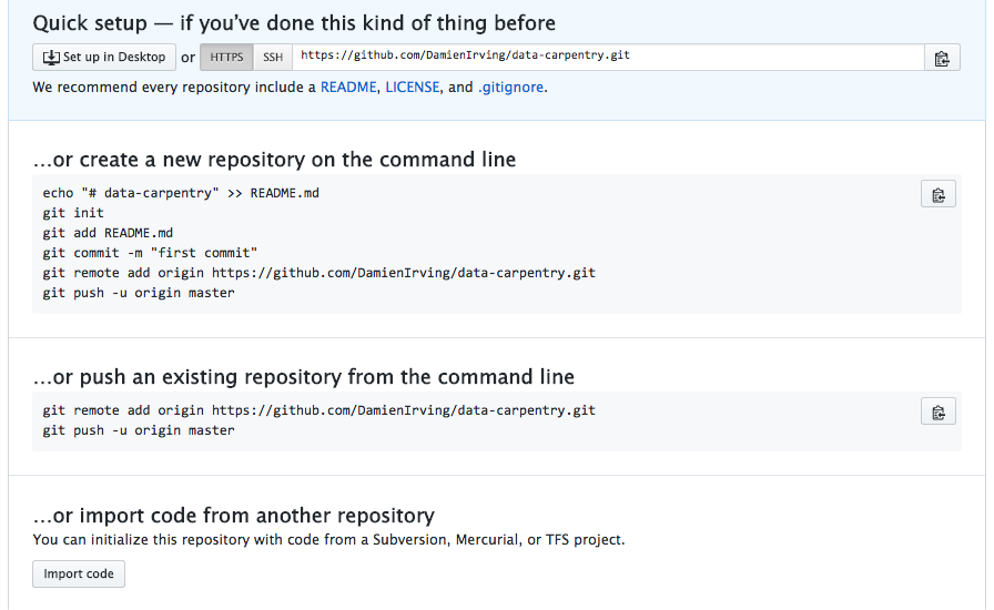
This effectively does the following on GitHub’s servers:
$ mkdir data-carpentry
$ cd data-carpentry
$ git init
Our local repository still contains our earlier work on plot_precipitation_climatology.py,
but the remote repository on GitHub doesn’t contain any files yet.
The next step is to connect the two repositories. We do this by making the GitHub repository a “remote” for the local repository. The home page of the repository on GitHub includes the string we need to identify it:
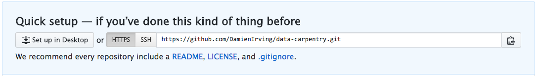
Click on the ‘HTTPS’ link to change the protocol from SSH to HTTPS if HTTPS isn’t already selected.
HTTPS vs. SSH
We use HTTPS here because it does not require additional configuration. After the workshop you may want to set up SSH access, which is a bit more secure, by following one of the great tutorials from GitHub, Atlassian/BitBucket and GitLab (this one has a screencast).
Copy that URL from the browser, go into the local data-carpentry repository,
and run this command:
$ git remote add origin https://github.com/DamienIrving/data-carpentry.git
Make sure to use the URL for your repository rather than Damien’s: the only
difference should be your username instead of DamienIrving.
We can check that the command has worked by running git remote -v:
$ git remote -v
origin https://github.com/DamienIrving/data-carpentry.git (push)
origin https://github.com/DamienIrving/data-carpentry.git (fetch)
Let’s do a command to make sure we are working in the right space called a branch. Branches are a more advanced topic we won’t be covering today. Today we will stay in our main branch.
- You may see older screenshots and documentation refer to “master” instead of “main” for your primary branch. Follow the below command to make sure you are using the new convention.
$ git branch -M main
The name origin is a local nickname for your remote repository. We could use
something else if we wanted to, but origin is by far the most common choice.
Once the nickname origin is set up, this command will push the changes from
our local repository to the repository on GitHub.
$ git push origin main
Counting objects: 9, done.
Delta compression using up to 4 threads.
Compressing objects: 100% (6/6), done.
Writing objects: 100% (9/9), 821 bytes, done.
Total 9 (delta 2), reused 0 (delta 0)
To https://github.com/DamienIrving/data-carpentry
* [new branch] main -> main
Branch main set up to track remote branch main from origin.
We can pull changes from the remote repository to the local one as well:
$ git pull origin main
From https://github.com/DamienIrving/data-carpentry
* branch main -> FETCH_HEAD
Already up-to-date.
Pulling has no effect in this case because the two repositories are already synchronised. If someone else had pushed some changes to the repository on GitHub, though, this command would download them to our local repository.
Sharing code with yourself or others
If we logged onto a different computer (e.g. a supercomputing facility or our desktop computer at home) we could access a copy of our code by “cloning” it.
$ git clone https://github.com/DamienIrving/data-carpentry.git
Since our repository is public, anyone (e.g. research collaborators) could clone the repository by getting the URL from the corresponding page on GitHub:
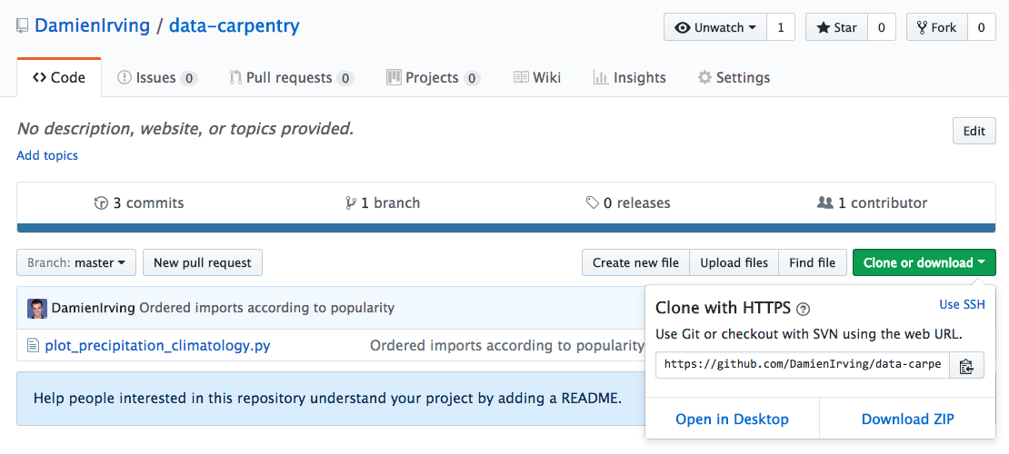
Working with others
Someone who clones your repository can’t push changes directly to it (unless you add them as a collaborator). They could, however, “fork” your repository and submit suggested changes via a “pull request”. Collaborators and pull requests are beyond the scope of this lesson, but you may come across them as you get more experienced with using git and GitHub.
Key Points
A local Git repository can be connected to one or more remote repositories.
Use the HTTPS protocol to connect to remote repositories until you have learned how to set up SSH.
git pushcopies changes from a local repository to a remote repository.
git pullcopies changes from a remote repository to a local repository.
Defensive programming
Overview
Teaching: 15 min
Exercises: 15 minQuestions
How can I make my programs more reliable?
Objectives
Explain what an assertion is.
Add assertions that check the program’s state is correct.
Debug Python scripts using the
pdblibrary.Identify sources of more advanced lessons on code testing.
Why do tests?
Adding tests to your code does take extra time but it makes your code and data more reliable. Here we are going to discuss a type of test called assertions but there are many more. You can review the resources below for more information about types of tests, why you would want to do them, and how to implement them.
Resources:
- The Turing Way: Code Testing. Great information about why and how to test. This includes guidance for other languages too, not just python.
- The Hitchhiker’s Guide to Python: Testing Your Code Targeted guidance for ways to test in python.
Scientist’s nightmare
If you needed any motivation to learn and employ the principles of defensive programming, look no further than this article. It documents the experience of a researcher who had to retract five published papers - three of which were in Science - because his code had inadvertently switched the rows and columns of a data table.
Now that we’ve written plot_precipitation_climatology.py, how can we be sure that it’s producing reliable results?
The first step toward getting the right answers from our programs is to assume that mistakes will happen and to guard against them. This is called defensive programming, and the most common way to do it is to add assertions to our code so that it checks itself as it runs. An assertion is simply a statement that something must be true at a certain point in a program. When Python sees one, it evaluates the assertion’s condition. If it’s true, Python does nothing, but if it’s false, Python halts the program immediately and prints the error message if one is provided.
To demonstrate an assertion in action, consider this piece of code that halts as soon as the loop encounters a rainfall observation value that isn’t positive:
rainfall_obs = [1.5, 2.3, 0.7, -0.2, 4.4]
total = 0.0
for ob in rainfall_obs:
assert ob >= 0.0, 'Rainfall observations should only contain positive values'
total += ob
print('total rainfall is:', total)
---------------------------------------------------------------------------
AssertionError Traceback (most recent call last)
<ipython-input-19-33d87ea29ae4> in <module>()
2 total = 0.0
3 for ob in rainfall_obs:
----> 4 assert ob > 0.0, 'Rainfall observations should only contain positive values'
5 total += ob
6 print('total rainfall is:', total)
AssertionError: Rainfall observations should only contain positive values
Programs like the Firefox browser are full of assertions: 10-20% of the code they contain are there to check that the other 80-90% are working correctly.
Adding assertions
To setup for this section, use this version of the plot_precipitation_climatology.py that has an added function to apply a mask. This was done during the vectorization challenge: plot_precipitation_climatology.py section.
import argparse

import numpy as np
import matplotlib.pyplot as plt
import xarray as xr
import cartopy.crs as ccrs
import cmocean


def convert_pr_units(darray):
    """Convert kg m-2 s-1 to mm day-1.

    Args:
      darray (xarray.DataArray): Precipitation data

    """

    darray.data = darray.data * 86400
    darray.attrs['units'] = 'mm/day'

    return darray


def apply_mask(darray, sftlf_file, realm):
    """Mask ocean or land using a sftlf (land surface fraction) file.

    Args:
      darray (xarray.DataArray): Data to mask
      sftlf_file (str): Land surface fraction file
      realm (str): Realm to mask

    """

    dset = xr.open_dataset(sftlf_file)

    if realm == 'land':
        masked_darray = darray.where(dset['sftlf'].data < 50)
    else:
        masked_darray = darray.where(dset['sftlf'].data > 50)

    return masked_darray


def create_plot(clim, model_name, season, gridlines=False, levels=None):
    """Plot the precipitation climatology.

    Args:
      clim (xarray.DataArray): Precipitation climatology data
      model_name (str): Name of the climate model
      season (str): Season

    Kwargs:
      gridlines (bool): Select whether to plot gridlines
      levels (list): Tick marks on the colorbar

    """

    if not levels:
        levels = np.arange(0, 13.5, 1.5)

    fig = plt.figure(figsize=[12,5])
    ax = fig.add_subplot(111, projection=ccrs.PlateCarree(central_longitude=180))
    clim.sel(season=season).plot.contourf(ax=ax,
                                          levels=levels,
                                          extend='max',
                                          transform=ccrs.PlateCarree(),
                                          cbar_kwargs={'label': clim.units},
                                          cmap=cmocean.cm.haline_r)
    ax.coastlines()
    if gridlines:
        plt.gca().gridlines()

    title = '%s precipitation climatology (%s)' %(model_name, season)
    plt.title(title)


def main(inargs):
    """Run the program."""

    dset = xr.open_dataset(inargs.pr_file)

    clim = dset['pr'].groupby('time.season').mean('time', keep_attrs=True)
    clim = convert_pr_units(clim)

    if inargs.mask:
        sftlf_file, realm = inargs.mask
        clim = apply_mask(clim, sftlf_file, realm)

    create_plot(clim, dset.attrs['model_id'], inargs.season,
                gridlines=inargs.gridlines, levels=inargs.cbar_levels)
    plt.savefig(inargs.output_file, dpi=200)


if __name__ == '__main__':
    description='Plot the precipitation climatology for a given season.'
    parser = argparse.ArgumentParser(description=description)

    parser.add_argument("pr_file", type=str, help="Precipitation data file")
    parser.add_argument("season", type=str, help="Season to plot")
    parser.add_argument("output_file", type=str, help="Output file name")

    parser.add_argument("--gridlines", action="store_true", default=False,
                        help="Include gridlines on the plot")
    parser.add_argument("--cbar_levels", type=float, nargs='*', default=None,
                        help='list of levels / tick marks to appear on the colorbar')
    parser.add_argument("--mask", type=str, nargs=2,
                        metavar=('SFTLF_FILE', 'REALM'), default=None,
                        help="""Provide sftlf file and realm to mask ('land' or 'ocean')""")

    args = parser.parse_args()

    main(args)
To see how assertions might be useful
in the context of the plot_precipitation_climatology.py script,
let’s try the following at the command line:
$ python plot_precipitation_climatology.py data/pr_Amon_ACCESS1-3_historical_r1i1p1_200101-200512.nc JJA plots/pr_Amon_ACCESS1-3_historical_r1i1p1_200101-200512-JJA-clim_land-mask.png --mask data/sftlf_fx_ACCESS1-3_historical_r0i0p0.nc Land
- Adjust the above command to match the paths to your data files and where you want your output to go. In the example, the image will go into an existing folder called “plots.”
If we view the resulting image, we can see that the ocean has been masked, even though we specified the land at the command line.

When confronted with perplexing code behaviour like this, it can be useful to insert a tracer into your scripts using the Python debugger:
import pdb
...
def apply_mask(darray, sftlf_file, realm):
"""Mask ocean or land using a sftlf (land surface fraction) file.
Args:
darray (xarray.DataArray): Data to mask
sftlf_file (str): Land surface fraction file
realm (str): Realm to mask
"""
dset = xr.open_dataset(sftlf_file)
pdb.set_trace()
if realm == 'land':
masked_darray = darray.where(dset['sftlf'].data < 50)
else:
masked_darray = darray.where(dset['sftlf'].data > 50)
return masked_darray
...
When we run the script, it will stop at the tracer and allow us to interrogate the code:
$ python plot_precipitation_climatology.py data/pr_Amon_ACCESS1-3_historical_r1i1p1_200101-200512.nc JJA pr_Amon_ACCESS1-3_historical_r1i1p1_200101-200512-JJA-clim_land-mask.png --mask data/sftlf_fx_ACCESS1-3_historical_r0i0p0.nc Land
> /Users/irv033/Desktop/data-carpentry/plot_precipitation_climatology.py(40)apply_mask()
-> if realm == 'land':
(Pdb) print(realm)
Land
(Pdb) 'Land' == 'land'
False
The problem appears to be that Python strings are case sensitive,
which means we should have entered land as opposed to Land at the command line.
We can fix this issue while in debug mode and then step through the code line by line
(using n) to make sure the correct where statement is executed.
(Pdb) realm = 'land'
(Pdb) n
> /Users/irv033/Desktop/data-carpentry/plot_precipitation_climatology.py(41)apply_mask()
-> masked_darray = darray.where(dset['sftlf'].data < 50)
Once we’re satisfied, we can enter c to run the remainder of the script
(it’s q to quit at any time).
To avoid making this case sensitive mistake in future, we should now remove the debugging tracer and replace it with an assertion to catch invalid inputs,
...
def apply_mask(darray, sftlf_file, realm):
"""Mask ocean or land using a sftlf (land surface fraction) file.
Args:
darray (xarray.DataArray): Data to mask
sftlf_file (str): Land surface fraction file
realm (str): Realm to mask
"""
dset = xr.open_dataset(sftlf_file)
assert realm in ['land', 'ocean'], """Valid realms are 'land' or 'ocean'"""
if realm == 'land':
masked_darray = darray.where(dset['sftlf'].data < 50)
else:
masked_darray = darray.where(dset['sftlf'].data > 50)
return masked_darray
...
test to make sure it’s working,
$ python plot_precipitation_climatology.py data/pr_Amon_ACCESS1-3_historical_r1i1p1_200101-200512.nc JJA pr_Amon_ACCESS1-3_historical_r1i1p1_200101-200512-JJA-clim_land-mask.png --mask data/sftlf_fx_ACCESS1-3_historical_r0i0p0.nc Land
Traceback (most recent call last):
File "plot_precipitation_climatology.py", line 120, in <module>
main(args)
File "plot_precipitation_climatology.py", line 91, in main
clim = apply_mask(clim, sftlf_file, realm)
File "plot_precipitation_climatology.py", line 39, in apply_mask
assert realm in ['land', 'ocean'], """Valid realms are 'land' or 'ocean'"""
AssertionError: Valid realms are 'land' or 'ocean'
and then commit the changes to git and push to GitHub.
$ git add plot_precipitation_climatology.py
$ git commit -m "Added realm check"
$ git push origin main
Testing and continuous integration
An assertion checks that something is true at a particular point in the program. For programs that are more complex (or research critical) than
plot_precipitation_climatology.py, it’s a good idea to take the next step and check the overall behavior of entire pieces (or units) of code. Related concepts like unit testing and continuous integration are beyond the scope of this lesson, but take a look at The Hitchhiker’s Guide to Python: Testing Your Code.
Add your own assertions
Add some more assertions to your copy of
plot_precipitation_climatology.py. Once you’re done, commit the changes to git and push to GitHub.Solution
There are many examples of assertions that could be added, but the most critical is to check the units of the input data before converting from kg m-2 s-1 to mm day-1.
... def convert_pr_units(darray): """Convert kg m-2 s-1 to mm day-1. Args: darray (xarray.DataArray): Precipitation data """ assert darray.units == 'kg m-2 s-1', "Program assumes input units are kg m-2 s-1" darray.data = darray.data * 86400 darray.attrs['units'] = 'mm/day' return darray ...
plot_precipitation_climatology.py
At the conclusion of this lesson your
plot_precipitation_climatology.pyscript should look something like the following:import pdb import argparse import numpy as np import matplotlib.pyplot as plt import xarray as xr import cartopy.crs as ccrs import cmocean def convert_pr_units(darray): """Convert kg m-2 s-1 to mm day-1. Args: darray (xarray.DataArray): Precipitation data """ assert darray.units == 'kg m-2 s-1', "Program assumes input units are kg m-2 s-1" darray.data = darray.data * 86400 darray.attrs['units'] = 'mm/day' return darray def apply_mask(darray, sftlf_file, realm): """Mask ocean or land using a sftlf (land surface fraction) file. Args: darray (xarray.DataArray): Data to mask sftlf_file (str): Land surface fraction file realm (str): Realm to mask """ dset = xr.open_dataset(sftlf_file) assert realm in ['land', 'ocean'], """Valid realms are 'land' or 'ocean'""" if realm == 'land': masked_darray = darray.where(dset['sftlf'].data < 50) else: masked_darray = darray.where(dset['sftlf'].data > 50) return masked_darray def create_plot(clim, model_name, season, gridlines=False, levels=None): """Plot the precipitation climatology. Args: clim (xarray.DataArray): Precipitation climatology data model_name (str): Name of the climate model season (str): Season Kwargs: gridlines (bool): Select whether to plot gridlines levels (list): Tick marks on the colorbar """ if not levels: levels = np.arange(0, 13.5, 1.5) fig = plt.figure(figsize=[12,5]) ax = fig.add_subplot(111, projection=ccrs.PlateCarree(central_longitude=180)) clim.sel(season=season).plot.contourf(ax=ax, levels=levels, extend='max', transform=ccrs.PlateCarree(), cbar_kwargs={'label': clim.units}, cmap=cmocean.cm.haline_r) ax.coastlines() if gridlines: plt.gca().gridlines() title = '%s precipitation climatology (%s)' %(model_name, season) plt.title(title) def main(inargs): """Run the program.""" dset = xr.open_dataset(inargs.pr_file) clim = dset['pr'].groupby('time.season').mean('time', keep_attrs=True) clim = convert_pr_units(clim) if inargs.mask: sftlf_file, realm = inargs.mask clim = apply_mask(clim, sftlf_file, realm) create_plot(clim, dset.attrs['model_id'], inargs.season, gridlines=inargs.gridlines, levels=inargs.cbar_levels) plt.savefig(inargs.output_file, dpi=200) if __name__ == '__main__': description='Plot the precipitation climatology for a given season.' parser = argparse.ArgumentParser(description=description) parser.add_argument("pr_file", type=str, help="Precipitation data file") parser.add_argument("season", type=str, help="Season to plot") parser.add_argument("output_file", type=str, help="Output file name") parser.add_argument("--gridlines", action="store_true", default=False, help="Include gridlines on the plot") parser.add_argument("--cbar_levels", type=float, nargs='*', default=None, help='list of levels / tick marks to appear on the colorbar') parser.add_argument("--mask", type=str, nargs=2, metavar=('SFTLF_FILE', 'REALM'), default=None, help="""Provide sftlf file and realm to mask ('land' or 'ocean')""") args = parser.parse_args() main(args)
Key Points
Program defensively, i.e., assume that errors are going to arise, and write code to detect them when they do.
Put assertions in programs to check their state as they run, and to help readers understand how those programs are supposed to work.
The
pdblibrary can be used to debug a Python script by stepping through line-by-line.Software Carpentry has more advanced lessons on code testing.
Data provenance
Overview
Teaching: 10 min
Exercises: 20 minQuestions
How can keep track of my data processing steps?
Objectives
Automate the process of recording the history of what was entered at the command line to produce a given data file or image.
What is provenance?
Provenance is the history record of an object. The term has been used long before data scientists latched onto it to refer to the history record of piece of art such as who owned it and where has it been? What restorations were made to it? When was the frame changed?
We want to know the same details about data. Where did it come from? What changes have been made to it?
Provenance capture is a big part of implementing FAIR data practices: Findable, Accessible, Interoperable, and Reusable. See:
- Wilkinson, M., Dumontier, M., Aalbersberg, I. et al. The FAIR Guiding Principles for scientific data management and stewardship. Sci Data 3, 160018 (2016). https://doi.org/10.1038/sdata.2016.18
- The Turing Way: The Fair Principles and Practices
How do you capture provenance?
There are many ways you can record provenance records but here is a way we can do that in our command line program - plot_precipitation_climatology.py -
that calculates and plots the precipitation climatology for a given season.
The last step is to capture the provenance of plots we create. In other words, we need a log of all the data processing steps that were taken from the intial download of the data file to the end result (i.e. the .png image).
The simplest way to do this is to follow the lead of the NCO and CDO command line tools, which insert a record of what was executed at the command line into the history attribute of the output netCDF file.
Example:
import xarray as xr
csiro_pr_file = 'data/pr_Amon_CSIRO-Mk3-6-0_historical_r1i1p1_200101-200512.nc'
dset = xr.open_dataset(csiro_pr_file)
print(dset.attrs['history'])
Fri Dec 8 10:05:56 2017: ncatted -O -a history,pr,d,, pr_Amon_CSIRO-Mk3-6-0_historical_r1i1p1_200101-200512.nc
Fri Dec 01 08:01:43 2017: cdo seldate,2001-01-01,2005-12-31 /g/data/ua6/DRSv2/CMIP5/CSIRO-Mk3-6-0/historical/mon/atmos/r1i1p1/pr/latest/pr_Amon_CSIRO-Mk3-6-0_historical_r1i1p1_185001-200512.nc pr_Amon_CSIRO-Mk3-6-0_historical_r1i1p1_200101-200512.nc
2011-07-27T02:26:04Z CMOR rewrote data to comply with CF standards and CMIP5 requirements.
Fortunately, there is a Python package called cmdline-provenance that creates NCO/CDO-style records of what was executed at the command line. We can use it to generate a new command line record:
import cmdline_provenance as cmdprov
new_record = cmdprov.new_log()
print(new_record)
2017-12-08T14:05:34: /Applications/anaconda/envs/pyaos-lesson/bin/python /Applications/anaconda/envs/pyaos-lesson/lib/python3.6/site-packages/ipykernel_launcher.py -f /Users/dirving/Library/Jupyter/runtime/kernel-7183ce41-9fd9-4d30-9e46-a0d16bc9bd5e.json
(i.e. This is the command that was run to launch the jupyter notebook we’re using.)
Generate a log file
In order to capture the complete provenance of the precipitation plot, add a few lines of code to the end of the
mainfunction inplot_precipitation_climatology.pyso that it:
- Extracts the history attribute from the input file and combines it with the current command line entry (using the
cmdprov.new_logfunction)- Outputs a log file containing that information (using
cmdprov.write_log; the file should have name as the plot, replacing .png with .txt)(Hint: The documentation for cmdline-provenance explains the process.)
Solution
Make the following additions to
plot_precipitation_climatology.py(code omitted from this abbreviated version of the script is denoted...):... import cmdline_provenance as cmdprov ... def main(inargs): ... new_log = cmdprov.new_log(infile_history={inargs.pr_file: dset.attrs['history']}) fname, extension = inargs.output_file.split('.') cmdprov.write_log(fname+'.txt', new_log)
plot_precipitation_climatology.py
At the conclusion of this lesson your
plot_precipitation_climatology.pyscript should look something like the following:import pdb import argparse import numpy as np import matplotlib.pyplot as plt import xarray as xr import cartopy.crs as ccrs import cmocean import cmdline_provenance as cmdprov def convert_pr_units(darray): """Convert kg m-2 s-1 to mm day-1. Args: darray (xarray.DataArray): Precipitation data """ assert darray.units == 'kg m-2 s-1', "Program assumes input units are kg m-2 s-1" darray.data = darray.data * 86400 darray.attrs['units'] = 'mm/day' return darray def apply_mask(darray, sftlf_file, realm): """Mask ocean or land using a sftlf (land surface fraction) file. Args: darray (xarray.DataArray): Data to mask sftlf_file (str): Land surface fraction file realm (str): Realm to mask """ dset = xr.open_dataset(sftlf_file) assert realm in ['land', 'ocean'], """Valid realms are 'land' or 'ocean'""" if realm == 'land': masked_darray = darray.where(dset['sftlf'].data < 50) else: masked_darray = darray.where(dset['sftlf'].data > 50) return masked_darray def create_plot(clim, model_name, season, gridlines=False, levels=None): """Plot the precipitation climatology. Args: clim (xarray.DataArray): Precipitation climatology data model_name (str): Name of the climate model season (str): Season Kwargs: gridlines (bool): Select whether to plot gridlines levels (list): Tick marks on the colorbar """ if not levels: levels = np.arange(0, 13.5, 1.5) fig = plt.figure(figsize=[12,5]) ax = fig.add_subplot(111, projection=ccrs.PlateCarree(central_longitude=180)) clim.sel(season=season).plot.contourf(ax=ax, levels=levels, extend='max', transform=ccrs.PlateCarree(), cbar_kwargs={'label': clim.units}, cmap=cmocean.cm.haline_r) ax.coastlines() if gridlines: plt.gca().gridlines() title = '%s precipitation climatology (%s)' %(model_name, season) plt.title(title) def main(inargs): """Run the program.""" dset = xr.open_dataset(inargs.pr_file) clim = dset['pr'].groupby('time.season').mean('time', keep_attrs=True) clim = convert_pr_units(clim) if inargs.mask: sftlf_file, realm = inargs.mask clim = apply_mask(clim, sftlf_file, realm) create_plot(clim, dset.attrs['model_id'], inargs.season, gridlines=inargs.gridlines, levels=inargs.cbar_levels) plt.savefig(inargs.output_file, dpi=200) new_log = cmdprov.new_log(infile_history={inargs.pr_file: dset.attrs['history']}) fname, extension = inargs.output_file.split('.') cmdprov.write_log(fname+'.txt', new_log) if __name__ == '__main__': description='Plot the precipitation climatology for a given season.' parser = argparse.ArgumentParser(description=description) parser.add_argument("pr_file", type=str, help="Precipitation data file") parser.add_argument("season", type=str, help="Season to plot") parser.add_argument("output_file", type=str, help="Output file name") parser.add_argument("--gridlines", action="store_true", default=False, help="Include gridlines on the plot") parser.add_argument("--cbar_levels", type=float, nargs='*', default=None, help='list of levels / tick marks to appear on the colorbar') parser.add_argument("--mask", type=str, nargs=2, metavar=('SFTLF_FILE', 'REALM'), default=None, help="""Provide sftlf file and realm to mask ('land' or 'ocean')""") args = parser.parse_args() main(args)You can download a copy of the final code by right clicking this link and choosing “Save link as…” plot_precipitation_climatology_final.py. Remove “_final” from the name if you are using it with the following command.
And test your code by running:
$ python plot_precipitation_climatology.py data/pr_Amon_ACCESS1-3_historical_r1i1p1_200101-200512.nc JJA pr_Amon_ACCESS1-3_historical_r1i1p1_200101-200512-JJA-clim_land-mask.png --mask data/sftlf_fx_ACCESS1-3_historical_r0i0p0.nc land
You should see two files written. The image and the provenance record:
pr_Amon_ACCESS1-3_historical_r1i1p1_200101-200512-JJA-clim_land-mask.pngpr_Amon_ACCESS1-3_historical_r1i1p1_200101-200512-JJA-clim_land-mask.txt
Key Points
It is possible (in only a few lines of code) to record the provenance of a data file or image.
Accessing SQLite Databases Using Python and Pandas
Overview
Teaching: 20 min
Exercises: 25 minQuestions
What if my data are stored in an SQL database? Can I manage them with Python?
How can I write data from Python to be used with SQL?
Objectives
Use the sqlite3 module to interact with a SQL database.
Access data stored in SQLite using Python.
Describe the difference in interacting with data stored as a CSV file versus in SQLite.
Describe the benefits of accessing data using a database compared to a CSV file.
Python and SQL
When you open a CSV in python, and assign it to a variable name, you are using your computers memory to save that variable. Accessing data from a database like SQL is not only more efficient, but also it allows you to subset and import only the parts of the data that you need.
In the following lesson, we’ll see some approaches that can be taken to do so.
The sqlite3 module
The sqlite3 module provides a straightforward interface for interacting with
SQLite databases. A connection object is created using sqlite3.connect(); the
connection must be closed at the end of the session with the .close() command.
While the connection is open, any interactions with the database require you to
make a cursor object with the .cursor() command. The cursor is then ready to
perform all kinds of operations with .execute().
import sqlite3
# Create a SQL connection to our SQLite database
con = sqlite3.connect("data/portal_mammals.sqlite")
cur = con.cursor()
# The result of a "cursor.execute" can be iterated over by row
for row in cur.execute('SELECT * FROM species;'):
print(row)
# Be sure to close the connection
con.close()
Queries
One of the most common ways to interact with a database is by querying: retrieving data based on some search parameters. Use a SELECT statement string. The query is returned as a single tuple or a tuple of tuples. Add a WHERE statement to filter your results based on some parameter.
import sqlite3
# Create a SQL connection to our SQLite database
con = sqlite3.connect("data/portal_mammals.sqlite")
cur = con.cursor()
# Return all results of query
cur.execute('SELECT plot_id FROM plots WHERE plot_type="Control"')
cur.fetchall()
# Return first result of query
cur.execute('SELECT species FROM species WHERE taxa="Bird"')
cur.fetchone()
# Be sure to close the connection
con.close()
Accessing data stored in SQLite using Python and Pandas
Using pandas, we can import results of a SQLite query into a dataframe. Note that you can use the same SQL commands / syntax that we used in the SQLite lesson. An example of using pandas together with sqlite is below:
import pandas as pd
import sqlite3
# Read sqlite query results into a pandas DataFrame
con = sqlite3.connect("data/portal_mammals.sqlite")
df = pd.read_sql_query("SELECT * from surveys", con)
# Verify that result of SQL query is stored in the dataframe
print(df.head())
con.close()
Storing data: CSV vs SQLite
Storing your data in an SQLite database can provide substantial performance improvements when reading/writing compared to CSV. The difference in performance becomes more noticeable as the size of the dataset grows (see for example these benchmarks).
Challenge - SQL
Create a query that contains survey data collected between 1998 - 2001 for observations of sex “male” or “female” that includes observation’s genus and species and site type for the sample. How many records are returned?
Create a dataframe that contains the total number of observations (count) made for all years, and sum of observation weights for each site, ordered by site ID.
Storing data: Create new tables using Pandas
We can also us pandas to create new tables within an SQLite database. Here, we run we re-do an exercise we did before with CSV files using our SQLite database. We first read in our survey data, then select only those survey results for 2002, and then save it out to its own table so we can work with it on its own later.
import pandas as pd
import sqlite3
con = sqlite3.connect("data/portal_mammals.sqlite")
# Load the data into a DataFrame
surveys_df = pd.read_sql_query("SELECT * from surveys", con)
# Select only data for 2002
surveys2002 = surveys_df[surveys_df.year == 2002]
# Write the new DataFrame to a new SQLite table
surveys2002.to_sql("surveys2002", con, if_exists="replace")
con.close()
Challenge - Saving your work
For each of the challenges in the previous challenge block, modify your code to save the results to their own tables in the portal database.
What are some of the reasons you might want to save the results of your queries back into the database? What are some of the reasons you might avoid doing this.
Key Points
sqlite3 provides a SQL-like interface to read, query, and write SQL databases from Python.
sqlite3 can be used with Pandas to read SQL data to the familiar Pandas DataFrame.
Pandas and sqlite3 can also be used to transfer between the CSV and SQL formats.